filmov
tv
How to create horizontal scrolling images in Squarespace / Squarespace Scrolling Images Tutorial

Показать описание
The scrolling marquee block is an exciting content block available in Squarespace. The second it came out, I released a brand new video to teach people how to use it! The number one thing that people wanted to do was display images in this content, which it just couldn’t do.
But lucky for us, we can still make that magic happen on a Squarespace website thanks to CSS!
In this tutorial, you’ll learn how to set up a gallery section in Squarespace 7.1 and then use custom code to animate it so the images scroll across the screen.
When you’re ready to give it a try, watch the tutorial video and follow these steps:
Step 1: Create a Gallery Section First things first, you’ll need to create a Gallery Section in Squarespace. To do this, open up your site editor, and select Add Section. Select Images from the menu and pick an auto layout indicated by the ⓘ in the top right-hand corner of the preview.
Step 2: Add Your Images Upload your images to the gallery section and be sure to set the design layout to Grid: Simple.
Step 3: Add Custom CSS Now for the fun part – adding some custom CSS to create the scrolling effect! For this scrolling image marquee, we’ll be using the CSS animation property. Here’s the code you’ll need to add.
#page {
overflow-x:hidden
}
.gallery-grid-wrapper {
display:flex !important;
animation: slideshow 30s linear infinite
}
.gallery-grid-wrapper .gallery-grid-item {
min-width: 50%;
margin-right: 5%
}
@keyframes slideshow {
0% { left: 0; }
100% { left: -225%; }
}
Step 4: Update the code time, width, and keyframe percentage for your unique website style
And there you have it – a set if horizontally scrolling images on your Squarespace website! With a bit of custom CSS, you can create a unique and eye-catching effect that will impress visitors and make your site uniquely yours.
- - -
- - -
- - -
- - -
- - -
The term "Squarespace" is a trademark of Squarespace, Inc. This video was not approved or endorsed by Squarespace, Inc. I just really love their platform ♥
 0:00:47
How do I do horizontal scrolling in Figma?
 0:05:15
Build along to create a horizontal scroll effect
 0:04:25
Horizontal and Vertical Scroll in Figma - Quick Prototyping Tutorial
 0:26:13
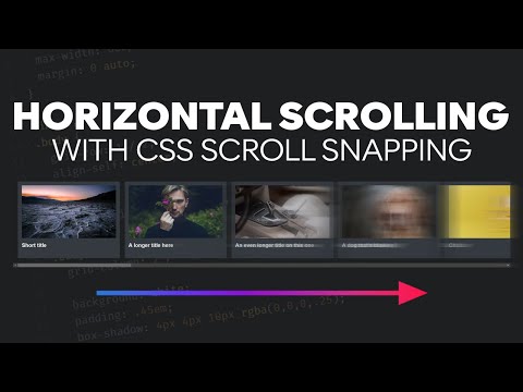
Create a horizontal media scroller with CSS
 0:07:55
Dynamic horizontal scrolling based on the amount of content
 0:00:24
Horizontal Scrolling in Excel | Excel Tricks
 0:11:25
How To Create Image Gallery In JavaScript | Horizontal Scrolling Using JavaScript
 0:32:01
Create an infinite horizontal scroll animation
 0:11:39
Stop Scroll Wheel from Moving Records in Continuous Forms While in Notes Field in Access, Part 2
 0:01:26
Horizontal scrolling in Figma
 0:06:17
Horizontal and Vertical Scroll in Figma | Scrolling in Figma explained.
 0:19:00
How to Create an Awesome Horizontal Scroller
 0:12:57
Create a Sick Horizontal Scroll Animation | GreenSock / JS
 0:01:36
How To Create A Horizontal Scroll Bar In HTML
 0:09:11
Vertical, Sticky, and Horizontal Scrolling in Figma
 0:02:39
How to Create Horizontal Scrolling Text | Adobe Premiere Pro
 0:09:55
Advanced interactions: Horizontal scroll in Webflow
 0:12:47
How to Create a Horizontal and Vertical Scrolling Website with a FREE Wordress Plugin
 0:04:40
Horizontal Scroll Flow Elementor Wordpress Tutorial - No Code - No Plugin
 0:21:21
Horizontal Scroll Elementor Pro Tutorial
 0:28:33
JavaScript: Implementing Horizontal and Vertical Scrolling on a Single Webpage
 0:05:42
Horizontal & Vertical Scrolling | Figma Tutorial
 0:22:01
Make a Horizontal Scroll Section/Page in Elementor FREE | Horizontal Scrolling with Parallax Effect
 0:08:23
How to create horizontal scrolling images in Squarespace / Squarespace Scrolling Images Tutorial
Комментарии