filmov
tv
The Blues I Use: Phthalo Ultramarine Prussian Cobalt Cerulean

Показать описание
The blues I often use are Phthalo Blue and French Ultramarine. Next is Cerulean Blue. I don't use Prussian and Cobalt Blue that much. Below are links mentioned in the video:
Blockx watercolor:
Find me also on
Blockx watercolor:
Find me also on
 0:17:53
The Blues I Use: Phthalo Ultramarine Prussian Cobalt Cerulean
 0:08:17
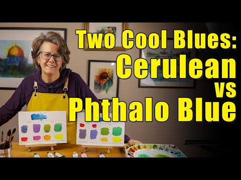
Compare Two Blues - Cerulean vs Phthalo Blue
 0:11:26
Phthalo Blues and Greens Compared
 0:19:02
Phthalo blues compared - acrylic paints
 0:18:14
Using Phthalo Blue & Green in Watercolor
 0:05:08
Phthalo Blue Red Or Green Shade? - Which Do I Use And Why?
 0:00:16
Color mixing the phthalo blues #shorts #danielsmithwatercolors
 0:00:37
Let’s mix Phthalo Blue and Burnt Umber Watercolours and see what happens #watercolor #watercolour
 0:04:38
The Best Blues To Use
 0:11:09
All My Blue Colors [Why I Chose Them]
 0:10:04
Let's talk about Phthalo Blue (RS) from Daniel Smith Watercolor
 0:15:04
TROPICAL Phthalo Blue - SAA Watercolors | The Paint Show 50
 0:20:16
Comparing Blue Oil Colors | Cobalt, Ultramarine, Prussian and Phthalo
 0:00:16
More color mixing with phthalo blues #shorts #shortsvideo #art #watercolor
 0:01:00
Choosing Blues for Watercolor Skies - Ultramarine Blue or Phthalocyanine Cyan?
 0:14:10
Blue Pigments from Ancient to Modern: Comparison of Prussian Blue, Indigo, and Phthalo Blue
 0:01:00
Get Gorgeous Colors with Pthalo Blues & Greens in Your Paintings
 0:00:21
Ladies and Gentlemen... Phthalo Blue
 0:06:03
PHTHALO BLUE (GS) - DANIEL SMITH | The Paint Show 8
 0:00:10
Daniel Smith, Phthalo Blue (GS) #shorts
 0:00:21
Mini Paint Review - Gamblin Phthalo Blue
 0:00:59
All the Blues on My Watercolor Palette [See What I Use] #shorts #watercolorblues #whatsonmypalette
 0:18:41
My Top 5 Favorite Watercolors: Blues
 0:00:40
Day 1 of a 4-Day Galaxy Skies Painting Challenge: Monochrome w/Phthalo Blue #milkyway #watercolor
Комментарии