filmov
tv
Using Phthalo Blue & Green in Watercolor

Показать описание
Phthalos are sometimes considered difficult to use because of their intensity. I'll show you some ways to tame the colors and learn what else you can do with them. I'll be demonstrating specifically with Phthalo Blue GS (PB15:3) and Phthalo Green BS (PG7).
*** Affiliate Links ***
(As an Amazon Associate I earn from qualifying purchases. Thanks for looking.)
My Amazon Store of Favorite Products:
Sponsored by Viewers Like YOU!
___
Popular Uploads
Watercolor Basics
Product Reviews
Mini Episodes
Paint With Me
Subscribe:
Show Theme Music
*** Affiliate Links ***
(As an Amazon Associate I earn from qualifying purchases. Thanks for looking.)
My Amazon Store of Favorite Products:
Sponsored by Viewers Like YOU!
___
Popular Uploads
Watercolor Basics
Product Reviews
Mini Episodes
Paint With Me
Subscribe:
Show Theme Music
 0:18:14
Using Phthalo Blue & Green in Watercolor
 0:08:11
Color Review: Phthalo Blue (Green Shade) by Daniel Smith
 0:00:21
Mixing Natural Greens From Phthalo Blue
 0:05:08
Phthalo Blue Red Or Green Shade? - Which Do I Use And Why?
 0:13:35
Phthalo Blue (Green Shade) - Winsor & Newton | The Paint Show 37
 0:07:00
Prussian Blue VS Phthalo Blue VS Cerulean Blue - Blue Green Shade
 0:00:15
What Color Wednesday: Phthalo Blue (Green Shade)
 0:11:26
Phthalo Blues and Greens Compared
 0:34:18
Mini Sunrise Acrylic Painting Tutorial + Tips for Smooth Blending!
 0:15:04
TROPICAL Phthalo Blue - SAA Watercolors | The Paint Show 50
 0:12:12
Phthalo Blue Green Shade vs Red Shade
 0:08:17
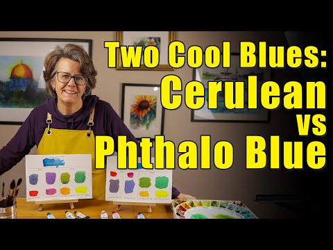
Compare Two Blues - Cerulean vs Phthalo Blue
 0:16:04
#98 Phthalo Green Blue Shade (Watercolor Landscape Tutorial)
 0:00:37
Let’s mix Phthalo Blue and Burnt Umber Watercolours and see what happens #watercolor #watercolour
 0:06:03
PHTHALO BLUE (GS) - DANIEL SMITH | The Paint Show 8
 0:00:58
Swatching Roman Szmal Phthalo Blue (Green Shade) #swatching #watercolor
 0:00:16
Mixing Recipe: Phthalo Blue (Red Shade) + Undersea Green @danielsmithartistsmaterials
 0:00:16
Color mixing the phthalo blues #shorts #danielsmithwatercolors
 0:06:17
Phthalo Blue Red Shade or Phthalo Blue Green Shade?
 0:13:45
Mixing Turquoise in Watercolor | Four Recipes
 0:39:07
A Comparison Between Daniel Smith Phthalo Blue G.S and R.S
 0:00:31
Viridian and Phthalo green couldn't be more different yet paints use them interchangeably, why?
 0:10:36
Watercolor Pigment Comparison - Phthalo Blue green shade PB15:3 vs Phthalo Turquoise PB16 (Holbein)
 0:19:02
Phthalo blues compared - acrylic paints
Комментарии