filmov
tv
Introducing the new 5B brand!

Показать описание
Check out our new brand!
A lot has changed in the 10 years since the original 5B logo hit Australia’s clean energy landscape.
Our product range has grown in sophistication and optionality. And so have we. We’ve developed a suite of integrated solutions for customers, developers and EPCs. And we’ve gone global, increasing our impact on the world.
This is a transitional milestone for our business as we launch our new slick and streamlined visual identity. Our new brand reflects this evolution from pioneers of a single (amazing) 5B Maverick product into the home of solar innovation solutions. The universe symbol pays homage to our science-based climate mission and reflects our expanding scope and the speed at which we move.
A huge shout out to our agency WordPlay Studio who called this visual identity refresh “Project Lobster” because a lobster grows into its shell. Our new visual identity will allow us to comfortably grow into an exciting future.
It’s an evolution, not a revolution. Our original branding has held us in very good stead and we are 100% keeping our roots as proud Aussie innovators pushing the boundaries of what’s possible in the solar energy realm.
Introducing the new 5B brand!
5B Maverick - safe, fast to deploy, powerful, cost effective
New Tests: 5B
5B-Marketing Introduction
Introduction of the Doosan DX800LC-5B Crawler Excavator
BACARDI REJECTS JAYZ'S $1 5B OFFER TO BUY COMPANY #jayz #bacardi #shorts
Johnson & Johnson - 5B (Case Study) | Campaign
xavier memes #memes
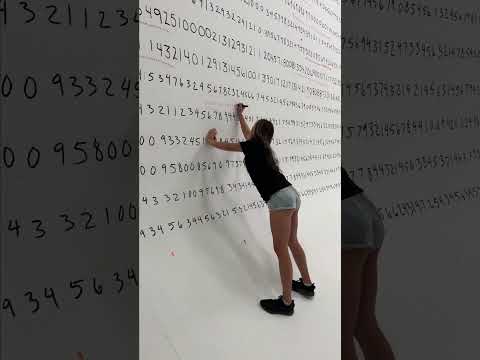
Human Calculator Solves World’s Longest Math Problem #shorts
CHOU STUN IN REAL LIFE 😂!! Mobile Legend:Bang Bang #mobilelegends #choustun #shorts
Members Mark Pro Series: 5 Burner Griddle Introduction
Unbelievable Outcome of THIS Crazy Science Experiment! #7PlusExperiment #shorts
Session 5B: Data Relationships - More Applications in Finance & Investing
Zildjian Unveils Its Redesigned 5A And 5B Drumstick Models At Winter NAMM 2018
*BRAND NEW* TFI Busconnects Phase 5b route Compilation November 25th 2023.
Techno Gamerz Evolution 2017 - 2030 | #shorts #technogamerz #thenvsnow
Introducing 10 Farnsworth Unit 5B in Boston's Fort Point
TLR 5B and Kraken Vekta
Bobby Lashley with UNBELIEVABLE strength! 🤯
Introduction to Current Transformers Part 5b: Delta Connected CTs
Introducing the ZX135USL-6 for forestry applications
SME MUDIM COMPANY (MKT540 / BA240 5B)
Bunion Correction 😨 (explained)
Top 25 March Quarterly Reports (Appendix 4C and 5B) | Introducing the Companies and the ONE RULE
Комментарии
 0:00:09
 0:01:42
 0:18:03
 0:01:05
 0:00:49
 0:00:06
 0:01:55
 0:00:06
 0:00:34
 0:00:15
 0:00:44
 0:00:31
 0:23:43
 0:03:00
 0:02:24
 0:00:24
 0:00:46
 0:00:14
 0:00:15
 0:06:45
 0:01:29
 0:08:52
 0:00:30
 0:17:09