filmov
tv
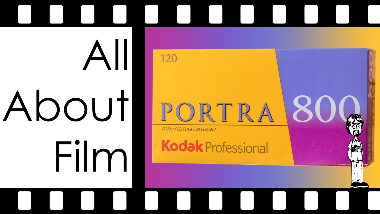
Kodak Portra 800 Film Review, Sample Photos, 35mm and 120 | All About Film
Показать описание
I started using Portra 800 in December 2015 and wrapped up the photos for this video in January 2023. Portra 800 has given me photos from a lot of different subjects in different lighting and different conditions. And, generally, I’ve been pleased with it most of the time. But I definitely have a strong preference with this film for some subjects and some lighting. People and animals in daylight work very well to my eye. Similar subjects in warm lighting can be recorded decently well. Landscapes and similar works doesn’t benefit from the Portra 800 look.
Porta is a specialist film and what it does well it does very well. It’s not great as a generalist and many subjects don’t benefit from what it offers. That said, portraits, weddings, events, animals, and other photos where the subject has a face will generally be rendered well on Portra 800. That said, if you take Portra 800 out of its environment it can perform fine, but not to its best. It’s sort of like a heart surgeon could probably perform a kidney operation, but it’s not truly their wheelhouse. Portra 800 is a specialist and it likes being where it’s strongest.
Kodak Portra 800 film is a versatile and much loved photographic film stock known for its outstanding performance in a wide range of shooting conditions. This comprehensive YouTube video provides a detailed analysis of the technical aspects and captivating results offered by Kodak Portra 800 in both 35mm and 120 formats. As part of the All About Film series, this video aims to provide students and film enthusiasts with valuable insights, facts, and educational content.
The review delves into the remarkable characteristics that make Kodak Portra 800 a favored choice among photographers. Throughout the video, the analysis focuses on various essential aspects of Kodak Portra 800. Topics covered include contrast, grain, dynamic range, scanability, spectral sensitivity, and reciprocity failure. Each of these features is explored, highlighting how they contribute to the overall performance and image quality of the film stock. The review incorporates sample photos captured using Kodak Portra 800, allowing viewers to witness firsthand the film's remarkable capabilities and stunning visual results.
In addition to technical details, practical tips and insights are shared to aid viewers in optimizing their experience when working with Kodak Portra 800. The content is meticulously designed to engage the primary audience of students and film enthusiasts, providing them with valuable information, facts, and educational content about this popular film stock.
Join this channel to get access to perks:
David Hancock's Amazon Author Page with Links to Select Camera Manual eBooks:
Video Index:
0:00 - Intro
0:13 - Skip the Intro
0:45 - Best Tips, Tricks, and Practices
5:00 - Image Characteristics
7:11 - Spectral Sensitivity
8:10 - Reciprocity Failure
9:16 - Development Latitude
10:32 - Closing Narrative
My Instagram:
"Rock this Joint" by Edward Joe Myers used under active license from Epidemic Sound at the time of this video's upload.
 0:12:15
Kodak Portra 800 Film Review, Sample Photos, 35mm and 120 | All About Film
 0:03:24
Kodak Portra 800 | The Perfect Film Stock
 0:00:41
Kodak Portra 800 mini review!
 0:09:43
Portra 800: Expensive, but WORTH IT.
 0:13:46
Why should you shoot PORTRA 800? // Leica M6
 0:12:58
Kodak Portra 800 | 35mm
 0:10:25
BEST Film for Night Photography? Cinestill 800T vs Portra 800
 0:18:34
A Side by Side Film Test: Portra 400 vs Portra 800
 0:19:08
Which film stock should you buy?
![[Film Photography] KODAK](https://i.ytimg.com/vi/_XBaSXZ2ToY/hqdefault.jpg) 0:11:18
0:11:18
[Film Photography] KODAK PORTRA 800 for GOLDEN HOUR in London - Street Photography PoV, Film Review
 0:11:21
Portra 800 is a GOAT & My New Camera
 0:12:45
Superia 1600, Portra 800 & Cinestill 800 | High ISO Color Films
 0:06:41
FINALLY Kodak Portra 800 on a digital camera (Honest review and test images)
 0:06:39
LOMO 800 VS KODAK PORTRA 800 | Basic Film Photographer Vibes
 0:10:37
Kodak Gold 200 vs Portra 800 | Portrait + Street Film Photography
 0:04:29
Kodak Portra 800
 0:06:08
Kodak Portra 160 vs Portra 400 vs Portra 800 - 8K
 0:03:58
Kodak Portra 160/400/800 Side by Side Comparison
 0:11:02
Not Kodak Gold or Portra 800, but close | #filmstocktryouts | 35mm film review | Lomography 800
 0:10:43
Portra 800 vs Lomo 800... Better luck next time.
 0:13:07
My NEW Favorite 35mm Color Film
 0:08:30
Is Portra 400 really worth the hype? | 35mm Film Review
 0:09:49
Review Film: Kodak Portra 800 in Scheveningen - analoge Fotografie I Lomtro
 0:04:49
Kodak Portra 800 Film Examples
Комментарии