filmov
tv
Histogram in 3 Simple Steps #Shorts

Показать описание
Learn how to build a histogram in three simple steps! Histogram data visualization clearly and visually explained. Making a histogram is easy and quick -- so is this explanation!
#Shorts #dataviz
0:00 Step #1 - Gather data
0:10 Step #2 - Make bins
0:19 Step #3 - Put data in bins
0:41 You did it!
Related Videos:
#Shorts #dataviz
0:00 Step #1 - Gather data
0:10 Step #2 - Make bins
0:19 Step #3 - Put data in bins
0:41 You did it!
Related Videos:
 0:00:55
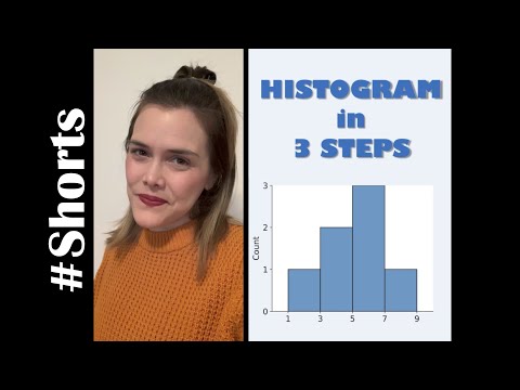
Histogram in 3 Simple Steps #Shorts
 0:03:31
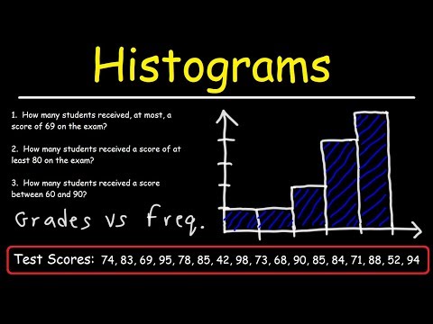
Histograms Explained! | How to Make a Histogram | Math Defined with Mrs. C
 0:02:36
How to make a histogram chart in Excel [in 3 easy steps]
 0:04:38
How to Make a Histogram in Excel
 0:07:21
How to create a histogram | Data and statistics | 6th grade | Khan Academy
 0:11:16
How To Make a Histogram Using a Frequency Distribution Table
 0:07:39
3 Easy Ways to Create a Histogram Chart in Excel
 0:06:08
Use Excel 2016 to make Frequency distribution and Histogram for quantitative data
 0:36:22
Data Visualization in Python using Seaborn | Aug 2024
 0:05:57
Introduction to Histograms
 0:03:40
Mat 144 - How to Create Histogram in Excel. SQL Videos below👇Tap/Click 'more'.
 0:14:25
Histogram and Frequency Polygon
 0:03:58
What Is And How To Construct Draw Make A Histogram Graph From A Frequency Distribution Table
 0:01:46
How To Get Histogram Or Column Chart Using Microsoft Word
 0:04:31
Histogram Explained! Get Perfect Exposure Everytime!
 0:10:13
Histograms
 0:00:45
Create Histogram Chart in Excel
 0:12:33
How to Create a Histogram with Normal curve overlay in Excel,Add normal curve, insert bell curve to
 0:01:29
How to construct a Histogram of a Grouped Frequency Table using Excel
 0:08:10
Creating a Histogram, Bins, and Frequency using Excel
 0:12:44
W209 6 3 D3: Creating a Histogram step by step
 0:06:30
How to Make a Histogram Chart in Excel? | FREE Download
 0:02:28
Median in a histogram | Summarizing quantitative data | AP Statistics | Khan Academy
 0:06:08
Histograms | Applying mathematical reasoning | Pre-Algebra | Khan Academy
Комментарии