filmov
tv
CMYK vs Pantone vs RGB - What's the difference? Why does it matter? When to use each?

Показать описание
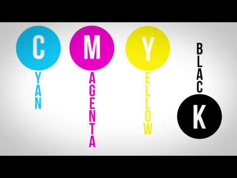
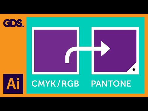
Austin from Print Peppermint gives an overview of the key differences between the RGB, CMYK, and PMS Pantone color spaces.
In order to help our designers and clients we created this 4-Color Process Reference book which displays a list of optimized CMYK color values and when printed acts as a handy tool in referencing on-screen color in real life.
You can download a Free PDF file here:
You can print this out at home on your digital printer which, although not perfect, should still act as a good guide for choosing CMYK values inside photoshop or whatever design software you are using.
------------------------------------
TABLE OF CONTENTS
------------------------------------
0:00 - Intro
0:15 - What is RGB color?
0:26 - What is CMYK color?
0:44 - What are PMS Pantone Colors?
0:59 - How does RGB work? / How do screens work? / Additive Color Model
1:30 - How does CMYK work? What is 4-color process printing?
1:51 - What is halftone and how does it work?
2:12 - Subtractive Color Model
2:24 - Why was 4-color CMYK process invented?
2:37 - When should you use CMYK color?
2:48 - Why are my printed colors different than my computer screen?
2:58 - 4-Color Process Reference Guide Book (FREE DOWNLOAD)
3:21 - (Cont) Pantone Spot Colors: Neon / Fluorescent / Pastel / Metallic /
3:40 - PMS Color Palettes in Photoshop, Illustrator, or Affinity Design Software
3:53 - When to use PMS color? Why use PMS colors? Benefits
4:10 - How many PMS colors can be recreated in CMYK?
4:18 - What is Pantone Extended Gamut?
4:32 - Outro - Please Like & Subscribe :)
------------------------------------
Комментарии
 0:05:01
 0:06:43
 0:02:30
 0:05:47
 0:00:38
 0:00:35
 0:06:35
 0:02:16
 0:04:31
 0:03:52
 0:03:14
 0:08:32
 0:02:25
 0:04:07
 0:01:12
 0:01:11
 0:13:46
 0:05:48
 0:01:33
 0:02:33
 0:06:13
 0:11:47
 0:01:01
 0:07:12