filmov
tv
🔴 Learn Typography Through This Poster Design Critique 2018

Показать описание
Don't get stuck with your type layouts. Improve your typography skills by watching Chris Do & Emily Xie review and critique fan submitted design and layouts. They offer up helpful suggestions, design alternatives and explore different design options.
Adam Sanborne
Musical Director
—
Love the content? Become a sustaining member for $5/mo today.
BOOKLIST –
Kits & Proposals:
Visit our website:
FREE resources:
Mandarin (Chinese) Subtitles on UiiUii
—
OUR AFFILIATE LINKS*
—
Futur Podcast on iTunes: 🎙
—
Credits:
Executive Producer– Chris Do
Host– Chris Do
Cinematography– Aaron Szekely, Erica Pead, Mark Contreras
Editor– Erica Pead
Annotations– Melissa Katherine
Typefaces: Futura, Din, Helvetica Neue
Futur theme song— Adam Sanborne
===
*By making a purchase through any of our affiliate links, we receive a very small commission at no extra cost to you. This helps us on our mission to provide quality education to you. Thank you.
 1:34:43
🔴 Learn Typography Through This Poster Design Critique 2018
 0:29:49
Learn Typography Through Experimenting and Reflecting | Eduard Vidiella, Juan Arrausi | ATypI 2020
 0:00:29
How to Type Faster
 0:00:40
Stop looking for new notetaking apps. This is all you need.
 0:00:32
🔥 Outline Text Effect in Photoshop!
 0:00:58
You Won’t Believe How Much We Charge For A Logo
 0:00:25
How to Write Faster
 0:00:32
What programming language you should learn👩💻(based off your interests) #programming #technology...
 1:34:53
🎉 LEARN PRO-PRESENTER FOR FREE
 0:06:11
Typography through the ages/ history of typography
 0:59:26
The Adobe Fonts Show: Practicing Typography Basics - Guiding Through Information - Ep. 43
 0:00:33
Fastest Keyboard in the World!
 0:00:23
easy hand lettering tutorial (NO CURSIVE) ✨💕🤍
 0:00:55
CREATIVE 🔥 Animated PowerPoint Title Slide 🔥
 0:00:59
Are you a Graphic Designer? [Eng Sub]
 0:00:17
NEVER type THIS into Google Translate! (3) #shorts
 0:00:51
This is why Asians are smarter than you!
 0:01:00
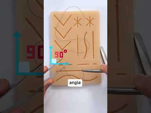
How to suture like a plastic surgeon!
 0:00:37
Are you an Introvert?
 0:00:16
Learn to Suture
 0:01:24
Designing Fonts: An Introduction to Professional Type Design (Flick Through / ASMR)
 0:00:19
This keyboard trick allows you to Type in DIFFERENT LANGUAGES! ⌨️
 1:46:14
Designing Type - Book Review & Flip-Through
 0:00:29
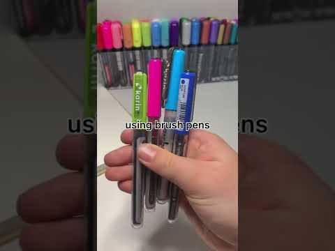
how to do calligraphy with brush pens 🤍✨ SUPER EASY BEGINNER LETTERING TUTORIAL 😊 #shorts
Комментарии