filmov
tv
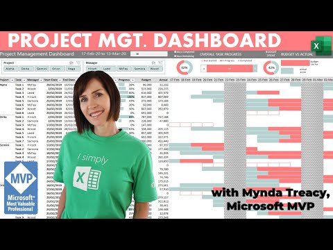
Excel Project Management Dashboard with Dynamic Periods

Показать описание
Revolutionize Your Project Management with this Excel Dashboard - See Progress in a Whole New Way! How to build dynamic Excel Project Management Dashboards with buttons to switch between viewing the progress by day, week and month.
🎓 LEARN MORE
🔔 SUBSCRIBE if you’d like more tips and tutorials like this.
💬 Please leave me a COMMENT. I read them all!
🎁 SHARE this video and spread the Excel love.
Or if you’re short of time, please click the 👍
⏲ TIMESTAMPS
0:00 Excel Project Management Dashboard
0:46 The Approach
1:01 Insert Radio Buttons
3:01 Timeline Formulas
6:08 Link Formulas to Form Control
9:20 Conditional Formatting Formulas
10:15 Weekend Conditional Formats
12:28 Grand Total Row Format
13:13 Task Not Started Format
17:46 In Progress Format
19:02 Completed Work Format
20:01 Set Stop If True Conditional Format Rules
 0:40:04
Interactive Excel Project Management Dashboard - FREE Download
 0:00:15
Project Management dashboard in excel for sale
 0:14:58
How to Use Excel to Create a Project Management Dashboard
 0:11:28
Make an awesome Project Management Dashboard with Excel (Free download ~ Part 1)
 0:21:45
Excel Project Management Dashboard with Dynamic Periods
 0:15:59
How to Make the BEST Gantt Chart in Excel (looks like Microsoft Project!)
 0:00:27
Excel Project Management Template
 0:15:08
Task Management Dashboard in Excel
 1:23:37
Project Management Essentials: Skills, Tools, and Real-World Insights
 0:00:16
Excel Task Management Template
 3:18:01
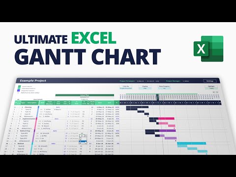
How to create Ultimate Excel Gantt Chart for Project Management (with Smart Dependency Engine)
 0:19:21
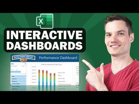
📊 How to Build Excel Interactive Dashboards
 0:17:13
Make This Awesome Gantt Chart in Excel (for Project Management)
 0:43:40
EASY Step by Step Excel Task or Activity List | Project Management Dashboard
 0:35:28
Easy Build Budget vs Actual Dashboard + FREE File Download
 0:00:50
Adding a menu in #excel to make navigating your #dashboards a bit easier
 0:15:37
Make a Fully Interactive & AWESOME Project Management Dashboard with Excel // The Final Part
 0:49:20
STEP by STEP Task, Project or Activity Simple EXCEL Dashboard | Agile | Management
 0:18:30
Project Status and Details Dashboard | Microsoft Excel
 0:23:15
Build a Project or Task Status Dashboard with Excel
 0:00:23
Excel KPI Dashboard Template
 0:08:17
10 Best Practices for Project Management Spreadsheets!
 0:18:56
How to create a Simple Dashboard Report in Microsoft Excel
 0:00:53
5 Project Management Tools every PM should know Part 1️⃣ #shorts
Комментарии