filmov
tv
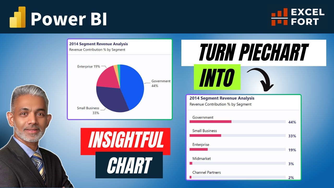
Enhanced Bar Chart: A Better Alternative to PIE Chart in Power BI
Показать описание
👋 Welcome to ExcelFort! In this tutorial, we're going to simplify your data visualization in Power BI by showing you an elegant alternative to pie charts – the Enhanced Bar Chart. If you're tired of pie charts complicating your data story, this video is a must-watch!
In the interest of full transparency, I'd like to acknowledge the inspiration behind the trick of displaying of the category name above the series bar in this chart which I implemented with a different approach. This idea was primarily inspired by the innovative content from @HowtoPowerBI, who continually inspires creators within our community. Regrettably, I forgot to mention it in the video. I believe in giving credit where it's due, and @HowtoPowerBI deserves recognition for their ideas
----------------------------------------------------------------------------------
⏲ Video Timestamps
00:00 The Limitations of Pie Charts
00:25 Enhanced Bar Charts to replace PIE chart
01:29 Dynamic Format String Application
03:10 Error Bars Application in Power BI
03:46 Apply Dynamic Label Measure
04:24 Finishing Touches
04:58 Conclusion
----------------------------------------------------------------------------------
📜 Video Script Summary
We start by introducing the limitations of pie charts and why they can make data comparison challenging. Then, we delve into the Enhanced Bar Chart, an excellent alternative. Our step-by-step tutorial includes creating a native bar chart, using dynamic format strings, adjusting labels, error bars, and customizing the visualization for a clean and informative look.
By the end of this tutorial, you'll have a sleek and effective bar chart that beautifully represents the percentage of revenue contribution by segments. If you're interested in enhancing your data visualization skills and learning more inventive ways to present your data, make sure to subscribe to our channel for more Power BI tips and tricks.
------------------------------------------------------------------------------------------------
🟢 LET'S CONNECT!
✔ Mobile No: 00966509791858
#powerbi #powerquery #msexcel #excelfort #powerbidesktop #powerbitraining #DAX
 0:05:24
Enhanced Bar Chart: A Better Alternative to PIE Chart in Power BI
 0:20:47
From Ordinary to Impressive: How to Enhance Your Bar Chart with ggplot
 0:01:00
ADDITIONAL Indicators for a BAR Chart in Power BI
 0:11:41
Excel Mastery: Stunning Comparison Bar Chart!
 0:08:15
ENHANCE PowerPoint Chart Design With Modern Graphics
 0:00:59
A Simple TRICK to show additional data labels for the BAR CHART in Power BI
 0:10:46
Enhanced Stacked Column Chart in Excel
 0:03:31
Create Stack Column Chart in Excel Like Power BI
 0:16:50
Redesigning beautiful charts to look like McKinsey slides
 0:00:26
How To Create Better PowerPoint Charts in 10 Seconds
 0:15:12
Quick 3D Container Chart in Excel
 0:00:49
What is Bar Chart in Trading | How to Use Bar Chart #intradaytrading #stockmarket #charttypes
 0:05:32
Google's Enhance AI - Super Resolution Is Here! 🔍
 0:05:20
QlikView Tutorial | Enhancing the QlikView bar chart with Dynamic Reference Lines | Data & Tools
 0:01:04
How to create a graph that combines a bar chart with two or more lines in Tableau
 0:01:31
How to Make a Graph Change Color Based on Value | Conditionally Formatting Charts
 0:10:14
Publication ready graphs in Microsoft Excel
 0:02:47
What is a Bar Chart?
 0:05:13
How To Choose The Right Graph (Types of Graphs and When To Use Them)
 0:19:24
'Beyond the barchart'. Some top picks from 'Get More Visuals' to enhance your re...
 0:00:49
Make Bar Chart Great again!!! part 1
 0:05:19
Stacked Bar Chart – How to create a Stacked Bar Chart in Excel | Excel Charts add-in
 0:16:25
Build Impressive Charts: It's NOT your usual Bar Chart (Infographics in Excel)
 0:09:26
Create an Enhanced Chart Data Label
Комментарии