filmov
tv
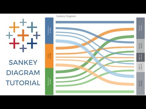
Sankey Chart in Tableau

Показать описание
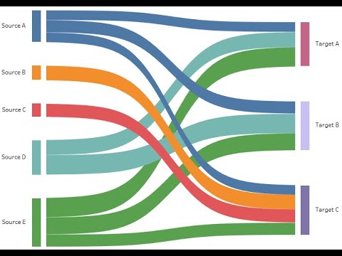
Sankey Chart: A type of flow diagram that visualizes the flow of data or values between multiple entities.
Source and Target: In a Sankey chart, these represent the start and end points of the flow. In Tableau, these are typically dimensions like categories or labels.
Weight: The measure that determines the thickness of the flow between the source and target. It represents the quantity being visualized.
Node Values: Calculated values representing the magnitude of each node in the Sankey chart. Usually derived from aggregated measures.
Calculated Field: Use calculated fields in Tableau to create new fields or modify existing ones. Useful for deriving node values or other customized metrics.
Sorting: Arrange the nodes and links in a meaningful order. Sorting can be done based on the magnitude of the flows or any other relevant metric.
Formatting: Adjust the appearance of the Sankey chart to enhance readability. Customize colors, labels, and tooltips for better visualization.
Tooltips: Configure tooltips to display additional information when hovering over nodes or links. Provide context or details about the data.
Filters: Implement filters to allow users to interactively explore the data. Filters can be used to focus on specific categories or time periods.
Interactivity: Utilize Tableau's interactive features. Users should be able to click on nodes or links to see more detailed information or drill down into specific data points.
Parameters: Use parameters to create dynamic controls, allowing users to change certain aspects of the Sankey chart interactively.
Annotations: Add annotations to highlight important points or provide additional explanations within the Sankey chart.
Testing: Test the Sankey chart with various scenarios and datasets to ensure accuracy and optimal performance.
Performance Optimization: Optimize the performance of the Sankey chart, especially when dealing with large datasets. Consider data extracts and aggregations.
Storytelling: Use Tableau's storytelling features to create a narrative around the Sankey chart. Combine it with other visualizations to tell a compelling data story.
Data Connection: Ensure that your data source is properly connected, and relationships are established to support the Sankey chart's construction.
Data Quality: Ensure the data used for the Sankey chart is clean, accurate, and properly formatted.
Level of Detail (LOD) Expressions: Utilize LOD expressions in Tableau to perform calculations at different levels of granularity for more detailed analysis.
#Tableaudesktop
#Dataviz
#DataScience
#dataanalytics
#Tableau
#DataVisualization
#SankeyChart
#TableauCharts
#DataAnalytics
#TableauPublic
#TableauDesktop
#TableauViz
#TableauCommunity
#Vizualization
#TableauTips
#DashboardDesign
#TableauPrep
#TableauServer
#TableauOnline
#VisualAnalytics
#DataViz
#TableauWorkbooks
#TableauBestPractices
#TableauBarChart
#TableauLineChart
#TableauAreaChart
#TableauScatterPlot
#TableauBubbleChart
#TableauBoxPlot
#TableauTreemap
#TableauPieChart
#TableauDonutChart
#TableauBulletGraph
#TableauHeatMap
#TableauWaterfallChart
#TableauFunnelChart
#TableauGanttChart
#TableauKPIChart
#TableauPackedBubbles
#TableauHistogram
#TableauStackedBarChart
#TableauTreeMap
#TableauRadarChart
#TableauSpiderChart
#TableauParetoChart
#TableauStepChart
#TableauVennDiagram
#TableauComboChart
#TableauDualAxisChart
#TableauReferenceLineChart
#TableauScatterPlotMatrix
#TableauDualCombinationChart
#TableauBulletGraph
#TableauPopulationPyramid
#TableauSlopeChart
#TableauChoroplethMap
#TableauFilledMap
#TableauSymbolMap
#TableauSpiderMap
#TableauPathChart
#TableauSunburstChart
#TableauFilledPolygonMap
#Tableau3DMap
#TableauConnectedScatterPlot
#TableauRibbonChart
#TableauBubbleMap
#TableauLineAndStackedBarChart
#TableauHorizontalBarChart
#TableauVerticalBarChart
#TableauHorizontalStackedBarChart
#TableauVerticalStackedBarChart
#TableauBulletGraph
#TableauSparklineChart
#TableauWordCloud
#TableauNetworkGraph
#TableauDonutChart
#TableauPackedCircleChart
#TableauWaffleChart
#TableauRoundedBarChart
#TableauRadarChart
#TableauBubbleCloudChart
#TableauWordTreeChart
#TableauCandlestickChart
#TableauOHLCChart
#TableauRadialBarChart
#TableauStreamGraph
#TableauCalendarHeatmap
#TableauRibbonChart
#TableauLollipopChart
#TableauMarimekkoChart
#TableauMekkoChart
#TableauControlCharts
#TableauErrorBars
 0:00:51
Tableau Mini Tutorial: Creating Sankey Chart in One Minute
 0:19:42
SANKEY DIAGRAM TABLEAU
 0:03:56
Sankey Chart in Tableau
 0:09:51
Tableau Tutorial : Sankey Chart | Sankey Chart in 10 minutes |
 0:09:11
Create Sankey Chart in Tableau 2020 (done in 10mins with superstore data)
 0:17:06
How to Create a Sankey Diagram in Tableau? | Step By Step
 0:11:11
Tableau Sankey Diagram | Sankey Chart
 0:12:01
Tableau How-To: Sankey Chart
 0:00:54
Easy Sankey Chart in Tableau
 0:05:47
How to in Tableau in 5 mins: Build a Sankey Chart
 0:03:55
Build Sankey Charts in Tableau 24.2 in 30 seconds | Tableau Viz Extensions
 0:16:54
How to build Circular Sankey Chart in Tableau | Tableau training for beginners
 0:04:21
3-Stage Sankey Chart via Template Cascading - Mini Tableau Tutorial
 0:41:52
Sankey Chart In Tableau
 0:06:33
Want Data Insights? Master Sankey Charts in Tableau.
 0:08:56
The simplest way to make a Sankey in Tableau (no calculations)
 0:00:58
Tableau Extensions - Sankey Diagram
 0:16:44
Custom chart types for Tableau with Viz Extensions | Tableau 2024.2
 0:00:44
New How to build a Tableau Sankey Chart in 10 seconds
 0:23:59
Learn how to create a Sankey Chart in Tableau
 0:02:29
Sankey Chart in Tableau
 0:12:06
Sankey Chart in Tableau | Tableau Mini Tutorial: Creating Sankey Chart in One Minute
 0:06:01
Sankey Chart in Tableau
 0:00:19
Income statement and a balance sheet Sankey diagram templates
Комментарии