filmov
tv
SANKEY DIAGRAM TABLEAU
Показать описание
Learn how to make Sankey Diagram in Tableau through this amazing tutorial!
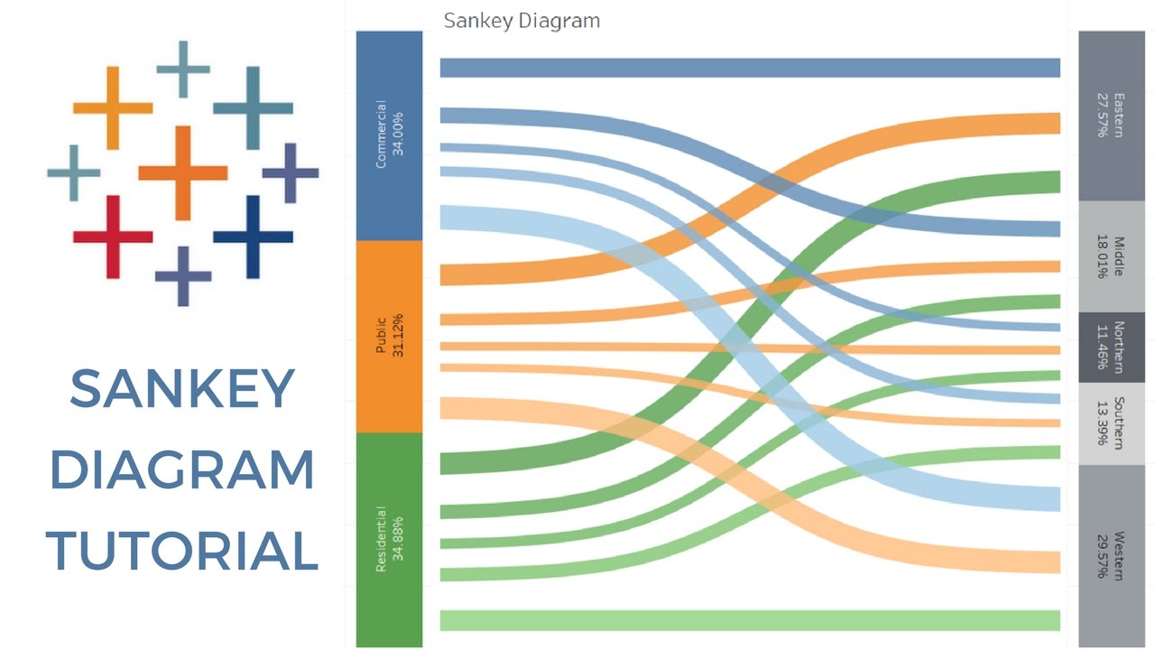
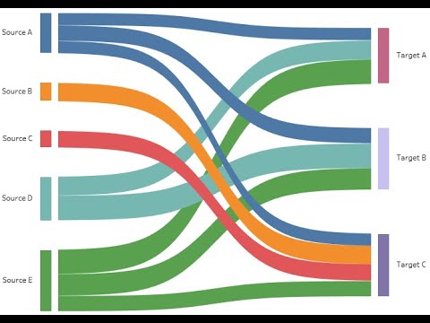
Sankey Diagrams display flows and their quantities in proportion to one another. The width of the arrows or lines are used to show their magnitudes, so the bigger the arrow, the larger the quantity of flow. Flow arrows or lines can combine together or split through their paths on each stage of a process. Colour can be used to divide the diagram into different categories or to show the transition from one state of the process to another.
INTRODUCTION
CONNECING TO THE DATA
2:02 - We'll connect the data, connect to our Excel file and we'll connect to our African mobile data Excel file.
2:15 - We'll bring in our sales data and you'll see that we have the full 1056 rows that we’re looking for.
2:41 - You have your SELECT statement, then you tell them what columns to bring in.
WORKING WITH DATA
2:57 - So what we're going to do, is we're going to take this; we're going to Union all, with the exact same data set.
3:24 - So we'll put it in segment right here, we'll call this "VizSide"
3:32 - Then over here, we're going to call this region, as "VizSide".
4:07 - So what we actually need to do, is somehow create these marks so Tableau will be able to draw the lines across them.
4:38 - I'm going to walk you through the first steps of that data densification
5:22 - So now we have ToPad, the thing is if you bring ToPad out to columns.
5:37 - But if you come down, you click on it you say create bins
6:17 - So we've basically done is used Tableaus in-memory engine, to create these extra marks
CREATING CALCULATIONS
6:31 - Next, we're going to create a calculated field called T.
6:44 - What this does is a little bit of an offset, that evenly spaces all our marks across the view.
7:10 - We have a value of 1 we have our value of 49 but we also have a mark for every single individual bin. This is the essence of data densification and data padding.
7:26 - So, now we have our vertical marks, we have vertical data sets, our horizontal marks.
8:01 - Now we're going to come in and we’re going to duplicate that, and we will edit, call this Rank 2 - I'm actually going to leave it entirely the same.
8:17 - The next calculated field we need to make is our sigmoid function. The sigmoid function right here off Wikipedia mathematical function with an s-shaped curve.
8:32 - So we're going to create a sigmoid. It is going to be 1 over 1 plus; now we need to use e; Tableau doesn't have e as a function but it does have an exponent function.
8:48 - So if we do exponent 1 that's the same thing as typing e. Then we're going to raise it to the power of negative T.
BUILDING A VIEW
10:17 - Ok those a lot of different calculations and now we get to the exciting part, where we're actually going to build out our view for a little bit.
10:55 - At this point we'll need to add in the two sides of our table or the two sides of our visualization that we’re building.
11:13 - So we want it to include Segment, we want to include Region and then we want to include Padded because it tells you go from Segment to go to Region a long Padded.
11:30 - Coming up to Rank 2 we're going to use all three again, but in this case, we want it to go from Padded, sorry from Region to Segment to Padded.
11:42 – And then for T we're going to make sure that it's using Padded so that our sigmoid function is able to comprehend every single mark.
12:19 - In the same spirit we will come to our curve and make it go from 0 to 1.
12:46 - Then we can come in we can hide our headers and we have very good makings of our Sankey Chart.
13:44 - So, what we need to do rather than using sum sales itself, we're going to create another calculation. We call this a Sales Sizing and we'll use a table calculation in order to trick Tableau
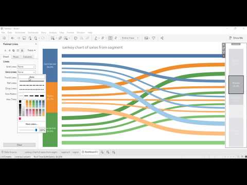
15:27 - We want to come into our color scheme as well and rather than being blue orange red will make it blue orange green just so it matches our Sankey Chart.
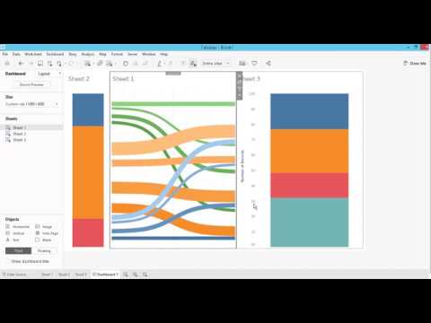
CREATING A DASHBOARD
16:13 - Now we're going to create a dashboard that has all three of them.
16:25 - So first we're going to bring in our Sankey Chart. Then we'll add in Segment to the side and we'll add in Region to the other side.
16:40 - Then we'll do some more cosmetic stuff where we'll hide the actually don't need these titles either. As we come through we can format we can get rid of our gridlines we can get rid of our 0 lines clean that up a little
17:22 - A couple more cosmetic things we're going to do real fast. Our tool tips are really distracting at this point. So I'm going to go, I'm going to disable them on all of our charts.
18:18 - The last thing we want to add is actually some dashboard actions.
Sankey Diagrams display flows and their quantities in proportion to one another. The width of the arrows or lines are used to show their magnitudes, so the bigger the arrow, the larger the quantity of flow. Flow arrows or lines can combine together or split through their paths on each stage of a process. Colour can be used to divide the diagram into different categories or to show the transition from one state of the process to another.
INTRODUCTION
CONNECING TO THE DATA
2:02 - We'll connect the data, connect to our Excel file and we'll connect to our African mobile data Excel file.
2:15 - We'll bring in our sales data and you'll see that we have the full 1056 rows that we’re looking for.
2:41 - You have your SELECT statement, then you tell them what columns to bring in.
WORKING WITH DATA
2:57 - So what we're going to do, is we're going to take this; we're going to Union all, with the exact same data set.
3:24 - So we'll put it in segment right here, we'll call this "VizSide"
3:32 - Then over here, we're going to call this region, as "VizSide".
4:07 - So what we actually need to do, is somehow create these marks so Tableau will be able to draw the lines across them.
4:38 - I'm going to walk you through the first steps of that data densification
5:22 - So now we have ToPad, the thing is if you bring ToPad out to columns.
5:37 - But if you come down, you click on it you say create bins
6:17 - So we've basically done is used Tableaus in-memory engine, to create these extra marks
CREATING CALCULATIONS
6:31 - Next, we're going to create a calculated field called T.
6:44 - What this does is a little bit of an offset, that evenly spaces all our marks across the view.
7:10 - We have a value of 1 we have our value of 49 but we also have a mark for every single individual bin. This is the essence of data densification and data padding.
7:26 - So, now we have our vertical marks, we have vertical data sets, our horizontal marks.
8:01 - Now we're going to come in and we’re going to duplicate that, and we will edit, call this Rank 2 - I'm actually going to leave it entirely the same.
8:17 - The next calculated field we need to make is our sigmoid function. The sigmoid function right here off Wikipedia mathematical function with an s-shaped curve.
8:32 - So we're going to create a sigmoid. It is going to be 1 over 1 plus; now we need to use e; Tableau doesn't have e as a function but it does have an exponent function.
8:48 - So if we do exponent 1 that's the same thing as typing e. Then we're going to raise it to the power of negative T.
BUILDING A VIEW
10:17 - Ok those a lot of different calculations and now we get to the exciting part, where we're actually going to build out our view for a little bit.
10:55 - At this point we'll need to add in the two sides of our table or the two sides of our visualization that we’re building.
11:13 - So we want it to include Segment, we want to include Region and then we want to include Padded because it tells you go from Segment to go to Region a long Padded.
11:30 - Coming up to Rank 2 we're going to use all three again, but in this case, we want it to go from Padded, sorry from Region to Segment to Padded.
11:42 – And then for T we're going to make sure that it's using Padded so that our sigmoid function is able to comprehend every single mark.
12:19 - In the same spirit we will come to our curve and make it go from 0 to 1.
12:46 - Then we can come in we can hide our headers and we have very good makings of our Sankey Chart.
13:44 - So, what we need to do rather than using sum sales itself, we're going to create another calculation. We call this a Sales Sizing and we'll use a table calculation in order to trick Tableau
15:27 - We want to come into our color scheme as well and rather than being blue orange red will make it blue orange green just so it matches our Sankey Chart.
CREATING A DASHBOARD
16:13 - Now we're going to create a dashboard that has all three of them.
16:25 - So first we're going to bring in our Sankey Chart. Then we'll add in Segment to the side and we'll add in Region to the other side.
16:40 - Then we'll do some more cosmetic stuff where we'll hide the actually don't need these titles either. As we come through we can format we can get rid of our gridlines we can get rid of our 0 lines clean that up a little
17:22 - A couple more cosmetic things we're going to do real fast. Our tool tips are really distracting at this point. So I'm going to go, I'm going to disable them on all of our charts.
18:18 - The last thing we want to add is actually some dashboard actions.
 0:03:55
Build Sankey Charts in Tableau 24.2 in 30 seconds | Tableau Viz Extensions
 0:00:51
Tableau Mini Tutorial: Creating Sankey Chart in One Minute
 0:19:42
SANKEY DIAGRAM TABLEAU
 0:17:06
How to Create a Sankey Diagram in Tableau? | Step By Step
 0:08:56
The simplest way to make a Sankey in Tableau (no calculations)
 0:11:11
Tableau Sankey Diagram | Sankey Chart
 0:09:11
Create Sankey Chart in Tableau 2020 (done in 10mins with superstore data)
 0:00:54
Easy Sankey Chart in Tableau
 0:05:47
How to in Tableau in 5 mins: Build a Sankey Chart
 0:06:10
I tried Tableau's Sankey Chart Extension so you don't have to
 0:03:56
Sankey Chart in Tableau
 0:09:51
Tableau Tutorial : Sankey Chart | Sankey Chart in 10 minutes |
 0:00:44
New How to build a Tableau Sankey Chart in 10 seconds
 0:16:54
How to build Circular Sankey Chart in Tableau | Tableau training for beginners
 0:06:33
Master Sankey Charts in Tableau.
 0:12:01
Tableau How-To: Sankey Chart
 0:23:31
Tableau Tutorial 69: Sankey Diagram Well Explained
 0:02:34
Sankey Chart for Web Data Analytics and Visualization. Tableau (My first Sankey diagram!)
 0:00:58
Create SANKEY CHART under 1 minute || #tableau pre-beta release
 0:05:18
Tableau's Game Changing Sankey Chart Feature
 0:23:23
Sankey Diagram -- Tableau
 0:21:37
Sankey with Tableau: A Lesson in Discretion
 0:22:55
Tableau Tutorial 59: Sankey Diagram (a relatively easy way without data preparation)
 0:26:39
Tableau Dashboard for Nonprofits - Sankey Diagram
Комментарии