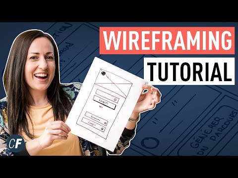
Low fidelity wireframes in UX explained

preview_player
Показать описание
Low Fidelity wireframes are one of those things that come to mind when you think UX design. They're still all over the internet when you search for UX, but are they even useful anymore? And what are they about exactly?

If you want me to continue with this shortest UX course in the world please leave a like + comment and share this video - the more people see it the more I'll be motivated to do the next episode - this time on Wireframes.

========================================

The idea for this series comes from my bestselling NO BS Guide to UX book.

✅ You can get it right here:

✅ Learn Design for free with daily challenges:

🔥 Or check my bestselling design courses:

We have over 40,000 paid students!

========================================

#lowfidelity #ux #wireframe
Рекомендации по теме
Комментарии
Автор

I work in the high tech industry (for different clients) and we start off with low-fidelity. Complex machine or service UIs have workflows that takes months or sometimes years to define, during which you often start from scratch again several times. Even if the client has a mature design system, high (or mid) fidelity is not the right approach here. I can imagine it works if you only do straight forward stuff like e-commerce or something.

stiggy-the-stig
Автор

Interesting. In our agency, we try to use low-fi wireframes a lot. I taught my designers never to skip this part. We have a lot of instructions on how to keep wireframes lo-fi to focus on logic at this stage. We see the benefits of this approach.

design_lovers
Автор

Man....as a UX content designer, this INFURIATES me, because it happens 99% of the time. So much is missed by diving straight into high fidelity, but as they say, you can't unbake a cake. I always want to start with customer journals and flows, but requestor don't want to take the time, because that requires effort from them, instead of throwing it over the wall.

There's often massive heuristics issues that are missed by going straight to hi-fi, but stakeholders and eng teams don't care cuz they still view UX as a speedbump, so they just find whatever designer will immediately make visuals and go with them.

Low fi generate conversation and real discussions about the correct direction to take, hi fi first is less effort, but leads to a compromised user experience for end users.

abigwreck
Автор

Low-fi for bigger projects, hi-fi start for smaller ones. Lately I've only had one week per project, so I've been going right in to hifi because I simply don't have the time, but I can feel the frustration when the stakeholders focus on colours etc rather than the placement/flow.

victim
Автор

When I design Dashboards, I use the low fidelity technique for myself (after I made a series of questions about what needs the Dashboard should cover), then I do a high fidelity mockup (since I create the Dashboard, I know what's possible) and that's what I show to the users; it has worked well for me until now

Mithferion
Автор

Brilliant episode! Personally, Low Fidelity Wireframes help me when building information architecture and wondering how a given solution should work and whether, for example, filters should be placed from above or better from the side. This helps me quickly visualize the solution and allow me, as a designer, to consider the pros and cons of this solution. Thanks, Michał very good episode and have a beautiful day! ✏✏

SzabatDesign
Автор

I love your animations so much! Awesome content, as always

debbittencourt
Автор

Fully agree. I can honestly say I've only used LoFi a handful of times in the past 10 years. I will often just start my design process there, but with a good understanding of the client and the user you should be able to get the prototype to 80-90% of final design on first internal review, then spend a few days in minutia with the understanding that UX is iterative and we will be optimizing it based on data post-launch.

PokeFangOfficial
Автор

Low fidelity (aka wireframing) is just as much to stop YOURSELF from becoming attached to your design outputs too soon as it is your client. Once you've tweaked something to look production ready, youre way less likely to rip up your ideas and start again from scratch when you need to.

Also, if something looks like it took a lot of effort to put together, your client and team may feel apprehensive about highlighting its flaws (if indeed they can see past the gloss and polish)

Sketching and wireframing are essential steps in the design process. Whenever I encounter poor UX during a peer review or critique session....they skipped straight to hi-res "because Design System".

P.s. wireframes still use actual UX copy and semantic colours (i.e. red=error, green=success)

ProvocativeSloth
Автор

You are right. I work at an industrial mnc and it is more around mid….because of design systems, quick iterations, tight deadlines

rajmusic
Автор

This makes a lot of sense - but I still like how you taught the text frames for planning out copy for landing pages. That is really helpful to visualize a longer screen.

suzanneshea
Автор

I wasn't planning on watching but the video is too short to skip! 💛

hseindesigns
Автор

Yes this is very insightful. I sketch and do the basics since am still coming up.

gloriacassidy
Автор

I'm a beginner at UI/UX design and wanted to ask where I can get people for interview for my case study. My case study is about designing an import/export and cargo website for my father's business. Its basically a trade and tourism company, so there is a mixture of e-commerce (people buy turkish products online or we buy for them and then sent the items to client's respective countries), logistics and courier service. Can you give me any tips as to where I should start or how I should approach it or if you know anyone that might have done a similar case study?.
I'm currently looking at other websites such as dhl, ups, fedex and other logistics company (trying to identify problems) but I'm still a bit vague as to where I should really focus on my case study. Also, finding people for interview is another issue.

Lorenzo
Автор

I agree that 100% client not sure what they want to build exactly😅

effakrisma
Автор

Skipping LoFi prototypes is often a really bad idea. However, if you are in a hurry to get to the wrong result fast, it works.

martinmichaelfrederiksen
Автор

True true true we did same today nobady has time for bullshit everyone wants pretty design and helping devlopers to make it fast

adarshss
Автор

Can you make a video explaining about copyright and content rights, please? I'm always afraid of using premade UI KIT yk, but it seems to be so handy

kevyn.patrick
Автор

I've just started learning UX design and I am learning low fidelity wireframing right now lol. Is it true that low fidelity is "phasing out"? Is it a good core skill to learn?

Silhouette_one
Автор

I don't agree. Whenever I show mid fidelity stuff to stakeholders or developers they pay attention to little things and give the feedback about the visual aspect of UI. So to cut off those meaningless discussions I go back to block frames on the first stages of the discussion.

paczes
visit shbcf.ru