filmov
tv
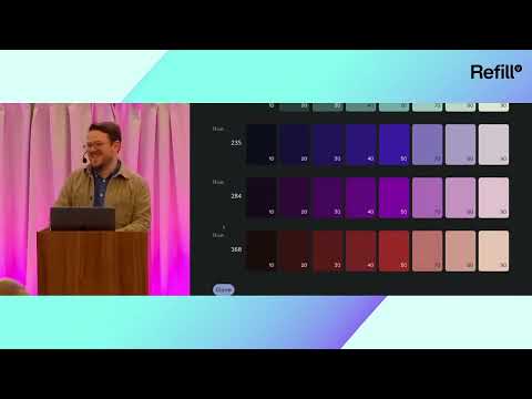
The NEW 2025 Color System That Makes Any Design 'Work'

Показать описание
This is a new color system for 2025, that you can apply to ANY graphic design!
In today’s fast-moving creative industry, color isn't just about aesthetics anymore—it's about functionality, clarity, and cross-platform performance. Most designers still use outdated color strategies rooted in beginner-level theory, but in 2025 and beyond, it's time to think deeper.
This video explores a powerful way to approach color in your design work—one that integrates visual hierarchy, UI/UX logic, and systematic thinking. It’s a must-watch for designers serious about developing a visual language that works across digital, print, packaging, branding, and beyond. Whether you're working in web design, interface design, or brand identity, understanding how to apply color as a functional tool will elevate the way you think—and the results you produce.
If you're ready to move beyond palettes and presets into a more thoughtful, results-driven approach to color, this is the shift you’ve been looking for.
▶▶▶▶▶▶▶▶▶▶▶▶▶▶▶▶▶▶▶▶▶▶
📌📌📌📌📌📌📌📌📌📌📌📌📌📌📌📌📌📌📌📌
📌📌📌📌📌📌📌📌📌📌📌📌📌📌📌📌📌📌📌📌
********************************************************************
********************************************************************
©️ Copyright
The work is protected by copyright, produced by Satori Graphics®
This is applied to the video recording of itself as well as all artistic aspects including special protection on the final outcome. Legal steps will have to be taken if copyright is breeched. Music is used from the YouTube audio library and or sourced with permission from the author
0:00 Are You Using Basic Color?
0:17 A Smarter Color System
1:25 Defining Color Roles
2:16 Intro Into The Color Map Matrix
4:10 Improving Your Workflow
5:29 Dropping Into The Color Map Matrix
6:23 Applying To The Design
7:00 Adding Flow and Rhythm
7:35 Test Tes Test
Subscribe to stay updated to all of my uploads and until next time, design your future today, peace ✌️
Satori Graphics®
Комментарии
 0:09:11
 0:18:15
 0:17:44
 0:01:31
 0:43:53
 0:01:47
 0:18:23
 0:00:47
 0:00:23
 0:06:18
 0:00:25
 0:00:21
 0:00:26
 0:00:16
 0:10:05
 0:00:11
 0:00:20
 0:00:21
 0:00:19
 0:00:11
 0:10:01
 0:00:24
 0:00:15
 0:00:15