filmov
tv
NEVER TOO SMALL: Storage Packed Micro Apartment, Hong Kong 24sqm/258sqft

Показать описание
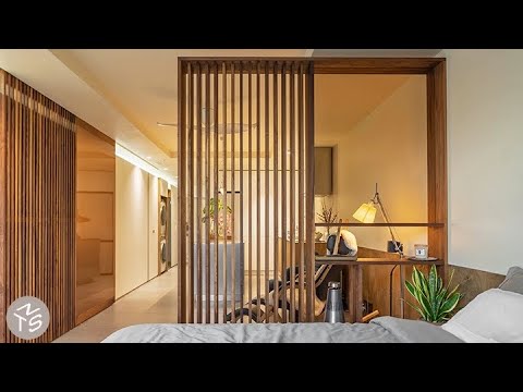
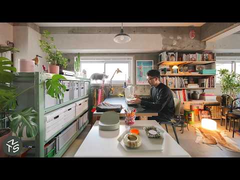
With their reimagining of this newly built apartment in bustling Kowloon, owners and interior designers Alice and Brian chose to minimise waste by retaining the existing floor plan and keeping all walls and appliances intact. Instead, they introduced clever spatial interventions, the primary being an “attic” into which they added deep overhead cabinets that can be competitively accessed from the living room. A series of practical and functional walnut-clad joinery and furniture throughout, including a custom-designed shoe cabinet with an integrated slide-out bar table and a hydraulic lift platform bed, blend seamlessly into the space creating a cohesive and efficient home within the limited footprint.
#smallapartment #architecture #interiordesign
Ep 179
Project Name: WALNUT
Produced by New Mac Video Agency
Creator: Colin Chee
Director: Nam Tran
Cinematographer: Alan Leung
Producer: Lindsay Barnard
Editor: Jessica Ruasol
NEVER TOO SMALL: Storage Packed Micro Apartment, Hong Kong 24sqm/258sqft
NEVER TOO SMALL: DIY Plant-filled Waterfront Loft, Amsterdam - 45sqm/484sqft
NEVER TOO SMALL: Paris Architect's Small Family Loft Extension - 45sqm/484sqft
NEVER TOO SMALL: Light Filled Scandi Style Apartment, Paris 37sqm/398sqft
NEVER TOO SMALL 36sqm/387sqft Small Apartment - Man Cave, Garage Loft
NEVER TOO SMALL: Bright, Minimalist Mezzanine Apartment, Taiwan 70sqm/753sqft
NEVER TOO SMALL: Parking Space Sized Family Home, Tokyo - 56sqm/602sqft
NEVER TOO SMALL 24sqm/258sqft Micro Apartment - Boneca
NEVER TOO SMALL: Simple and Stylish Singapore Apartment, 55sqm/592sqft
NEVER TOO SMALL Scandi Style Paris Small Apartment - 50sqm/538sqft
NEVER TOO SMALL: Family of 5’s Multifunctional Micro Apartment, Manila 28 sqm/301sqft
NEVER TOO SMALL: Narrow, Light-filled Paris Apartment Renovation, 42sqm/452sqft
NEVER TOO SMALL: Seoul Small City Sanctuary Apartment 45sqm/484sqf
NEVER TOO SMALL Melbourne Flexible Small Apartment - 55sqm/592sqft
NEVER TOO SMALL: Colourful, Open Plan Apartment, Seville 58qm/624sqft
NEVER TOO SMALL: Paris Architect’s 70s Luxe Apartment, 53sqm/570sqft
NEVER TOO SMALL: Easy, Breezy, Adaptable Small Apartment - Poland 32sqm/344sqft
NEVER TOO SMALL London Heritage Loft Apartment Conversion 54sqm/581sqft
NEVER TOO SMALL: Elderly Mother & Son’s Small Apartment, Japan - 46sqm/495sqf
NTS Renters: Cat Lover’s Plant Filled DIY Apartment, Buenos Aires - 28sqm/301sqft
NEVER TOO SMALL: Tokyo Light-Filled Industrial Oasis, 59sqm/635sqft
NEVER TOO SMALL: Architect Couple’s Small Heritage Apartment, France 57sqm/613sqft
NEVER TOO SMALL: Self Taught Interior Designer’s Apartment, Hong Kong - 48sqm/516sqft
NEVER TOO SMALL: Architect’s Tranquil Minimalist Apartment, Sydney 42sqm/452sqft
Комментарии
 0:09:43
 0:07:38
 0:08:05
 0:08:55
 0:05:28
 0:07:35
 0:07:56
 0:04:22
 0:06:32
 0:09:09
 0:07:34
 0:08:45
 0:06:26
 0:08:08
 0:10:06
 0:09:29
 0:07:28
 0:07:42
 0:06:24
 0:06:34
 0:10:57
 0:08:17
 0:09:44
 0:07:35