filmov
tv
Charting Stocks in Python | Python for Trading | Quantra Free Course

Показать описание
Next, we will use the plot function to plot these data points and the show () function to visualise these data points. You can see the output here.
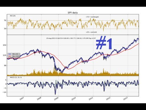
We can see a line graph is plotted by default. There are two axis here: a vertical axis or the Y axis and a horizontal axis or the X axis. The Y-axis represents the ‘close price’ of the infy series and the X-axis represents the ‘dates’. You can see a sharp drop in prices from 1185 to almost 1145, however, it is quite difficult to read the dates here. So, let us tweak this code a bit and make the plot visually appealing and understandable.
Quantra is an online education portal that specializes in Algorithmic and Quantitative trading. Quantra offers various bite-sized, self-paced and interactive courses that are perfect for busy professionals, seeking implementable knowledge in this domain.
 0:06:23
 0:04:08
 0:00:16
 0:00:33
 0:07:13
 0:00:44
 0:11:38
 0:09:28
 0:02:45
 0:23:54
 0:04:03
 0:00:59
 0:00:51
 0:05:48
 0:06:03
 0:14:25
 0:08:07
 0:08:01
 0:06:45
 0:15:29
 0:08:14
 0:00:25
 0:06:10
 0:10:31