filmov
tv
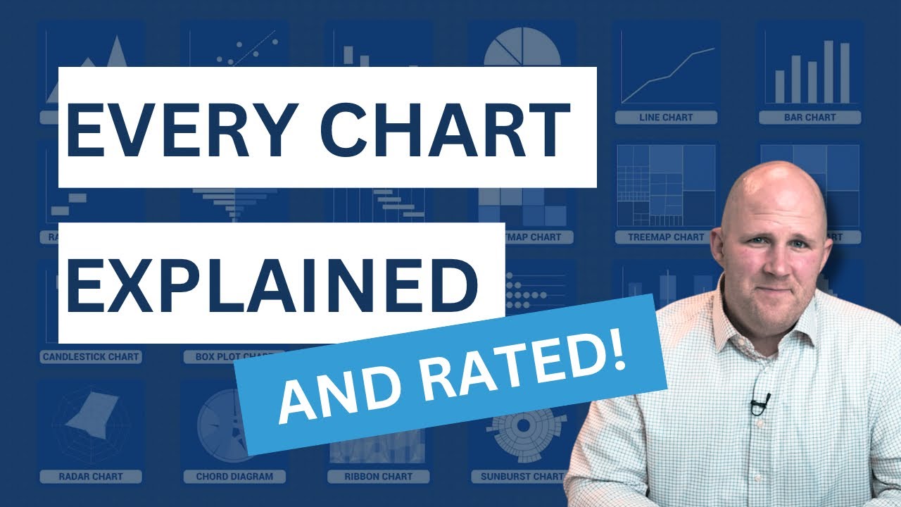
Every Major Chart Type and When to Use It
Показать описание
Learn every major chart type, and when to use each one. From bar charts for rankings to line charts for trends, and even advanced options like Mekko and Waterfall charts, understand how to avoid common mistakes and create visuals that deliver a clear message. Whether it’s for a presentation, report, or dashboard, these practical tips and insights will help you turn data into compelling stories.
0:00 Introduction
0:51 Bar and Column Charts
1:52 Bar Chart Variations
3:02 Line Chart
4:05 Ampler Charts
5:13 Area Chart
6:18 Pie Chart
7:16 Scatter Plot
8:27 Waterfall Chart
9:20 Mekko Chart
10:08 Treemap Chart
11:43 Heatmap
12:40 Range Bar Chart
13:15 Diverging Bar Chart
13:35 Tornado Chart
13:52 Butterfly Chart
14:13 Gantt Chart
14:24 Bullet Chart
14:38 Histograph
14:56 Dot Plot
15:07 Candlestick,
15:21 Pareto Chart
15:46 Waffle Chart
16:03 Sankey Diagram
16:29 Sunburst Chart
16:41 Ribbon Chart
17:08 Chord Diagram
17:27 Radar Chart
18:07 Final Ranking
=============================================
📣 FREE STUFF
🏆 COURSES
🎬 VIDEOS
🚀 MORE STUFF
*Affiliate relationship
=============================================
ABOUT US
All views expressed on this channel are that of Analyst Academy LLC and its employees. Any materials mentioned or shown have been obtained through publicly available sources (e.g. firm or client website).
=============================================
#powerpoint #presentations #consulting #charts
 0:19:21
Every Major Chart Type and When to Use It
 0:01:07
Every Major Chart Type Ranked
 0:00:40
How to Use the Chord Chart! 🎼👆🏼✨ #piano #chords #pianolessons #pianist
 0:00:37
Basic Trading Chart Pattern Everyone Should Know!
 0:00:28
How to make a pie chart in Google Sheets! 🥧 #googlesheets #spreadsheet #excel #exceltips
 0:00:16
Success chart for students#ytshorts #beginnersart #art
 0:00:10
How to spot key levels in Forex Market MT4 chart #forex #shortsfeed #shorts
 0:00:06
draw a nutrition chart|#pramitsingharts #nutrition #healthyfood #art
 0:00:11
Free Chart Pattern Printing on Tradingview
 0:00:09
Landforms chart 🏝 🏜 ⛰️ #drawing #landforms #education #chartmaking #chart #shorts #youtubeshorts...
 0:00:39
6 Steak Temps (Ketchup - Vampire) #shorts
 0:00:07
Music Notes in keys chart diagram for all keys, Major, Minor keys Music keys theory Notes in c major
 0:00:10
Blood group chart antigen antibody.Blood group chart donor and receiver#medicaleducation
 0:00:06
Blood Sugar Levels Chart
 0:03:29
The Hurricane Category Scale Is Broken
 0:00:12
Changes in matter #chart for physical science #BEd
 0:00:05
height and weight chart #shorts #ytshorts
 0:21:36
ALL ABOUT MUSICAL SCALES - A COMPLETE GUIDE!!!
 0:00:06
blouse Measurement Chart#Blouse Size chart#Blouse ka Management#Blouse Management Nap #short
 0:00:15
Cut and Paste Chart album, Contains more than 300 charts for school homework, project work, activity
 0:00:06
physical features of india on chart|school project |holiday hhw| India map with physical features
 0:14:39
Best Chart Patterns in Price Action Trading
 0:00:53
Major and Relative Minor scale and chord Chart | Very Important for beginners | Indian Solfege
 0:06:19
Music Scales Explained in 6 Minutes
Комментарии