filmov
tv
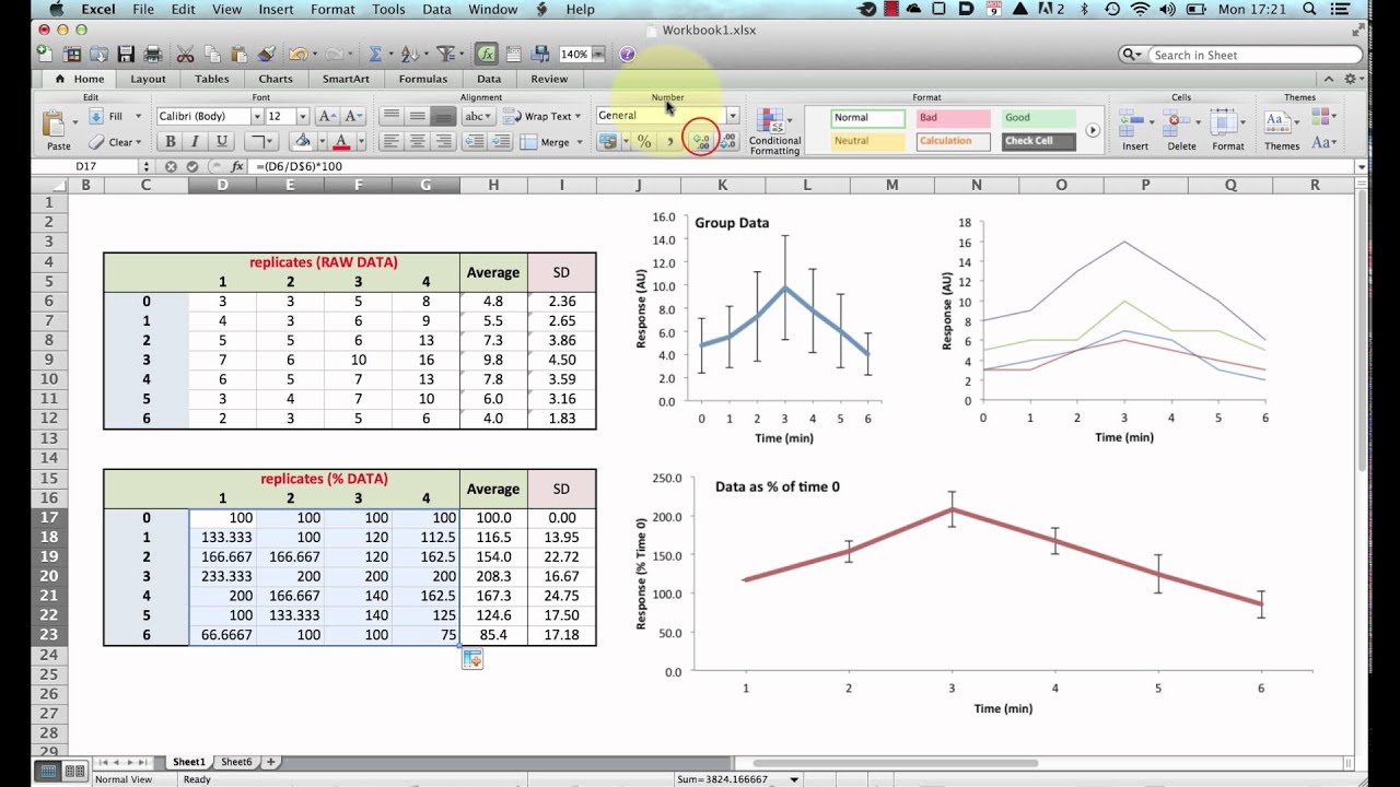
Normalising Data for plotting graphs in Excel
Показать описание
This short tutorial shows how to normalise grouped data in Excel for the production of graphs showing change in outcome over time where the baseline may be variable but the change in outcome consistent.
© 2015 James Clark
© 2015 James Clark
 0:07:43
Normalising Data for plotting graphs in Excel
 0:07:32
How To Normalise Data In GraphPad Prism
 0:05:48
Standardization vs Normalization Clearly Explained!
 0:07:12
Normalising grouped data in Excel
 0:04:52
Quantile Normalization, Clearly Explained!!!
 0:10:02
How To Normalize A Heat Map In GraphPad Prism
 0:28:34
Learn Database Normalization - 1NF, 2NF, 3NF, 4NF, 5NF
 0:05:31
Normalizing Inputs (C2W1L09)
 0:19:48
Normalization Vs. Standardization (Feature Scaling in Machine Learning)
 0:07:16
Excel Histogram with Normal Distribution Curve
 0:03:41
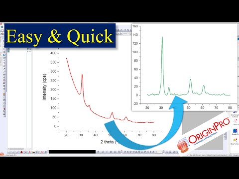
How to correct baseline | remove Background | Origin | Easy
 0:12:52
Standardization Vs Normalization- Feature Scaling
 0:10:43
MTT Assays: Part 3 - Analysis & Presentation
 0:11:59
Data Normalization
 0:29:34
Plotting Multiple Data Sets on a Single XY Graph in Excel (Reaction Enthalpy and Hess's Law)
 0:04:53
Normalization Practice Exercise | Third Normal Form| Denormalization
 0:01:28
Normalizing a Vector - Interactive 3D Graphics
 0:01:24
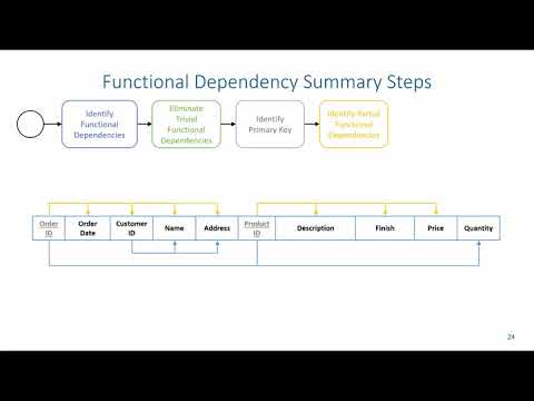
Normalization: Functional Dependency Summary Steps
 0:05:13
The Normal Distribution, Clearly Explained!!!
 0:06:57
Z-Scores, Standardization, and the Standard Normal Distribution (5.3)
 0:06:39
Box-Plot (Simply explained and create online)
 0:08:36
How To Analyse XRD Data / Plot / Graph in Research Paper? Experimental Paper Skills
 0:01:06
How to Add Individual Error Bars in Excel
 0:02:55
Transforming nonlinear data | More on regression | AP Statistics | Khan Academy
Комментарии