filmov
tv
Change Colors of Ranges in ggplot2 Heatmap in R (2 Examples) | Gradient & Categories | geom_tile()

Показать описание
R code of this video:
y = letters[1:5],
values = runif(50, 0, 10))
library("ggplot2") # Load ggplot2 package
ggplot(data, aes(x, y, fill = values)) + # Default ggplot2 heatmap
geom_tile()
ggplot(data, aes(x, y, fill = values)) + # Change gradient color
geom_tile() +
scale_fill_gradient(low = "#353436",
high = "#f6f805",
guide = "colorbar")
data_new <- data # Duplicate data
data_new$groups <- cut(data_new$values, # Add group column
breaks = c(0, 2, 4, 6, 8, 10))
ggplot(data_new, aes(x, y, fill = groups)) + # Specify colors manually
geom_tile() +
scale_fill_manual(breaks = levels(data_new$groups),
values = c("#353436", "#f6f805", "#1b98e0", "white", "green"))
Follow me on Social Media:
 0:05:51
Change Colors of Ranges in ggplot2 Heatmap in R (2 Examples) | Gradient & Categories | geom_tile...
 0:02:37
How to Change a Color in Photoshop Using Color Range (Step-by-Step)
 0:09:57
How to Use Color Range in Photoshop CC
 0:09:01
Apply Specific Color Using 'HSB Values' in Photoshop!
 0:03:19
Select and Change Colors using Color Range in Photoshop
 0:05:36
How to CHANGE COLOR in Photoshop 2022 | Select Color Range & Hue/Saturation (1)
 0:03:53
Change Entire Color Ranges w/ HSL Adjustments In Inkscape
 0:00:56
Using Color Range for Changing Color in Adobe Photoshop
 9:09:35
Aqua Pop Party: Seahorse, Lobster, Turtle, Clownfish, Goldfish, #Shark #Octopus
 0:00:30
Color Range - Short Photoshop Tutorial
 0:00:21
How pros change colors in Photoshop #photoshop #photoshoptutorial
 0:04:56
UiPath RPA - Set Range Color Activity || add background color to Column
 0:07:17
Photoshop: Select and change a color with Color Range
 0:01:54
How To Use Color Range In Photoshop - Naveen kushen
 0:10:41
how to select color range in photoshop | change color range in photoshop | Sinhala
 0:04:35
Change Continuous Color Range in ggplot2 Plot in R (Example) | Adjust Palette | colorRampPalette()
 0:02:21
How to replace a color or a color range in gimp
 0:01:59
Color Range Changes in Photoshop CS6 |
 0:10:18
How to Select and Change Colors in Photoshop
 0:03:42
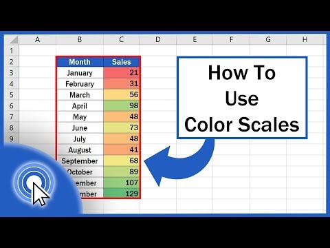
How to Use Color Scales in Excel (Conditional Formatting)
 0:16:29
How You Can Change Color in Photoshop using Select Color Range
 0:02:39
Better Cut Outs with This Color Range Photoshop Trick - 90-Second Tip #11
 0:00:11
Quick IPhone Tip: Increase Color Contrast
 0:00:15
LAMBORGHINI THAT CHANGES COLOUR 🌈🤯 #Shorts
Комментарии