filmov
tv
hollywood has a floating head design problem

Показать описание
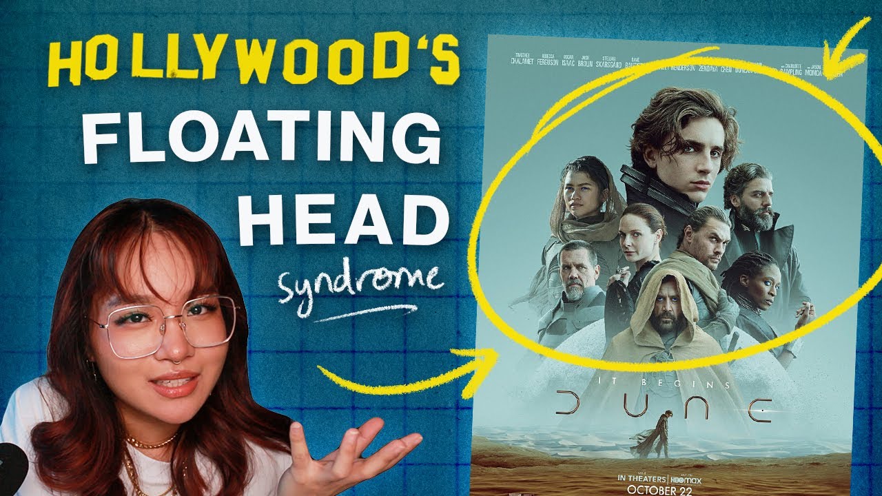
Hollywood movie posters look the same. There's many trends in movie poster design: one being the curse of the floating head syndrome. Here's why it works (sometimes) and why we see it so much.
Marvel films. Horror. Romance. Sci-fi. Period dramas. Sometimes all you need to sell a film is a big actor's head. The beauty of this trend is how versatile it is. Like ketchup you can spread that ish anywhere.
Look at Marvel, any Nicholas Sparks movie remake and even 2022's most anticipated film releases.
We talk about the use of colour, composition and some good and bad(?) examples.
It's all up to your own interpretation.
Of course, more goes into the poster making process than just the designer. Often, marketing for a movie can be make or break. So when the steaks are high and you have input from different people in the marketing department sometimes the floating head becomes the safer bet. Depending on the arrangement, floating heads can be used to communicate a particular message to audiences within a design.
Some resources:
TIMESTAMPS
00:00 - intro
00:21 - why movie poster design is hard
01:00 - a floating head for every genre
02:23 - menacing floating heads
03:00 - bigger heads mean more success
04:30 - women in film posters
04:55 - celebrities sell
05:30 - why the trend won't stop
06:10 - outro / ukraine
06:50 - bloopers
If you would like to help out and donate to those in need in Ukraine, here is a start for some charities. Please feel free to do your own research.
• • • • • • • • • • •
✶ MY LINKS ✶
BUSINESS ENQUIRIES/BOOK COVER & DESIGN REQUESTS
TWITTER
INSTAGRAM
TIKTOK
GOODREADS
(my account is set to private so to add me as a friend open up the page in a desktop setting if you are using a mobile device/tablet) ^ i also never use it
✶ VIDEO DETAILS ✶
CAMERA
↪ Canon 650D
VIDEO EDITING SOFTWARE
↪ Premiere Pro CC
THUMBNAIL
↪ Photoshop CC
INTRO ARTIST
Marvel films. Horror. Romance. Sci-fi. Period dramas. Sometimes all you need to sell a film is a big actor's head. The beauty of this trend is how versatile it is. Like ketchup you can spread that ish anywhere.
Look at Marvel, any Nicholas Sparks movie remake and even 2022's most anticipated film releases.
We talk about the use of colour, composition and some good and bad(?) examples.
It's all up to your own interpretation.
Of course, more goes into the poster making process than just the designer. Often, marketing for a movie can be make or break. So when the steaks are high and you have input from different people in the marketing department sometimes the floating head becomes the safer bet. Depending on the arrangement, floating heads can be used to communicate a particular message to audiences within a design.
Some resources:
TIMESTAMPS
00:00 - intro
00:21 - why movie poster design is hard
01:00 - a floating head for every genre
02:23 - menacing floating heads
03:00 - bigger heads mean more success
04:30 - women in film posters
04:55 - celebrities sell
05:30 - why the trend won't stop
06:10 - outro / ukraine
06:50 - bloopers
If you would like to help out and donate to those in need in Ukraine, here is a start for some charities. Please feel free to do your own research.
• • • • • • • • • • •
✶ MY LINKS ✶
BUSINESS ENQUIRIES/BOOK COVER & DESIGN REQUESTS
TIKTOK
GOODREADS
(my account is set to private so to add me as a friend open up the page in a desktop setting if you are using a mobile device/tablet) ^ i also never use it
✶ VIDEO DETAILS ✶
CAMERA
↪ Canon 650D
VIDEO EDITING SOFTWARE
↪ Premiere Pro CC
THUMBNAIL
↪ Photoshop CC
INTRO ARTIST
Комментарии
 0:07:10
 0:00:33
 0:03:28
 0:04:48
 0:08:26
 0:01:55
 0:00:58
 0:01:41
 0:06:28
 0:03:21
 0:00:11
 0:01:16
 0:00:51
 0:12:07
 0:03:15
 0:01:35
 0:01:01
 0:00:08
 0:05:16
 0:00:10
 0:00:12
 0:03:22
 0:01:00
 0:22:21