filmov
tv
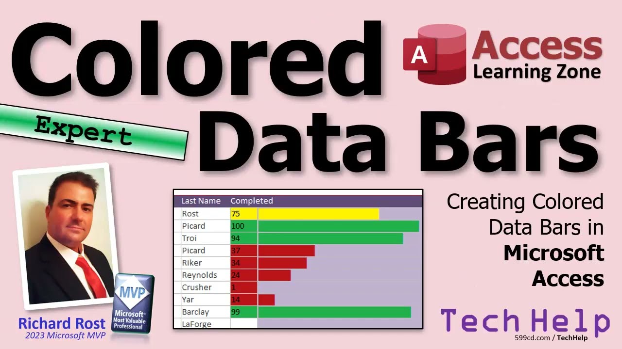
Create Colored Data Bars in Microsoft Access Combining Data Bars with Color Scales
Показать описание
In today's Microsoft Access tutorial, I'm going to teach you how to create Colored Data Bars, which are a mix between regular data bars and color scales that you can build in Microsoft Excel with conditional formatting. We're going to learn how to do that today in Access, which isn't something you can easily do in Excel.
Silver Members & up get access to an Extended Cut of this video. Members will learn how to enhance their color data bars so that they can work with any scale of values instead of just one to 100.
MEMBERS-ONLY EXTENDED CUT VIDEO:
BECOME A MEMBER:
LEARN MORE:
PREREQUISITES:
LINKS:
COLORED DATA BARS SERIES:
FREE TEMPLATE DOWNLOADS:
ADDITIONAL RESOURCES:
KEYWORDS:
TechHelp Access 2016, Access 2019, Access 2021, Access 365, Microsoft Access, MS Access, MS Access Tutorial, #msaccess, #microsoftaccess, #help, #howto, #tutorial, #learn, #lesson, #training, #database, create colored data bars, conditional formatting access, access data visualization, color scales Access, Excel-like formatting Access, custom data bars Access, Access tutorial, visual data representation, Access conditional formatting, Access database design, advanced Access features, Access design tips, Access form design, graphical data Access, Access form customization, enhance Access forms
QUESTIONS:
Please feel free to post your questions or comments below. Thanks.
Live long, and prosper.
 0:18:19
Create Colored Data Bars in Microsoft Access Combining Data Bars with Color Scales
 0:08:07
Multi-color Data bar with REPT function in Excel
 0:10:08
Excel Multi Color Data Bars using Conditional Formatting
 0:15:24
Creating Excel-Like Data Bars in Microsoft Access Using Conditional Formatting
 0:01:31
How to Make a Graph Change Color Based on Value | Conditionally Formatting Charts
 0:03:48
Conditional Formatting Data Bars Actual vs Target - % Progress Bar
 0:09:49
Percentage Progress Bar in Excel With Conditional Formatting | Change Colour Based on Value in Cell
 0:04:15
Excel Conditional Formatting Data Bars Actual vs Target - % Progress Bar
 0:11:50
Combining Multiple Charts: Excel for Beginners Part 07
 0:15:51
Multicolor Filling Bars in Excel Cells Without using Chart
 0:01:47
How to Create Progress Bars in MS Excel with Conditional Formatting
 0:03:19
How to create progress bars in Excel with conditional formatting? - Excel Tips and Tricks
 0:01:13
Fill cell with color based on value (Data Bar)
 0:10:23
Simple Excel Trick to Conditionally Format Your Bar Charts
 0:05:47
Conditional Formatting With Data Bars In Excel
 0:02:38
How to use Conditional formatting in Excel - Data Bars for data analysis
 0:03:30
How to Use Data Bars and Color Scales in Excel
 0:01:32
Use data bars, color scales, and icon sets to highlight data || Basic to Advance Microsoft Excel
 0:17:35
Microsoft Excel 2010 Advanced Training - Part 22 - Formatting Data Bars, Color Scales & Icon Set...
 0:10:56
How to Use Data Bars, Color Scales and Icon Sets using Conditional Formatting in Excel
 0:05:00
Display Data Visually in Excel with Data Bars and Color Scales
 0:10:37
Master Conditional Formatting in Excel (The CORRECT Way)
 0:07:40
Conditional Formatting 2-Color Scheme & Data Bars
 0:06:43
Conditional Formatting in Excel Tutorial
Комментарии