filmov
tv
Four ways to set a color in R using ggplot2 and how to read hexadecimal (CC139)

Показать описание
If you want the figures you generate in R to really stand out from the rest, you can modify the color you are using to help tell your data story and reflect your own personality. In this episode of Code Club, Pat will share with you four different ways to set a color as well as several approaches for matching the color schemes you find elsewhere using the Mac digital color meter. He also spends a little time describing what those hexadecimal codes are all about. Here, Pat continues to morph a figure he made that was originally created by Ipsos to a more stylized one published by chartr. The data depict the percentage of people in 15 countries who would be willing to receive the COVID-19 vaccine as of August and October of 2020.
You can also find complete tutorials for learning R with the tidyverse using...
0:00 Introduction
2:23 How do we find colors?
7:57 Using the digital color meter
9:54 Pick a color to be applied to all cases of a geom
13:55 Specify how colors are mapped to values
16:55 Modify color of non-data elements in the plotting window
19:59 Using HTML/CSS to modify colors
22:12 Recap
 0:04:50
4 Ways to Set Up an Ultralight Tarp Shelter || REI
 0:23:50
Four ways to set a color in R using ggplot2 and how to read hexadecimal (CC139)
 0:00:30
4 MOVE CHECKMATE: Best Chess Trap for Beginners (Wayward Queen)
 0:01:31
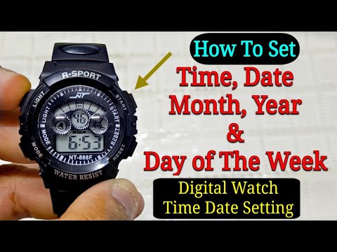
How To Set Time, Day & Date On 4 Buttons Digital Sport Watch? | Time Setting
 0:00:32
LEGO Fantastic Four - WORST SET of 2025?
 0:00:47
How to set timing on a 4 stroke
 0:00:35
4-Way Switch Wiring Explained! #shorts #youtubeshorts #diy #electrical
 0:00:17
Pocket Square - Winged Puff
 0:00:45
How To Use The MC Command Center Mod To Give Your Sims An 'Age'
 0:00:41
How To: Operate Jeep JL Wrangler Four Wheel Drive 4wd 4x4 Command Trac Rock Trac| Kentucky Ohio IN
 0:00:27
How to Properly Setup Your Clubs In Your Golf Bag! #shorts #golf
 0:01:58
Huawei Watch Fit 4: How to Set Photo as Watch Face?
 0:00:15
how to set date and time in Samsung galaxy watch 4 #viral #trending #samsunggalaxywatch
 0:00:34
4 Set Ups for the Double Leg Takedown in Wrestling or BJJ
 0:00:21
IPOOLGO inflatable swimming pool 4*2*0.8m size quickly set up
 0:02:03
How to set a four-digit PIN without tapping 'OK' on the Galaxy phone? (One UI 6.1.1 & ...
 0:00:18
Win Chess in just 2 Moves Only! #Shorts
 0:10:23
How to set up a four stand mosquito net/How to fix/install a four stand mosquito net/Mosquito net
 0:02:32
4 ways to set up a tarp for camping
 0:00:19
4-ingredient Mini Oreo Cakes for two! Tutorial
 0:00:26
How to set maximum distance on your DJI Mini 4 Pro drone 🔥😎#shorts #dji #viral
 0:00:35
How to Install a Case Fan!
 0:00:35
Having issues with your PS4 Controller? | Try This Trick Out!
 0:00:23
Roller set on type 4 hair | I took your advice
Комментарии