filmov
tv
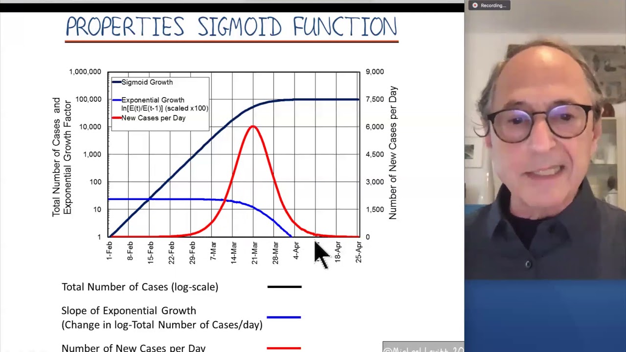
Curve Fitting for Understanding Michael Levitt 14May2020
Показать описание
This is Part 2. Fitting viral growth data with simple mathematical functions can give important insights into how epidemics will grow. Here we illustrate two commonly used growth curves, the Sigmoid Function and the Gompertz Function. While superficially similar, they are really very different.
 0:05:55
Curve Fitting for Understanding Michael Levitt 14May2020
 0:05:37
M Levitt explains curve fitting using real data
 0:22:24
Video Tutorial on Curve Fitting
 0:07:29
Video Tutorial on Uncertainty of Parameters for Curve Fitting
 0:08:46
Trig: 5.7: Curve Fitting
 0:05:19
M Levitt #2 Concepts of curve fitting
 0:20:06
Algebra II:1.4 Curve Fitting With Linear Models
 0:18:33
Algebra II: 5.7 Curve Fitting With Quadratic Functions
 0:23:07
Review of Curve Fitting in Python
 0:20:21
Algebra II:2.8 Curve Fitting With Quadratic Models
 0:08:04
curve fitting English
 0:09:29
Excel - Fitting Data to Curve
 0:12:51
Fitting Experimental Data and Linearization
 0:00:31
Fitting Bell Curves to Data Distributions using Visualization - Fast Forward | VIS 2023
 0:14:37
MTH 111 Linear Curve Fitting 4 3
 0:11:57
Physics 111 CurveFitting with Google Sheets
 0:02:46
Parabola of best fit using desmos
 0:50:19
Estimating Partial Properties from Data & Ideal Gas Mixtures (Sept. 22, 2017)
 0:09:07
116: Building entries without curvefitting [AUDIO ONLY]
 0:00:51
Instantly Fix Lower Back Pain #Shorts
 0:30:53
18th Jan reducing non-linear laws to linear form
 0:18:38
Curve Fitting, Filleting
 0:07:57
1.4: Curve fitting using pylab: Spring problem
 0:44:45
Lesson 3.1, 2024 STEMNetX Data Science Workshop
Комментарии