filmov
tv
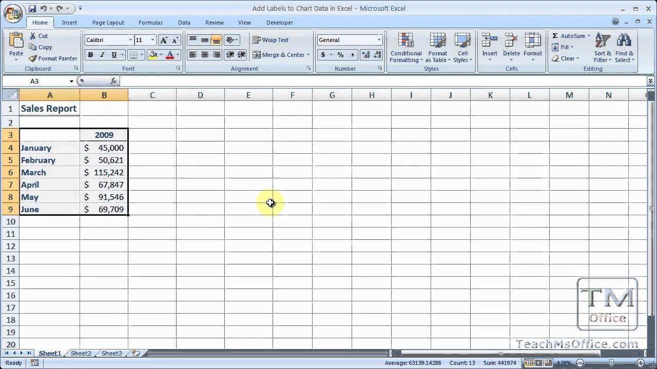
Add Labels to Chart Data in Excel
Показать описание
This tutorial shows you how to insert data labels into charts in Excel. Data labels tell you the exact value of an entity in a chart. This can make a chart easier to read because it allows you to quickly and easily read the values that are otherwise being visually displayed within a chart. This tutorial also shows you how to move, edit, customize, and format data labels for charts in Excel.
 0:00:10
Microsoft PowerPoint - Adding Data Labels to a Chart
 0:00:42
Add Labels to Chart Data in Excel
 0:00:31
#shorts - how to add data labels to a bar chart in Excel
 0:01:01
How to Add Data Labels to your Excel Chart
 0:00:18
How to add data labels on Pie Charts in Excel (video out now!)
 0:01:10
How To Add Data Labels To A Chart in Microsoft Excel
 0:00:30
Bar Chart Labels in Two Spots?! ☝️
 0:00:59
How to directly label data in a graph #excel
 0:08:55
Create an Awesome Native Lead Time Visual in Power BI!
 0:00:59
Adding data labels to bars in Google Chart
 0:04:39
How to Add Category AND Data Labels to the Same Bar Chart in Excel!🔥 [CHART TIPS]
 0:00:11
Add data to chart in excel #exceltips #exceltutorials #charts
 0:07:12
Adding Data Labels to a Scatter Graph - Made Easy
 0:00:20
How to add data labels in chart? #excel #shorts
 0:04:59
Create Custom Data Labels. Excel Charting.
 0:00:52
Customizing Data Labels in Excel Charts: A Visual Guide to Data Insights | Tutor Joes
 0:00:15
Easy Way To Create And Add Data To Graph
 0:06:57
How to Add, Edit and Rename Data Labels in Excel Charts
 0:05:01
How to Add Total Values to Stacked Chart in Excel
 0:05:50
5-18: Add and Format Data Labels and add a Data Table an Excel Chart
 0:04:41
013. How to create Custom DATA LABELS in Excel Charts - Include numbers and percentages
 0:00:18
Draw a Multiple Bar Diagram in Excel
 0:00:28
How to make a pie chart in Google Sheets! 🥧 #googlesheets #spreadsheet #excel #exceltips
 0:00:55
Show external data labels in a chart
Комментарии