filmov
tv
How to Combine Individual Subplots Into One Plot? [R Data Science Tutorial 6.3 (a)]

Показать описание
This tutorial illustrates how we can combine subplots to make one single plot.
This further illustrates the functionality of the grid and gridExtra package for combining plots together.
Check out our website for more Data Science and Statistics Tutorials
# Making plots using ggplot2
R Tutorial 6.0 (a): How to create a dodged bar plot and change filled colours using ggplot2 ?
R Data Science Tutorial 6.0 (b): How to adjust width and spacing of bar plot using ggplot2 ?
R Data Science Tutorial 6.0 (c): How to create a stacked bar plot using ggplot2?
R Data Science Tutorial 6.0 (d): How to add labels in a bar plot using ggplot2 ?
R Data Science Tutorial 6.1 (a): How to create a line graph using ggplot2?
R Data Science Tutorial 6.1 (b): How to change appearance of lines in line graph using ggplot2?
R Data Science Tutorial 6.1 (c): How to change appearance of points in a line graph using ggplot2?
R Data Science Tutorial 6.1 (d): How to plot an area graph using ggplot2?
R Data Science Tutorial 6.2 (a): How to make scatter Plots using ggplot2?
R data Science Tutorial 6.2 (b): How to change shape, colour and fill of scatter plots?
R Data Science Tutorial 6.2 (c): How to map a continuous variable to scatter plot?
R Data Science Tutorial 6.2 (d): How to solve the overplotting issue in scatter plots?
R Data Science Tutorial 6.2 (e): How to make boxplot using ggplot2?
R Data Science Tutorial 6.3 (a): How to Combine Individual Subplots Into One Plot?
 0:07:15
How to Combine Individual Subplots Into One Plot? [R Data Science Tutorial 6.3 (a)]
 0:07:57
Matplotlib Series Part#17 - Creating Multiple Subplots
 0:04:53
Python Matplotlib Tutorial #11 for Beginners - Plotting Several Graphs
 0:12:29
How to Write PLOTS & SUBPLOTS Better than 99% of Writers (Writing Advice)
 0:02:32
How to merge two origin graphs?
 0:12:30
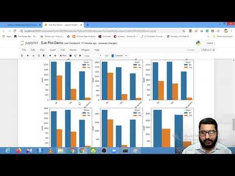
How to plot multiple sub-plots using Matplotlib and Seaborn | Session With Sumit
 0:21:22
Matplotlib Tutorial (Part 10): Subplots
 0:03:44
How to plot multiple dataframes in subplots
 0:14:13
Scatter Plots - Plotting, Combining, Subplots: Tutorial 6
 0:07:49
ggplot- patch many plots together: how to put many subplots together and annotate those
 0:16:09
How to Write a Subplot in a Screenplay — Adding Layers to Your Film
 0:04:05
multiple Subplots in one Frame using MATLAB coding
 0:01:53
Show Multiple Images Using Matplotlib Subplot in Python
 0:16:57
How to plot multiple graph in MATLAB | Subplot in MATLAB | Hold on in MATLAB | MATLAB TUTORIALS
 0:09:29
patchwork: The ggplot2 plot combiner
 0:02:23
Plot and Merge Multiple Graphs in Origin
 0:06:44
81. How do I plot multiple subplots in Matplotlib?
 0:07:04
Matplotlib Subplot - How Do You Plot a Subplot in Python Using Matplotlib | Matplotlib Tutorial
 0:07:49
12 Subplots
 0:06:38
💻 MATLAB TUTORIAL || How to plot multiple plot using 'subplot(m,n,p)' command?
 0:04:36
Matplotlib Subplot Tutorial
 0:01:01
How to plot multiple graphs all at once in origin
 0:09:39
How to Write COMPLEX Scenes (Main Plot + Subplots) | Spider-Man 2
 0:15:09
How to make subplots and multiple plots in Python?
Комментарии