filmov
tv
Statistics lesson everyone should know

Показать описание
This is why you should always visualize your data! #shorts #math #maths #mathematics #statistics
Anscombe quartet
Same Stats, Different Graphs. Justin Matejka, George Fitzmaurice
Send me suggestions by email (address at end of many videos). I may not reply but I do consider all ideas!
If you purchase through these links, I may be compensated for purchases made on Amazon. As an Amazon Associate I earn from qualifying purchases. This does not affect the price you pay.
Book ratings are from January 2022.
My Books (worldwide links)
My Books (US links)
Mind Your Decisions: Five Book Compilation
A collection of 5 books:
"The Joy of Game Theory" rated 4.2/5 stars on 224 reviews
"The Irrationality Illusion: How To Make Smart Decisions And Overcome Bias" rated 4/5 stars on 24 reviews
"40 Paradoxes in Logic, Probability, and Game Theory" rated 4.1/5 stars on 38 reviews
"The Best Mental Math Tricks" rated 4.2/5 stars on 76 reviews
"Multiply Numbers By Drawing Lines" rated 4.3/5 stars on 30 reviews
Mind Your Puzzles: Collection Of Volumes 1 To 3
A collection of 3 books:
"Math Puzzles Volume 1" rated 4.4/5 stars on 87 reviews
"Math Puzzles Volume 2" rated 4.1/5 stars on 24 reviews
"Math Puzzles Volume 3" rated 4.2/5 stars on 22 reviews
2017 Shorty Awards Nominee. Mind Your Decisions was nominated in the STEM category (Science, Technology, Engineering, and Math) along with eventual winner Bill Nye; finalists Adam Savage, Dr. Sandra Lee, Simone Giertz, Tim Peake, Unbox Therapy; and other nominees Elon Musk, Gizmoslip, Hope Jahren, Life Noggin, and Nerdwriter.
My Blog
Twitter
Merch
Patreon
Press
Anscombe quartet
Same Stats, Different Graphs. Justin Matejka, George Fitzmaurice
Send me suggestions by email (address at end of many videos). I may not reply but I do consider all ideas!
If you purchase through these links, I may be compensated for purchases made on Amazon. As an Amazon Associate I earn from qualifying purchases. This does not affect the price you pay.
Book ratings are from January 2022.
My Books (worldwide links)
My Books (US links)
Mind Your Decisions: Five Book Compilation
A collection of 5 books:
"The Joy of Game Theory" rated 4.2/5 stars on 224 reviews
"The Irrationality Illusion: How To Make Smart Decisions And Overcome Bias" rated 4/5 stars on 24 reviews
"40 Paradoxes in Logic, Probability, and Game Theory" rated 4.1/5 stars on 38 reviews
"The Best Mental Math Tricks" rated 4.2/5 stars on 76 reviews
"Multiply Numbers By Drawing Lines" rated 4.3/5 stars on 30 reviews
Mind Your Puzzles: Collection Of Volumes 1 To 3
A collection of 3 books:
"Math Puzzles Volume 1" rated 4.4/5 stars on 87 reviews
"Math Puzzles Volume 2" rated 4.1/5 stars on 24 reviews
"Math Puzzles Volume 3" rated 4.2/5 stars on 22 reviews
2017 Shorty Awards Nominee. Mind Your Decisions was nominated in the STEM category (Science, Technology, Engineering, and Math) along with eventual winner Bill Nye; finalists Adam Savage, Dr. Sandra Lee, Simone Giertz, Tim Peake, Unbox Therapy; and other nominees Elon Musk, Gizmoslip, Hope Jahren, Life Noggin, and Nerdwriter.
My Blog
Merch
Patreon
Press
 0:00:49
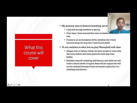
Statistics lesson everyone should know
 0:16:52
What changes? | A lesson in statistics, incentives, and internet stupidity
 0:14:23
PSY 2110 Statistics: How to Pass a Statistics Class
 0:06:34
Statistics for Managers: Lesson 1 Basics of Statistics
 0:08:37
Statistics 101: A Class Preview
 0:20:23
Lesson 1 - What is the F-Distribution in Statistics?
 0:12:36
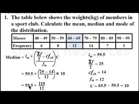
Mean, median and mode of grouped Data(Lesson 1)
 0:14:31
5 key skills you need to become a GREAT Data Analyst ~ Lessons from 15 years of analytics experience
 0:18:06
Dynamic Forms with Big Buttons for Data Entry in Microsoft Access, Part 4
 0:26:09
Inferential Statistics: Lesson 1 - Basic Definitions and Key Concepts in Statistics
 0:13:20
Introductory Statistics Lesson using Dragons
 0:00:34
Basic Data Types - Python for beginners - Lesson 1 #python #shorts #programming #coding #data
 0:05:25
Measure of Central Tendency || Lesson 1 || Probability & Statistics || Learning Monkey ||
 0:07:19
Intro to Business Statistics: Lesson 2: Describing Data
 0:12:46
Complete Statistics in One Shot in 20 minutes | Class 10 Maths | CBSE 2024
 0:00:16
statistics project class 9th
 0:04:04
Class 9th - Statistics - Introduction
 0:06:13
The Complete Data Science Roadmap [2024]
 0:15:00
Business Statistics Lesson 5: Probability Concepts
 0:00:16
Finding MEDIAN for ODD number of Observations|Class 7th|Maths|Statistics
 0:00:23
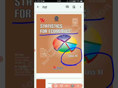
PDF of statistics for economics book class 11th VK Ohri & TR jain
 0:19:14
Lesson 1 - Learn Scatter Plots in Statistics
 0:00:39
#MCQ on Statistics#CBSE Class 10#Standard&Basic Maths#Educart Sample papers#short#shorts
 0:04:01
Lesson 3 - The Normal Probability Distribution (Statistics Tutor)
Комментарии