filmov
tv
Making a good slide deck: Simple advice on text, figures, and design for scientific slides

Показать описание
Simple advice on designing a scientific slide deck that avoids the common mistakes. I first briefly talk about PowerPoint and my distinct, minimalist slide style. I then talk about the root cause of the problem, namely that people put too much on each slide because the confuse number of slides with amount of content. Afterwards, I cover the two main problems with slides, namely text and figures. Having long sentences and bullet lists are a problem because the audience cannot read and listen at the same time. While slides with figures are a good idea, scientific presentations often have too many, complex, and small figures on each slide. Finally, I give some brief advise on slide design.
0:00 Introduction: blame PowerPoint, my distinct style, and traditional slides
0:40 Root cause: physical slides, 2 minutes per slide, and confusing slides with content
1:36 Text on slides: long bullet lists, cannot read and listen, reading from slides, and keywords
2:26 Figures on slides: figures are good, the problems with figures, and how to avoid them
3:36 Design: simple is better, employer templates, consistency, font, and color palette
4:16 Many right ways: alternative solutions, only figures, and photos as backdrop
 0:09:59
How to Make a Presentation Deck that Doesn't Stink | Christine vs. Work
 0:11:24
The Best Presentation Design Tips to Create the Perfect Deck
 0:01:31
Google Slides - Create a Slide Deck
 0:09:16
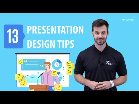
13 Presentation Design Tips to Create an Awesome Slide Deck
 0:01:47
Creating a Good Slide Deck
 0:05:05
Making a good slide deck: Simple advice on text, figures, and design for scientific slides
 0:09:47
5 QUICK Ways to Improve Your PowerPoint Design
 0:12:19
Create an Interactive Slide Deck in PowerPoint
 0:05:34
Present with CONFIDENCE with THESE 3 PowerPoint Tips
 0:06:04
What Is a PowerPoint Slide Deck?
 0:13:18
What investors ACTUALLY want to see in your PITCH DECK.
 0:06:17
Animated PowerPoint Slide Design Tutorial
 0:02:11
How To Create an Interactive Slide Deck in Powerpoint
 0:06:37
The $100M Sales Deck: This Sales Deck Structure Closed $100,000,000 of Software
 0:12:48
How to Make a Pitch Deck for Investors - Startups 101
 0:04:48
How to create a perfect slide deck with AI | Presentations.ai demo
 0:18:03
Create an Interactive Slide Deck in PowerPoint | Free Slide Deck | PowerPoint University
 0:18:31
15 Slides you NEED on your Pitch Deck - Startups 101
 0:14:36
How to Create a Webinar Slide Deck Presentation (for free!)
 0:10:33
The Ultimate Pitch Deck Guide - 2024
 0:03:27
Great Pitch Deck Presentation Example – Fibrtex
 0:13:11
Complete PowerPoint Presentation deck | Free Slide deck
 0:13:57
Canva Presentation Tutorial: Make a Slide Deck For Your Agency / Freelancing Business (Canva Hacks)
 0:10:13
13 Pitch Deck Design Tips for Creating the Perfect Startup Pitch
Комментарии