filmov
tv
Python Tutorial: t-SNE visualization of high-dimensional data

Показать описание
---
In this video, you'll learn to apply t-Distributed Stochastic Neighbor Embedding or t-SNE. While this may sound scary, it's just a powerful technique to visualize high dimensional data using feature extraction.
t-SNE will maximize the distance in two-dimensional space between observations that are most different in a high-dimensional space. Because of this, observations that are similar will be close to one another and may become clustered. This is what happens when we apply t-SNE to the Iris dataset.
We can see how the Setosa species forms a separate cluster, while the other two are closer together and therefore more similar.
However, the Iris dataset only has 4 dimensions to start with, so let's try this on a more challenging dataset.
Our ANSUR female body measurements dataset has 99 dimensions.
Before we apply t-SNE we're going to remove all non-numeric columns from the dataset by passing a list with the unwanted column names to the pandas dataframe .drop() method.
t-SNE does not work with non-numeric data as such. We could use a trick like one-hot encoding to get around this but we'll be using a different approach here.
We'll create a TSNE() model with learning rate 50. While fitting to the dataset, t-SNE will try different configurations and evaluate these with an internal cost function. High learning rates will cause the algorithm to be more adventurous in the configurations it tries out while low learning rates will cause it to be conservative. Usually, learning rates fall in the 10 to 1000 range.
Next, we'll fit and transform the TSNE model to our numeric dataset.
This will project our high-dimensional dataset onto a NumPy array with two dimensions.
We'll assign these two dimensions back to our original dataset naming them 'x' and 'y'.
We can now start plotting this data using seaborn's .scatterplot() method on the x and y columns we just added.
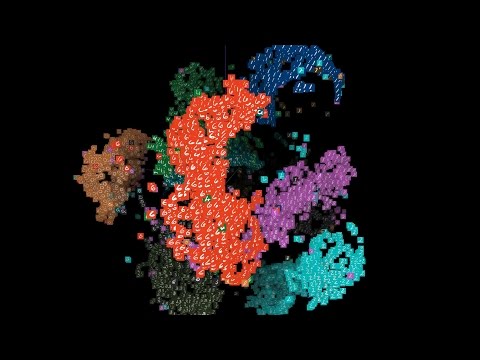
The resulting plot shows one big cluster, and in a sense, this could have been expected. There are no distinct groups of female body shapes with little in between, instead, there is a more continuous distribution of body shapes, and thus, one big cluster. However, using the categorical features we excluded from the analysis, we can check if there are interesting structural patterns within this cluster.
The Body Mass Index or BMI is a method to categorize people into weight groups regardless of their height. I added a column 'BMI_class' to the dataset with the BMI category for every person. If we use this column name for the hue, which is the color, of the seaborn scatterplot, we'll be able to see that weight class indeed shows an interesting pattern.
From the 90+ features in the dataset, TSNE picked up that weight explains a lot of variance in the dataset and used that to spread out points along the x-axis, with underweight people on the left and overweight people on the right.
We've also added a column with height categories to the dataset. If we use this 'Height_class' to control the hue of the points we'll be able to see that in the vertical direction, variance is explained by a person's height.
Tall people are at the top of the plot and shorter people at the bottom.
In conclusion, t-SNE helped us to visually explore our dataset and identify the most important drivers of variance in body shapes.
Now it is your turn to use t-SNE on the combined male and female ANSUR dataset.
#PythonTutorial #DataCamp #Python #Dimensionality #Reduction #visualization #data
 0:03:27
 0:03:27
 0:14:40
 0:11:48
 0:13:19
 0:16:14
 0:06:13
 0:00:48
 0:08:24
 0:05:54
 0:25:49
 0:03:21
 0:11:17
 0:03:08
 0:17:55
 0:03:17
 0:00:29
 0:12:56
 0:04:00
 0:10:58
 0:00:31
 0:11:25
 0:03:11
 0:01:53