filmov
tv
SECRETS OF THE IMPOSSIBLE TUDOR PORTRAIT | Art history documentary | Tudor history documentary

Показать описание
What are the HIDDEN MEANINGS in this impossible Tudor portrait, entitled An Allegory of the Tudor Succession: The Family of Henry VIII? Why does it show four of the five Tudor monarchs (Henry VIII, Edward VI, Mary I and Elizabeth I), plus Mary’s husband, Philip II of Spain, even though in reality the five never met at the same time and their ages and clothing as shown in the picture are mostly incompatible with true history?
In this art history documentary from History Calling I set about decoding the secrets of this impossible picture. Why are the Tudors positioned in this way, with Henry in the centre, even though Elizabeth was on the throne at the time it was painted? Why is the then Queen on his left, at the far side of the picture, arguably the place of least honour? Why is Edward still a young child here, instead of the boy of fifteen he was when he died? Why are none of Henry VIII’s wives present? Who are the classical figures standing to the left and right of the image? What do they represent, what is the significance of the sword Henry VIII is passing to Edward VI and what does the inscription around the picture’s border mean?
I’ll also look at a near copy of the picture. The original was painted in 1572 supposedly by Lucus de Heere and now hangs at Sudeley Castle, having originally been a gift from Elizabeth I to Sir Francis Walsingham. The copy was painted by an anonymous artist in c. 1590 and now hangs on the wall of the Yale Centre for British Art in New Haven, Connecticut. How do they compare to each other and to other famous Tudor portraits including the Family of Henry VIII which is held at Hampton Court Palace? I’ll discuss the vandalism to the copy too and how it has been conserved over the years.
YOU MIGHT ALSO LIKE:
HIDDEN MESSAGES WITHIN FAMOUS PAINTING OF HENRY VIII AND HIS CHILDREN
WILL SOMMER – HENRY VIII’S FOOL
ART HISTORY PLAYLIST
TUDOR MONARCHS’ PLAYLIST
GEAR USED
BUY OR RENT:
The Tudors, season 1
The Tudors, season 2
The Tudors, season 3
The Tudors, season 4
Becoming Elizabeth, season 1 (Starz, 2022)
Elizabeth I and Her Enemies (2017)
Elizabeth: The Golden Age (2007)
Elizabeth (1998)
Elizabeth I (2006)
Elizabeth I – The Virgin Queen (2006)
Elizabeth R (1972)
Henry VIII and his Six Wives (2016 docu-drama)
Six Wives with Lucy Worsley (2016 docu-drama)
Thumbnail: An Allegory of the Tudor Succession: The Family of Henry VIII, Yale Centre for British Art, public domain
NB: Links above may be affiliate links. This means if you make a purchase through one of these links, I earn a small commission. It in no way affects the price you pay.
 0:18:13
SECRETS OF THE IMPOSSIBLE TUDOR PORTRAIT | Art history documentary | Tudor history documentary
 0:08:50
Why Everyone HATES Tom Cruise..
 0:00:22
Waking up in Dan Bilzerian’s house lol
 0:01:36
Charlie Munger: The BIG Problem with Quant Trading
 0:07:31
Leaked email reveals sex SECRET keeping Tom Cruise in Scientology
 0:03:08
Peter Falk’s Hilarious Acceptance Speech for COLUMBO | Emmys Archive (1972)
 0:22:57
Why You Wouldn’t Survive Life in Tudor England
 0:10:19
Tudor Houses Explained in 10 Minutes | KS1/2
 0:14:35
DID ANNE BOLEYN ATTACK JANE SEYMOUR? Tudor history | Six wives documentary @HistoryCalling
 0:33:27
Exclusive Interview - Anne Boleyn's Letter Revealed - Unlocking Tudor Secrets
 0:10:33
The Untold Secret of QUEEN ELIZABETH I?
 0:58:51
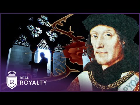
Henry VII's Dark Truths: The First Tudor King | Henry VII Winter King | Real Royalty
 0:48:22
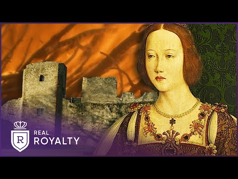
The Forgotten Tudor Queen: Bloody Mary | Mary I | Real Royalty
 0:00:28
Putin vs Zelensky playing Piano
 0:16:28
TUDOR QUEENS’ NECKLACE | Six wives documentary | lost royal jewels | History Calling | famous jewels...
 0:25:54
Arthur Tudor, the King Who Never Was - A Glimpse into England’s Lost Monarch
 0:25:25
Visiting Jacob & Co. With Teddy Baldassarre - Hands-On With The World’s Most Expensive Watches
 0:17:38
What They Don't Want You To Know - Secrets Of The Watch Industry, Luxury Market & Social Me...
 0:48:06
How Queen Mary Earned Her Bloody Reputation | Mary I - Bloody Mary | Chronicle
 0:11:57
WHAT HAPPENED TO THE TUDOR CROWN? What happened to the crown jewels? Most famous royal jewels
 1:21:15
Elizabeth I - England's Greatest Queen Documentary
 0:08:07
The SHADY Side Of Henry Cavill REVEALED..
 0:21:43
Before You Buy That Tudor Black Bay 54, 58 Or Pelagos FXD Watch: What You Should REALLY Know
 0:40:34
Anne Diamond interviews author and Tudor historian Dr. Tracy Borman
Комментарии