filmov
tv
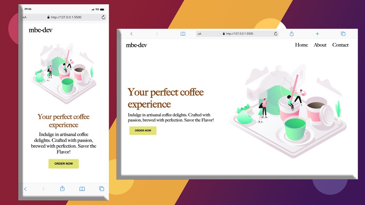
How to create a simple, responsive hero section | HTML & CSS

Показать описание
In this tutorial, we'll walk you through step-by-step on how to create a stunning, responsive hero section using only HTML and CSS. You'll learn how to implement responsive design principles, use CSS Flexbox to create a flexible layout, and create a beautiful design that looks great on any device.
#herosection #responsive #simple #csstricks #tutorial #frontenddeveloper #landingpage #mbedev
Thank you for watching! 🙂!
#herosection #responsive #simple #csstricks #tutorial #frontenddeveloper #landingpage #mbedev
Thank you for watching! 🙂!
The Absolute FASTEST Way to Create a Simple Website in Less Than 10 Minutes
How to Create a Simple Process Map (With Examples)
How to Create a Simple Website Layout using HTML CSS
Create Simple Personal Portfolio Website with HTML & CSS | Step by Step Tutorial
How to create a Simple Dashboard Report in Microsoft Excel
How to Create Simple Registration Form using only HTML and CSS || Sign up Page Design Tutorial
How to Create a Simple Makefile - Introduction to Makefiles
HOW TO CREATE SIMPLE LOGO IN ADOBE ILLUSTRATOR
How to Create a Simple Site Footer in GeneratePress
How to create a Simple Flask app in just 5 minutes | Python Flask Tutorial for beginners
How To Create Simple Cover Art Design in Photoshop | Photoshop Tutorial
How to Create a Simple Sign Up Form - Google Forms
Create a Simple Neural Network in Python from Scratch
How to Create Simple Login Form using only HTML and CSS || Sign In Page Design Tutorial
How To Create Simple Table On Figma
Learn Bootstrap and Create a Simple Website in just 20 Minutes
How To Create a Simple Animation Using HTML in 5 minutes | Animation In HTML | Html Animation
How to create a simple select query in Microsoft Access
How to create a simple supply and demand graph in Excel
How to Create a Simple Flowchart in WORD (2 Easy Methods)
How to Create a Simple Batch File In Windows 10/8/7
Packet Tracer - Create a Simple Network Using Packet Tracer
How to Create a Simple Spiral Pattern with Lines - Doodle Art
Create a Simple Data Entry Form: Enter Data Using a Form in Google Sheets & Apps Script
Комментарии
 0:06:02
 0:11:52
 0:04:53
 0:21:57
 0:18:56
 0:05:59
 0:09:24
 0:01:04
 0:05:01
 0:05:19
 0:05:50
 0:04:30
 0:14:15
 0:04:44
 0:05:41
 0:18:36
 0:05:03
 0:02:18
 0:04:48
 0:03:36
 0:01:50
 0:02:10
 0:02:27
 0:06:15