filmov
tv
Correlation (Scatterplot) in SPSS

Показать описание
In this video, how to produce and interpret a Scatterplot Graph in SPSS is illustrated. Scatterplots go hand-in-hand with Pearson's r correlation.
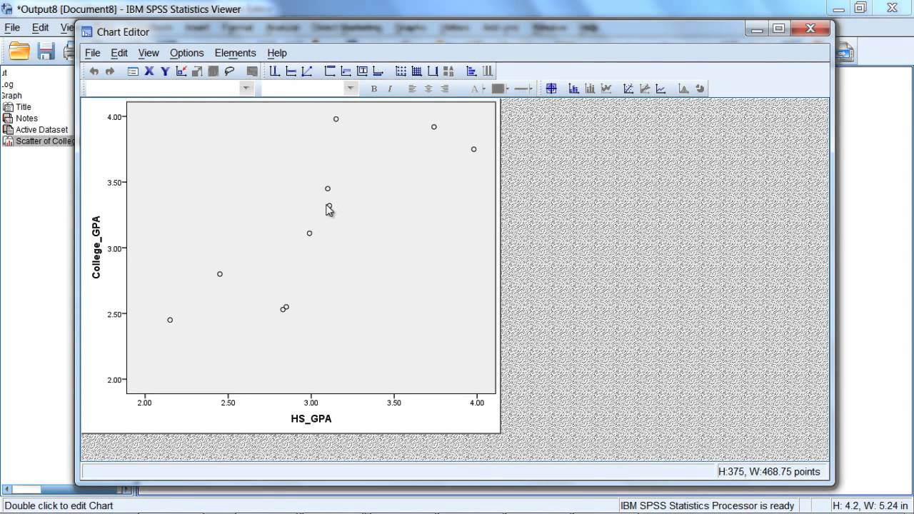
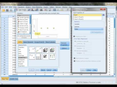
Video Transcript: In this tutorial we'll examine how to produce a scatterplot in SPSS. Notice the example that you see on your screen we have the scores for 10 different people on two variables: we have their college GPA, and this was their first year in college, and then we have their high school GPA, which corresponds to their four years they spent in high school. Now what we want to do is use these two variables to produce a scatterplot. And we'll do that by going to Graphs, and then select Legacy Dialogs, and then move down to the second-to-last option Scatter/Dot, go ahead and click on that. Notice the default option Simple Scatter is selected, as it has the black border, that's what we want. So this looks good let's go ahead and click Define. The Simple Scatterplot dialog box opens here and we want to move college GPA to the Y Axis so we'll click on that first arrow button, then go and select high school GPA and move that the X Axis box. This looks good, so let's go and click OK. And then the Viewer window opens here with our output of our scatterplot. We'll go and double click on this scatterplot to open up the chart editor window so we can look at it a little bit more closely here. And in this scatterplot, notice we have a number of different circles. These circles are known as coordinates, and what they are is they contain the values for a given individual, each circle. So if you count these, there would be ten circles, which matches ten values in our dataset. So, for example, this circle here, the individual, we can read vertically, or down, to find their value on the X-axis, and then we can read across, or horizontally, to find their value on Y. So this person had a very high, high school GPA, it looks like it was in the high 3's somewhere around 3.95, 3.97 or 3.98, somewhere in there. And if you read over, we see their GPA in college was somewhere, about halfway in between these two values, somewhere around 3.75, give or take. So that's what this coordinate means here, it shows a score, or value, both on our X axis, which in this example is high school GPA, and on our Y axis, which here is college GPA. And that's the case for each of these points. So for the 10 people, their coordinates are plotted, which reflect their value on high school GPA and their value on college GPA. And if you look at the scatterplot, it looks like it's linear in nature, as a straight line would do a good job representing these points. So if we want to perform a statistic on this we could calculate, for example, Pearson's r, and we should be in good shape there. OK that's about it for producing a basic scatterplot in SPSS. Thanks for watching.
Learn how to Produce a Graph of a Scatterplot in SPSS
Correlation plot in SPSS
Correlation
Graph in SPSS
SPSS video - graph
Комментарии
 0:03:51
 0:03:11
 0:07:24
 0:11:21
 0:04:19
 0:02:01
 0:02:44
 0:01:19
 0:12:38
 0:04:01
 0:05:51
 0:02:59
 0:04:14
 0:08:16
 0:02:45
 0:09:55
 0:09:33
 0:02:25
 0:03:53
 0:04:04
 0:06:41
 0:03:08
 0:13:11
 0:01:56