filmov
tv
A CSS3 Media Query Reporter
Показать описание
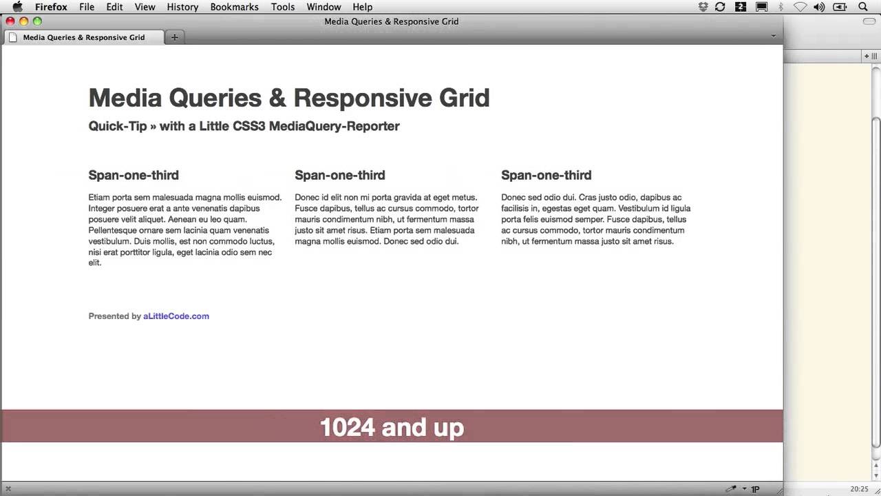
One of the small challenges in building a responsive layout is deciding when to have certain rules apply.
For instance, at what point will your site make the transition from a single narrow column for handheld devices to a multi-column design? Will you have one big transition (from one-column to many-column), or will you provide an intermediate step or two along the way (one-column, two-column, 8-column, and so on)? And if you want to supply intermediate steps — WHEN will they apply? At 480 pixels wide ... 768 ... 1024?
One thing that can be helpful in making these decisions is an on-screen media query reporter, which can provide visual feedback as we cross each width threshold.
 0:12:07
 0:09:56
 0:04:21
 0:44:21
 0:17:18
 0:05:10
 0:04:41
 0:23:53
 0:05:19
 0:10:30
 0:14:50
 0:04:29
 0:05:58
 0:11:43
 0:19:17
 0:13:34
 0:06:58
 1:01:20
 0:03:34
 0:20:39
 0:05:53
 0:10:57
 0:00:34
 0:07:18