filmov
tv
Use CSS media queries LIKE A PRO
Показать описание
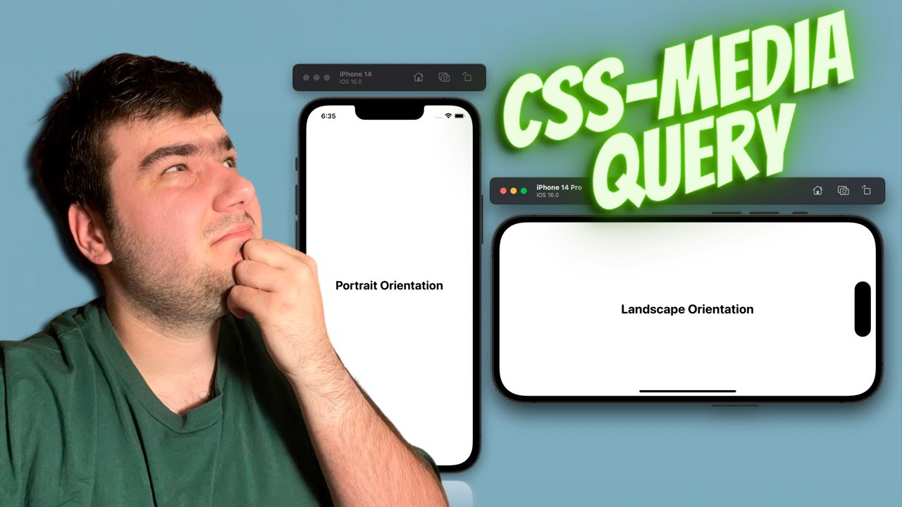
This video is about CSS media queries. It’s a common situation in web development when you have to change the styles on your page based on width or height of the screen viewport. And here media queries come to the game. I will tell you the basics, we will explore the syntax of media queries, understand breakpoints, and witness practical examples to enhance your understanding. Moreover, we will touch device types and I will show you how to change the styles of your elements for example for printing. Enjoy)
Follow me on:
Timecodes:
00:00 - Intro
00:35 - Code preparation
01:07 - Syntax basics (device type and media query selectors)
02:14 - Width
03:57 - Print
04:54 - Specificity and @media
06:21 - Orientation media query selectors
09:32 - Summary and outro
Follow me on:
Timecodes:
00:00 - Intro
00:35 - Code preparation
01:07 - Syntax basics (device type and media query selectors)
02:14 - Width
03:57 - Print
04:54 - Specificity and @media
06:21 - Orientation media query selectors
09:32 - Summary and outro
 0:09:44
Master Media Queries And Responsive CSS Web Design Like a Chameleon!
 0:04:30
Tutorial: Learn how to use CSS Media Queries in less than 5 minutes
 0:07:11
Learn CSS Media Query In 7 Minutes
 0:00:22
CSS media queries solve responsive design
 0:07:33
Media Query in CSS [Easiest Way] | How To Write Media Queries FAST
 0:00:58
This New CSS Feature Makes Media Queries So Much Easier
 0:11:37
CSS Media Queries | Sigma Web Development Course - Tutorial #31
 0:00:33
Responsive Design 101 - Learn CSS Media Queries In 32 Seconds
 0:11:38
CSS Media Queries Tutorial for Responsive Design
 0:08:18
How To Make Website Responsive Using CSS Media Queries | Responsive Web Design Tutorial
 0:00:05
Responsive Screen Size Breakpoints | Mastering CSS Media Queries for Responsive Web Design | CSS
 0:27:03
CSS Media Queries & Responsive Web Design tutorial for Beginners
 0:00:16
Media Queries in CSS || Responsive Design #css #responsive #projects #shorts #ytshorts #viral
 0:00:24
Learn How to Create a Responsive Grid with CSS in 24 Seconds
 0:14:11
CSS Tutorial: Media Queries Explained | Web Development Tutorials #30
 0:20:19
24 | MAKE A WEBSITE RESPONSIVE FOR ALL DEVICES | 2023 | Learn HTML and CSS Full Course for Beginners
 0:09:39
10 CSS Pro Tips - Code this, NOT that!
 0:20:16
Top 10 Advanced CSS Responsive Design Concepts You Should Know
 0:06:46
CSS Media Queries for Beginners: Breakpoints, Max-Width, Min-Width, and More
 0:00:16
Critical Responsive Layout Tips
 0:31:39
CSS Media Queries and Custom Variables Explained || Episode - 21
 0:11:03
Useful & Responsive Layouts, no Media Queries required
 0:00:30
mediaquery css responsive layout 🚀
 0:15:54
5 simple tips to making responsive layouts the easy way
Комментарии