filmov
tv
Motion Design Essentials 3: Contrast

Показать описание
When you choose colors for your motion design projects, make sure to ba aware of their contrast. Good color combinations allow you to give every element in your scene the amount of attention it needs.
This video is part of the Motion Design Essentials series - quick tips which help you to create better motion graphics.
#motiondesignessentials
Transcript:
So, you have some colours you like.
But when you put them together, they look… meh.
You need… contrast!
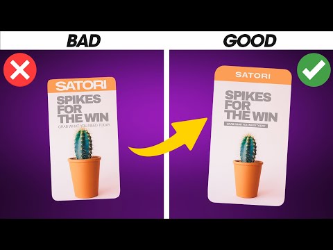
Colours should help tell your story.
Important things need lots of contrast.
Less important things, less contrast.
Use the Adobe Color page to check your colour values.
To find out the contrast, check how bright your colours are!
Big differences in brightness equals lots of contrast
The take homes:
Use light and dark colours in your design.
Contrast these colours to emphasise your chosen element.
To find out more, read our free Motion Design Ebook!
This video is part of the Motion Design Essentials series - quick tips which help you to create better motion graphics.
#motiondesignessentials
Transcript:
So, you have some colours you like.
But when you put them together, they look… meh.
You need… contrast!
Colours should help tell your story.
Important things need lots of contrast.
Less important things, less contrast.
Use the Adobe Color page to check your colour values.
To find out the contrast, check how bright your colours are!
Big differences in brightness equals lots of contrast
The take homes:
Use light and dark colours in your design.
Contrast these colours to emphasise your chosen element.
To find out more, read our free Motion Design Ebook!
 0:00:38
 0:00:49
 0:01:16
 0:00:56
 0:00:57
 0:00:34
 0:00:10
 0:01:17
 0:00:55
 0:00:44
 0:00:59
 0:01:00
 0:20:35
 0:01:00
 0:06:23
 0:00:29
 0:04:18
 0:20:35
 0:00:35
 0:01:00
 0:00:35
 0:00:16
 0:00:08
 0:09:56