filmov
tv
Responsive Images Tutorial 2022 - img srcset and sizes

Показать описание
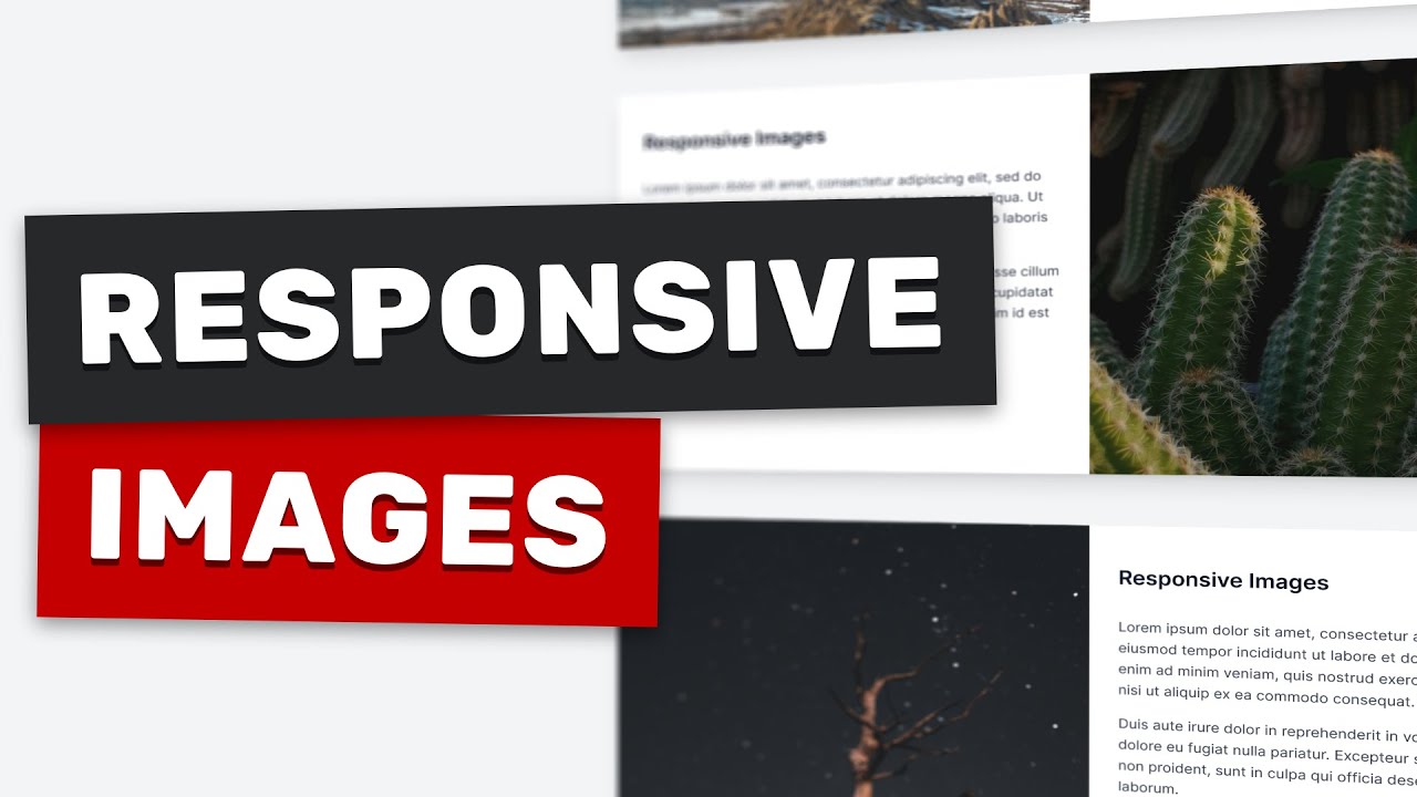
In this video you will learn how to optimize your website by only loading the most optimal image size depending on the viewport width. We will be going over three different examples step-by-step.
We are going to be using the srcset and sizes img attributes. Using these we can tell the browser of all the possible sizes of our image. In addition to that, we can tell in which viewport sizes should each image be loaded.
Using responsive images helps you get a faster website and better user experience.
At the end of this tutorial, you will have the necessary skills to implement responsive images on any website and layout.
00:00 - Introduction
00:45 - Full width image
02:17 - Container image
06:30 - Two column image
09:30 - Conclusion
Responsive Images Tutorial 2022 - img srcset and sizes
Make Your Site Lightning Fast With Responsive Images
The Ultimate Guide to Responsive Images
HTML Tutorial - Responsive image markup
CSS Responsive Images Tutorial: How to Make Images Responsive in CSS?
MUST KNOW methods to MASTER Responsive Images in HTML & CSS in 20 minutes | Responsive Design
Create responsive images with srcset and sizes
How to Make Images Responsive in HTML & CSS // Responsive Web Design Tutorial
Using srcset for responsive images
Turbo Tutorial | Learn about responsive image basics
Responsive images with media queries
CSS Background Images and Responsive Image Properties for Beginners
How to Make ANY Image Responsive (3 WAYS) | Responsive Image CSS | CSS Tutorial
Elementor - 3 Big Responsive Image Tips and How to Swap Images with CSS
Responsive Image With Text Section Design Using CSS Grid | Grid Layout | #DeveloperHub
31. Add Responsive Images using HTML IMG element, src, srcset and sizes attributes - HTML
Responsive Images In Webflow #shorts
Figma Plugin For Responsive designs
Responsive Image CSS | CSS Responsive Images Tutorial: How to Make Images Responsive in CSS? #120
Figma responsive component crash course
Tutorial - Automatically Deliver Responsive Images and Videos for Websites with Cloudinary
HTML Course Beginner to Advance | Responsive Images in HTML | Web development Course Lecture 6
Responsive design in 59 seconds #shorts
[HTML-Tutorial-14] srcset & sizes Attributes | Responsive Images (Part -1) | Web Development
Комментарии
 0:09:54
 0:14:13
 0:09:33
 0:06:05
 0:07:43
 0:25:12
 0:00:23
 0:08:17
 0:00:47
 0:05:11
 0:04:18
 0:46:50
 0:08:08
 0:05:29
 0:03:07
 0:12:25
 0:00:59
 0:00:25
 0:01:38
 0:00:57
 0:12:34
 0:33:21
 0:01:00
![[HTML-Tutorial-14] srcset &](https://i.ytimg.com/vi/Y7FpDmszZm4/hqdefault.jpg) 0:23:40
0:23:40