filmov
tv
How to Add a Trendline in Excel
Показать описание
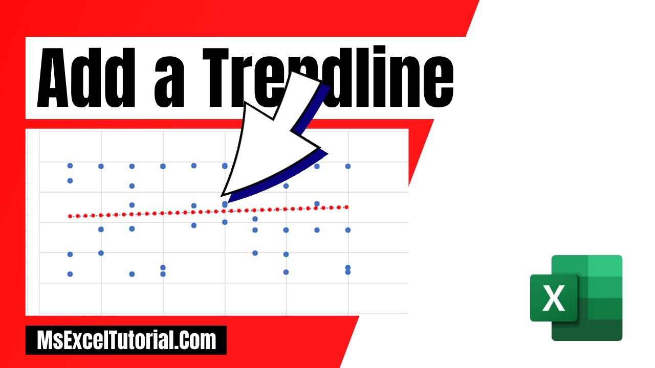
*How to Add a Trendline in Excel Using a Linear Trendline*
Adding a trendline in Excel is a straightforward and empowering technique to visualize the trend within your data set. Trendlines help identify the direction of data over a period of time. In this Excel tutorial for beginners, you'll walk-through the simple steps to add a linear trendline to your data in Excel, specifically using a scatter chart with dates in Column A and amounts in Column B.
*Step-by-Step Guide*
1. *Prepare Your Data*
- Ensure your data is properly organized like in the video; dates are in Column A, and corresponding amounts are in Column B.
2. *Create the Scatter Chart*
- Highlight the data range in columns A and B.
- Go to the “Insert” from the Excel ribbon.
- In the “Charts” group, click “Scatter” and select the “Scatter” option.
3. *Add the Linear Trendline*
- Once the chart is created, click on any data point within the chart to select the data series.
- Right-click on the selected data point or click on the “+” sign next to the chart.
- In the context menu or the Chart Elements menu, click on “Add Trendline.”
4. *Select the Trendline Type*
- In the “Trendline Options” pane, choose “Linear.”
- The linear trendline will be added to your chart, providing a straight line that best fits the data points.
5. *Customize the Trendline*
- You can format the trendline by clicking on it and then using the formatting options. This includes changing the line color, style, and width to make it distinct and visually appealing.
- Optionally, you can display the equation on the chart by checking the “Display Equation on chart” option in the “Trendline Options” pane. This shows the mathematical representation of the trendline.
6. *Final Adjustments*
- Adjust the chart title, axis titles, and legend to ensure your chart is clear and informative.
- Fine-tune other chart elements by right-clicking on them and selecting the appropriate formatting options.
*Benefits of Using Linear Trendlines*
- *Simple Interpretation:* Linear trendlines are straightforward to interpret, showing a steady rate of increase or decrease.
- *Forecasting:* They can be used to make future projections based on past data trends.
- *Customization:* Excel allows various customization options to tailor the trendline to your needs.
*Tips for Effective Charts*
- *Consistent Data Intervals:* Ensure your dates are in a consistent interval (e.g., daily, weekly) for accurate trendline analysis.
- *Clear Labels:* Always label your axes and provide a descriptive chart title.
- *Visual Clarity:* Use contrasting colors for your trendline and data points to ensure clarity.
Now, you can effectively add a linear trendline in Excel, enhancing your ability to visually analyze and interpret data trends.
#Trendline #Chart #exceltutorial
Thanks for watching.
----------------------------------------------------------------------------------------
Support the channel with as low as $5
----------------------------------------------------------------------------------------
Please subscribe to #excel10tutorial
Here goes the most recent video of the channel:
Playlists:
Social media:
 0:00:33
 0:02:56
 0:03:15
 0:09:25
 0:00:54
 0:00:30
 0:01:03
 0:00:51
 0:08:49
 0:01:26
 0:02:58
 0:01:33
 0:03:33
 0:01:50
 0:04:53
 0:03:47
 0:04:16
 0:00:24
 0:02:24
 0:06:43
 0:00:54
 0:01:33
 0:04:16
 0:02:04