filmov
tv
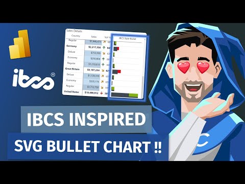
IBCS-styled Column Chart in Power BI Matrix Visual | It's NOT a Custom Visual !!!

Показать описание
How can you create an IBCS-styled column chart in Power BI using just the built-in Matrix visual and a single DAX measure?
What does the DAX measure used to generate the chart do?
How can you create a three-line title (IBCS-recommended title layout) in Power BI visual?
Why are the columns in this IBCS-styled chart either solid black, hatched, or outlined?
What do the gray triangles represent?
What do the green/red rectangles signify?
===
Power BI Implementation: Andrzej Leszkiewicz, IBCS® Certified Analyst
00:00 Intro. What do we see on the chart?
01:28 Chart review
04:52 Chart review v.2 (sorry, video editing error, 2 versions of the same chapter)
09:20 How the chart was created? (Matrix Visual, 3 lines title)
15:40 DAX measure that creates SVG code (code review)
31:29 Final comments
 0:32:27
IBCS-styled Column Chart in Power BI Matrix Visual | It's NOT a Custom Visual !!!
![[IBCS] New Column](https://i.ytimg.com/vi/4Kn9jmgUlnY/hqdefault.jpg) 0:17:01
0:17:01
[IBCS] New Column chart in Power BI - Feb 2024 Update
![[IBCS] Advanced Power](https://i.ytimg.com/vi/jvJd-Vqa8EU/hqdefault.jpg) 0:30:13
0:30:13
[IBCS] Advanced Power BI Tutorial - Native Column Chart
 0:14:51
NATIVE OVERLAPPING BARS in POWER BI // IBCS Style Variance Bar Chart Step by Step Guide
![[IBCS] Advanced Power](https://i.ytimg.com/vi/00Q6o0tddd0/hqdefault.jpg) 0:37:00
0:37:00
[IBCS] Advanced Power BI Tutorial - Native Bar Chart (With PBIX)
 0:16:27
Take Your Bar Charts to Next Level | IBCS Style Variance Chart in Power BI | MiTutorials
 0:25:17
Vega Bar Chart Example + Magic! = IBCS-Styled Chart for Power BI
 0:00:39
Configure IBCS standards in Power BI using Bullet Chart Custom Visual
 0:02:42
IBCS Style bar chart using small multiples in Power BI
 0:06:55
IBCS Styled Bullet Chart for Native Tables in Power BI!
 0:15:06
Create IBCS-compliant tables using DEFAULT MATRIX visual and SVG // Beginners Guide to Power BI
 0:43:32
How To Create Deneb IBCS-style Performance Visual In Power BI
 0:51:23
IMPROVED - IBCS Styled Bullet Charts (SVG) in Power BI!
 0:26:15
Want to Upgrade Your Power BI Matrix into an Advanced IBCS Style Data Visualization? Here's How...
 0:01:15
IBCS Table in Microsoft Power BI
 0:02:11
IBCS Template Tables in Power BI
 0:08:01
NO CUSTOM VISUAL | Create this Variance Chart in Power BI
 0:20:14
1 Trick for Endless Power BI Charts!
 0:08:52
Follow STANDARDS when designing reports using the IBCS Standards - Key Takeaways for Power BI
 0:31:54
NATIVE Power BI Table - Advanced Tutorial
 0:17:28
IBCS-ish Charts with Deneb in Power BI
 0:09:43
Transforming a table into a fancy bar chart - Power BI
 0:00:52
Is it the best Power BI custom visual? But's it's just a built-in Matrix! #dataviz #powerb...
 0:02:02
IBCS Template Tables in Power BI
Комментарии