filmov
tv
How to create a better research poster in less time (#betterposter Generation 1)
Показать описание
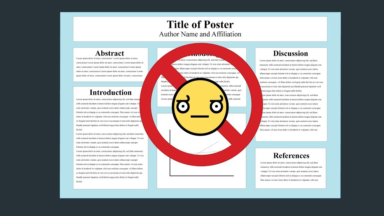
Every field in science uses the same, old, wall-of-text poster design. If we can improve the knowledge transfer efficiency of that design even by a little bit, it could have massive ripple effects on all of science.
Also, poster sessions tend to suck, so here's my pitch to make them more efficient AND more fun with a new approach to designing scientific posters/academic posters that is both more usable, and easier to create!
MY TWITTER (tag me in me your poster selfies!!):
PORTRAIT LAYOUT (alpha version)...
WAIT NEVERMIND: Ignore what I said about colors. Instead, use colors that trigger the right emotions to fit your punchline, when possible. Failing that, use colors that complement/repeat colors from a key graphic/image. Try to do something above defaulting to your school's bg color.
FAQ: HOW DID YOU MAKE THIS VIDEO?
FAQ: BUT IT'S MISSING [WHATEVER] THING I NEED
Add it! As in the video, I was aiming for a minimal base, with nothing to take away. There's plenty of stuff that can be added. Got an idea? Modify it and let me know how it goes! This is not the only way to do a poster well, nor is it perfect in all cases. Just one suggestion that, I think, is at least a step in the right direction from the wall of text. You can take it way further. It's more important that you experiment with lots of ideas than 'decide' on one layout.
FAQ: BUT MY FIELD IS VISUAL. I NEED A WALL OF VISUALS AND TEXT
In my experience, visual fields (e.g., org chem, robotics, planetary science) can actually go even more minimalist than this standard #betterposter layout. If that's you, think of your poster as a very brief visual story, that can be absorbed from 6 feet away. See how few images & sentences you can use to communicate your key methods and results.
THANKS
 0:06:05
How do we create a better economy?
 0:08:32
This Is How We Create a Better Future
 0:09:29
Jordan Peterson: How to CREATE a Better FUTURE for Yourself
 0:02:15
How to Create Better Relaxing Videos Under 2 Mins (Viral Niche)
 0:00:26
How To Create Better PowerPoint Charts in 10 Seconds
 0:15:22
I Challenged AI to Create a Better YouTube Channel Than Me... Here's What Happened
 0:07:08
7 better ways to create a React app
 0:03:02
Nancy Duarte: How to Create Better Visual Presentations
 0:00:57
How do you create more options in your life?
 0:16:32
How to create a better typography on Procreate【iPad Pro】
 0:16:14
How to Create Content that's “Better” than Your Competitor’s
 0:06:08
How To Create Better Lessons
 3:39:09
Tim Ferriss: How to Learn Better & Create Your Best Future | Huberman Lab Podcast
 0:19:32
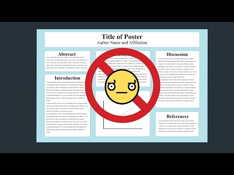
How to create a better research poster in less time (#betterposter Generation 1)
 0:11:13
How Breaking Rules Could Create Better Apartments
 0:20:53
How to create a better research poster in less time (#betterposter Generation 2).
 0:39:54
Create Better Motion Graphics Like Vox in After Effects | Tutorial #15
 0:02:14
How To Start Your YouTube Videos & Create BETTER Hooks!
 0:06:38
Create Better AI Images, Save Time & Yobeans On Yodayo AI
 0:11:08
How to Create Better Instagram Content in Canva (in less time!) | CANVA FEATURES YOU NEED TO KNOW
 0:08:49
Create better art - build your art intuition!
 0:10:23
Rewrite Your Story and Create a Better Future... Guided Meditation
 0:05:39
Best AI Art generators & AI tools to create better artwork!
 0:00:39
🔥 Photoshop Pro Tip: Create Custom Brushes for Better Mask Edges
Комментарии