filmov
tv
This Simple Color Theory Always Works

Показать описание
Let's talk about some simple colour plans you can easily apply! These are ideas that have always worked for me.
Below is an Automagically generated summary to help understand the video and aid search optimisation: (I think it does a pretty good job of summing things up, despite sounding a bit generic)
----
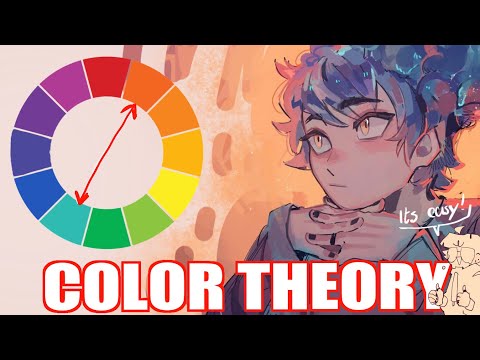
Mastering color in art can be daunting, but starting with a simple color scheme is a great way to avoid frustration. In this video, I share a straightforward approach to planning and applying colors that has consistently worked for me, keeping it basic to ensure you can apply these principles in your artwork.
The essence of this method is to first identify any necessary colors based on your scene or key elements, like a character's costume or the environment's natural hues. This foundational step helps establish a logical starting point for your color scheme.
From there, choose between two basic color schemes:
Complementary Color Scheme: Select colors opposite each other on the color wheel for a vibrant yet harmonious look.
Analogous Color Scheme: Use colors next to each other on the color wheel for a more subdued, cohesive appearance.
This approach simplifies the decision-making process, guiding you to either amplify vibrancy or maintain harmony in your artwork. Additionally, consider whether your image truly benefits from multiple vibrant colors. Often, less is more, and a limited palette can lead to a more impactful and cohesive piece.
In practical terms, start with the dominant color of your setting or significant element and build your scheme around it. Whether opting for complementary colors for pop or analogous hues for harmony, simplicity in your color choices can lead to sophisticated outcomes.
I also share some examples from my own work. And show how adhering to these simple plans—whether in a desert scene or a forest backdrop—can result in effective and appealing color compositions. It's about making informed choices that serve your artistic vision, without overcomplicating the process.
Remember, the goal is not to restrict creativity but to channel it more effectively through a well-considered color strategy. By focusing on what's essential and applying these basic color schemes, you can enhance your art's emotional impact and visual coherence.
----
Happy Drawing!
Tim Mcburnie
 0:25:42
This Simple Color Theory Always Works
 0:07:45
Something strange you should know about color | QUICK ESSENTIALS
 0:11:45
You HAVE to use this Color in EVERY Artwork! | Color Theory | DrawlikeaSir
 0:08:54
Color Theory for Noobs | Beginner Guide
 1:20:34
Forget Complex Color Theory... This Is All You Need!
 0:14:34
Art Teachers HATE this trick | COLOR THEORY | Drawlikeasir
 0:07:45
Basic Color Theory
 0:05:00
Color Theory Basics
 0:10:45
Color Theory - A Beginners Guide
 0:06:58
COLOR THEORY BASICS: Use the Color Wheel & Color Harmonies to Choose Colors that Work Well Toget...
 0:10:34
Basic Color Theory
 0:12:05
🎨 EASY COLOR THEORY to color like a PRO (art tutorial - beginner)
 0:17:53
COLOR THEORY - My Ideal Palette and Color Mixing Strategies for realistic Colors
 0:07:42
Minecraft Color Theory - Instantly improve your builds!
 0:05:35
5 Things I Tell Beginner Digital Artists
 0:29:14
COLOR THEORY FOR ARTISTS | Resources and Step by Step Techniques for Painting, Mixing and Composing
 0:13:48
Color Theory for BEGINNERS + How to ACTUALLY use it in Digital Painting
 0:20:14
A New Way to Think About Colors
 0:07:14
ADVANCED Colour Theory Makes Designs SUPERIOR! (With Real Examples)
 0:09:52
Basic Color Theory & Color Harmonies
 0:09:07
Full Guide: How To Combine Colors In Your Outfits | Color Theory For Men’s Fashion
 0:14:15
Color Theory Lesson, Pt. 1 - for Artists or Anyone Else
 0:04:05
How to use the Color Wheel to Make Satisfying Outfits.
 0:02:06
Basic Color Theory: Decorating with Color
Комментарии