filmov
tv
GNOME Shell on Mobile!

Показать описание
JUMP TO A SECTION:
0:15 Intro
0:53 Shell layout
- 1:15 quick settings
- 1:30 screenshot UI
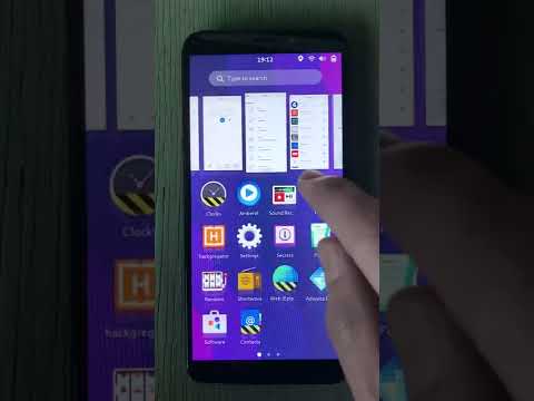
- 2:10 home screen/apps on desktop; similar to Endless OS
- 2:56 gesture navigation
- 3:48 keyboard swipe to dismiss
- 4:08 default/dark style quick toggle, animated splash screen
- 4:55 live window thumbnails
6:00 Paper app (for notes)
- 6:10 LibAdwaita About window, window management
6:46 Files (nightly), context menus, desktopiness
- 7:25 Oops, floating windows
- 7:55 more desktopiness in nightly Files
- 8:57 double-click to open doesn't work on touch…
9:35 Keyboard
11:05 Clocks
12:23 Calculator
- 12:48 per-app accent color
- 13:10 text input magnification
- 13:28 oops window management
- 13:49 unsolicited design feedback
14:40 GNOME Web (nightly)
- 14:56 multi-touch
- 15:01 default/dark style CSS
- 15:10 preferences
- 15:19 reader mode
- 16:09 tabs, basic UI
16:43 Settings
- 16:56 About
- 17:30 Displays (oops, window management)
- 18:06 Appearance (default/dark style, wallpaper demo)
- 18:28 Multitasking… desktop settings on a phone?
19:30 Third-party apps
- 19:30 Amberol
- 19:48 GTK4 popover touch bug?
- 20:03 oops window management
- 20:36 beautiful default/dark style
- 20:55 an aside about Notifications
- 21:17 Blanket
- 21:26 MPRIS integration = media controls in quick settings
- 21:58 Drawing (oops, untested)
- 22:07 meta discussion about GNOME Software and non-mobile apps
23:13 GNOME Shell on mobile is so smooth!
- 23:24 quick settings toggles
- 23:57 lock/unlock screen
- 22:06 type to search
- 25:40 oops I opened Lollipop
25:49 Misc
- 25:50 Chats
- 26:30 my apps (Clairvoyant, Dippi)
- 26:50 wrap up
Hey all, sorry about the rough quality here. I meant to upload and edit this later, but YouTube decided to make it public lol
So here you go in all its unedited glory, including me hitting the tripod at least twice!
Phone: OnePlus 6T
OS: postmarketOS Edge with GNOME Mobile
0:15 Intro
0:53 Shell layout
- 1:15 quick settings
- 1:30 screenshot UI
- 2:10 home screen/apps on desktop; similar to Endless OS
- 2:56 gesture navigation
- 3:48 keyboard swipe to dismiss
- 4:08 default/dark style quick toggle, animated splash screen
- 4:55 live window thumbnails
6:00 Paper app (for notes)
- 6:10 LibAdwaita About window, window management
6:46 Files (nightly), context menus, desktopiness
- 7:25 Oops, floating windows
- 7:55 more desktopiness in nightly Files
- 8:57 double-click to open doesn't work on touch…
9:35 Keyboard
11:05 Clocks
12:23 Calculator
- 12:48 per-app accent color
- 13:10 text input magnification
- 13:28 oops window management
- 13:49 unsolicited design feedback
14:40 GNOME Web (nightly)
- 14:56 multi-touch
- 15:01 default/dark style CSS
- 15:10 preferences
- 15:19 reader mode
- 16:09 tabs, basic UI
16:43 Settings
- 16:56 About
- 17:30 Displays (oops, window management)
- 18:06 Appearance (default/dark style, wallpaper demo)
- 18:28 Multitasking… desktop settings on a phone?
19:30 Third-party apps
- 19:30 Amberol
- 19:48 GTK4 popover touch bug?
- 20:03 oops window management
- 20:36 beautiful default/dark style
- 20:55 an aside about Notifications
- 21:17 Blanket
- 21:26 MPRIS integration = media controls in quick settings
- 21:58 Drawing (oops, untested)
- 22:07 meta discussion about GNOME Software and non-mobile apps
23:13 GNOME Shell on mobile is so smooth!
- 23:24 quick settings toggles
- 23:57 lock/unlock screen
- 22:06 type to search
- 25:40 oops I opened Lollipop
25:49 Misc
- 25:50 Chats
- 26:30 my apps (Clairvoyant, Dippi)
- 26:50 wrap up
Hey all, sorry about the rough quality here. I meant to upload and edit this later, but YouTube decided to make it public lol
So here you go in all its unedited glory, including me hitting the tripod at least twice!
Phone: OnePlus 6T
OS: postmarketOS Edge with GNOME Mobile
 0:27:15
GNOME Shell on Mobile!
 0:00:16
GNOME Shell on mobile, gnome-mobile postmarketOS wt86047 kernel 5.18.0
 0:09:14
GNOME mobile 46 - postmarketOS 24.06 - OnePlus 6t (fajita) - OSK Update (see description)
 0:19:29
Gnome Shell on my Pinephone Pro
 0:14:35
GNOME Shell on Mobile - postmarketOS - OnePlus 6t (fajita) 2024-02-21
 0:00:23
Gnome Shell on mobile: gestures
 0:03:27
Whats Gnome Shell Mobile anyway? + opinion
 0:07:12
Linux on smartphones - Mobile Gnome Shell + postmarketOS on a OnePlus 6
 0:08:34
CONHEÇA O ARCH LINUX GNOME 2025
 0:16:26
Can a GNOME Linux Phone be Daily Driven?
 0:05:25
Gnome Shell on the PinePhone - HomebrewXS
 0:27:37
Inkscape, NixOS, Linux Mint, PulseAudio, GNOME Shell on Mobile and more Linux news!
 0:05:02
Gnome Mobile on PinePhone: First Look
 0:00:18
Gnome Shell Mobile 46 QuickSettings on both Orientation #linuxmobile #linux #gnomeshell #linuxphone
 0:15:17
Fedora 37 Beta and GNOME Shell mobile - Linux and open source News
 0:01:00
PostmarketOS edge with Software Center & bootsplash, Gnome Shell Mobile w/ Gnome 44, PIN lock sc...
 0:02:31
Mainline Linux and GNOME on the Nexus 5 (postmarketOS)
 0:02:27
Gnome Shell for Mobile Phones looks ready - Technology News
 0:13:25
Is GNOME ready to tackle the SMARTPHONE ? A tour of Phosh on the PinePhone
 0:05:02
GNOME Shell/Desktop for Mobile Devices: A Promising Start with Huge Expectations is Shaping Up Nice
 0:09:32
Gnome stack performance on the PinePhone and Samsung Galaxy SII
 1:00:48
282: Linux on Smartphones & GNOME Shell on Mobile
 0:10:55
GNOME Shell & Mutter Finally Drop GTK3!!
 0:02:34
GNOME on Phones: Librem5 - Phosh Shell App Switcher
Комментарии