filmov
tv
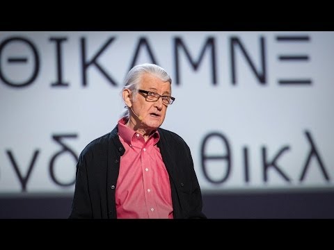
Matthew Carter: My life in typefaces

Показать описание
Pick up a book, magazine or screen, and more than likely you'll come across some typography designed by Matthew Carter. In this charming talk, the man behind typefaces such as Verdana, Georgia and Bell Centennial (designed just for phone books — remember them?), takes us on a spin through a career focused on the very last pixel of each letter of a font.
TEDTalks is a daily video podcast of the best talks and performances from the TED Conference, where the world's leading thinkers and doers give the talk of their lives in 18 minutes (or less). Look for talks on Technology, Entertainment and Design -- plus science, business, global issues, the arts and much more.
TEDTalks is a daily video podcast of the best talks and performances from the TED Conference, where the world's leading thinkers and doers give the talk of their lives in 18 minutes (or less). Look for talks on Technology, Entertainment and Design -- plus science, business, global issues, the arts and much more.
Matthew Carter: My life in typefaces
Matthew Carter - Typographer
Matthew Carter - ATypI 2018 - Keynote: Over the top
Matthew Carter on untypical typefaces -- trailer
Matthew Carter shares his triumph over trauma
Timeless in a time of change | Matthew Carter | Morisawa TypeDesign Competition 2024 Special Seminar
54 Advanced Academic Words Ref from 'Matthew Carter: My life in typefaces | TED Talk'
193 Academic Words Ref from 'Matthew Carter: My life in typefaces | TED Talk'
DETV News Special: Inauguration of Matthew Meyer as 76th Governor of Delaware
193 Academic Words Quick Look Ref from 'Matthew Carter: My life in typefaces | TED Talk'
Matthew Carter on untypical typefaces
Type Designer Matthew Carter: 2010 MacArthur Fellow | MacArthur Foundation
2011 National Design Awards: Lifetime Achievement Award - Matthew Carter
Your Story is Your Superpower! | Matthew Carter | TEDxHilliard
20 Years of Marriage, One Text, and the Shocking Truth About My Wife
Funeral held for Matthew Carter
Howard Schatz: Interview with Matthew Carter
Curator Recommendations - Matthew Carter
A Conversation with Type Designer Matthew Carter (Part 1 of 3)
Matthew Carter at Integrated2011 (Antwerp)
I Turned My House Into A Fish Tank!
The Science of Sleep (and the Art of Productivity) | Dr. Matthew Carter | TEDxNorthAdams
Matthew Carter: Seeing You There (Cut) - Ordinary Days
Typographics 2019: The Designer’s Role with Matthew Carter
Комментарии
 0:16:02
 0:01:01
 0:46:37
 0:02:12
 0:09:20
 0:11:49
 0:29:34
 1:39:12
 1:19:59
 0:17:07
 0:33:47
 0:02:10
 0:06:45
 0:15:17
 0:40:26
 0:00:25
 0:04:14
 0:02:54
 0:21:35
 0:01:19
 0:09:54
 0:18:21
 0:00:59
 0:18:07