filmov
tv
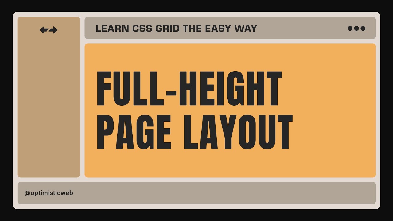
CSS Grid - Create a FULL-HEIGHT RESPONSIVE Layout in Minutes
Показать описание
You won't believe how easy it is to create a stunning full-height page using CSS Grid! Learn CSS grid and build fully responsive web page layouts.
In this CSS tutorial, we're diving deep into the world of CSS Grid to build a fully responsive full-height page layout that adapts perfectly to any screen size. Whether you're a beginner or a seasoned developer, this front-end development tutorial is packed with tips and tricks to elevate your web design skills.
We'll walk through every step of the process, from setting up the grid container to defining rows and columns, all while ensuring our layout remains responsive and visually appealing. We’ll explore the powerful `grid-template-areas` property and discover how to create an organized structure for the web page. Make sure to like, share, and subscribe for more amazing front-end development tutorials! Leave your questions in the comments below, and let’s conquer CSS Grid together!
Related Topics
-----------------------------------------------------
- How to create a full-height page layout with CSS grid
- Responsive CSS grid layout: a step-by-step tutorial
- Learn CSS grid the easy way
Chapters
-----------------------------------------------------
00:00 Intro
00:43 Setup for the demo project
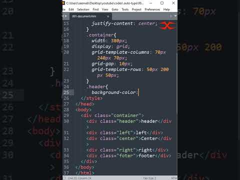
01:26 CSS grid for the full-height page layout
02:54 The repeat() function
04:32 Using grid-template-areas for the placement
07:13 Resizable sidebar
Subscribe and never miss a beat
-----------------------------------------------------
Learn at your own pace
-----------------------------------------------------
Connect, share, and grow
-----------------------------------------------------
#css #cssgrid #cssgridlayout #responsivewebdesign #frontenddesign #frontendtutorial #csstricks #frontenddevelopment #webdevelopment #codingtips #webdevtutorial #csstutorial #csstips #cssmagic #cssshorts #cssforbeginners #css3 #learncss #optimisticweb
In this CSS tutorial, we're diving deep into the world of CSS Grid to build a fully responsive full-height page layout that adapts perfectly to any screen size. Whether you're a beginner or a seasoned developer, this front-end development tutorial is packed with tips and tricks to elevate your web design skills.
We'll walk through every step of the process, from setting up the grid container to defining rows and columns, all while ensuring our layout remains responsive and visually appealing. We’ll explore the powerful `grid-template-areas` property and discover how to create an organized structure for the web page. Make sure to like, share, and subscribe for more amazing front-end development tutorials! Leave your questions in the comments below, and let’s conquer CSS Grid together!
Related Topics
-----------------------------------------------------
- How to create a full-height page layout with CSS grid
- Responsive CSS grid layout: a step-by-step tutorial
- Learn CSS grid the easy way
Chapters
-----------------------------------------------------
00:00 Intro
00:43 Setup for the demo project
01:26 CSS grid for the full-height page layout
02:54 The repeat() function
04:32 Using grid-template-areas for the placement
07:13 Resizable sidebar
Subscribe and never miss a beat
-----------------------------------------------------
Learn at your own pace
-----------------------------------------------------
Connect, share, and grow
-----------------------------------------------------
#css #cssgrid #cssgridlayout #responsivewebdesign #frontenddesign #frontendtutorial #csstricks #frontenddevelopment #webdevelopment #codingtips #webdevtutorial #csstutorial #csstips #cssmagic #cssshorts #cssforbeginners #css3 #learncss #optimisticweb
 0:13:35
Learn CSS Grid - A 13 Minute Deep Dive
 0:01:51
CSS Grid in 100 Seconds
 0:00:24
Learn CSS Grid Column and CSS Grid Row in 24 Seconds
 0:06:14
Create Responsive CSS Grid Layouts with GRID WRAPPING
 0:17:14
Responsive CSS Grid Tutorial
 0:11:37
The Joy of CSS Grid - Build 3 Beautifully Simple Responsive Layouts
 0:00:18
CSS Grid trick that’s worth remembering
 0:17:15
Intro to CSS Grid - Create a Basic Layout - Web Design Tutorial
 1:21:02
Louisville .NET Meetup - Coding Paradise: The Future of App Creation with .NET Maui
 0:18:35
Learn CSS Grid in 20 Minutes
 1:02:44
CSS Grid Course
 0:11:04
How to create RESPONSIVE Layouts with CSS GRID
 0:07:10
Simplify your CSS with these 3 grid layout solutions
 0:01:00
CSS Grid Template Area Tutorial Speedrun
 0:00:24
Learn CSS Flexbox Flex-wrap in 24 Seconds
 0:28:00
How to Create Website Layouts Using CSS Grid | Learn HTML and CSS | HTML Tutorial
 0:00:59
CSS Grid | HTML CSS
 0:04:37
Learn How to Make a Responsive CSS Grid Layout
 0:37:04
Learn CSS Grid the easy way
 0:43:12
#37 CSS Grid Tutorial [Complete Guide] - CSS Full Tutorial
 0:31:52
Learn how to create a responsive CSS grid layout
 0:16:49
How To Create A CSS Grid | Build Responsive Website With CSS Grid Layout
 0:27:28
Master CSS Grid 2024 | build 5 CSS Grid Layouts 🔥 | Beginner - Master | Responsive Design | CSS Grid...
 0:53:45
CSS Grid Crash Course
Комментарии