filmov
tv
Create Responsive Font Sizes for Dynamic Labels Based on Screen Size - Power Apps Tutorial

Показать описание
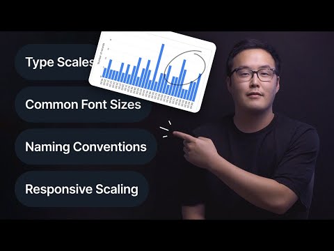
Responsive Font Size in Power Apps: Create Dynamic Labels Based on Screen Size
In this video, we'll explore how to adjust font sizes in your Power Apps gallery based on screen size. This technique ensures that your labels and headers adapt to different device dimensions, enhancing the user experience across various screen sizes.
Here's what you'll learn:
- Setting up dynamic font sizes for labels and headers based on the screen size.
- Understanding size breakpoints in Power Apps and how to modify them for better responsiveness.
- Troubleshooting common issues with screen size detection and testing.
🔧 Steps to Adjust Font Size Based on Screen Size:
2. Observe how the size value changes with different screen widths (1 = small, 2 = medium, 3 = large, 4 = extra large).
3. Set conditional font sizes for labels within the gallery based on this screen size value.
4. Apply similar conditions to headers for consistency across your app.
5. Optionally, refine the formula to handle additional conditions for even smaller screens.
💡 Helpful Tips:
- The screen size value may not update accurately in Play mode. Test using actual device dimensions or browser inspection tools.
- Adjust the size breakpoints in the app properties to customize how screen sizes are classified.
🔔 Subscribe and Support the Channel!
If you found this video useful, please subscribe to our channel and hit the like button. Your support helps us create more valuable content!
💬 Comment Below!
Share your thoughts or questions about dynamic font sizing and screen responsiveness in Power Apps. We appreciate your feedback!
Questions This Video Might Answer:
- How do you adjust font sizes based on screen size in Power Apps?
- What are the size breakpoints in Power Apps, and how can they be modified?
- How can you troubleshoot issues with screen size detection?
🔑 Keywords: dynamic font size Power Apps, screen size adjustment, Power Apps gallery, responsive design Power Apps, screen size breakpoints, font size conditions, Power Apps tutorial, label size adjustment, header size adjustment, app responsiveness, Power Apps screen size properties.
Thanks for watching, and stay tuned for our next video, where we'll cover how to add a scroll bar to your gallery when it overflows the screen width!
Hashtags: #PowerApps #ResponsiveDesign #FontSizing #AppDevelopment #MicrosoftPowerApps
 0:09:21
 0:08:37
 0:12:52
 0:15:18
 0:07:09
 0:08:45
 0:09:19
 0:06:05
 1:05:25
 0:10:04
 0:00:51
 0:09:27
 0:18:12
 0:04:42
 0:00:17
 0:23:13
 0:06:37
 0:05:05
 0:00:22
 0:05:01
 0:20:59
 0:04:16
 0:07:06
 0:13:42