filmov
tv
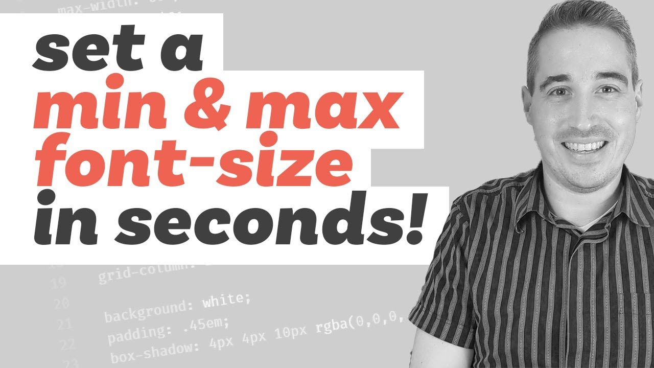
min(), max(), and clamp() are CSS magic!
Показать описание
CSS has come a long way, but min(), max(), and clamp() make a lot of things a lot easier than they used to be, and really open up the world of responsive typography like we never had before! Clamp() is the ingredient that we've needed for a long time to really be able to make type fully responsive in our CSS, and to be able to do it on one line is absolute magic!
#css #responsive #typography
--
Come hang out with other dev's in my Discord Community
---
Keep up to date with everything I'm up to
---
Help support my channel
---
---
I'm on some other places on the internet too!
If you'd like a behind the scenes and previews of what's coming up on my YouTube channel, make sure to follow me on Instagram and Twitter.
---
And whatever you do, don't forget to keep on making your corner of the internet just a little bit more awesome!
 0:18:12
min(), max(), and clamp() are CSS magic!
 0:10:57
Using the CSS Numeric Functions - min, max, calc, clamp, and minmax
 0:14:54
Advanced CSS | Understanding CSS min( ), max( ), and clamp( )
 0:08:37
Responsive Typography with CSS Clamp
 0:03:17
CSS Functions: min(), max() and clamp() 🔥 #shorts
 0:10:06
CSS Функции calc(), min(), max(), clamp()
 0:10:24
min(), max(), and clamp() are CSS Magic!
 0:54:03
PB101: L06 - Fluid Responsive Development With Math Functions (clamp, min, max, calc)
 0:07:12
3 Responsive sizing with min, max, and clamp - typography
 0:14:32
3 modern CSS techniques for responsive design
 0:27:33
CSS Min() Max() Clamp() Function Tutorial in Hindi / Urdu
 0:05:31
¿Cómo se usa min(), max() y clamp()? Te enseño bien fácil.
 0:11:42
CSS функции min, max и clamp с примерами использования
 0:08:52
min-content, max-content, fit-content - intrinsic sizing with CSS
 0:09:21
Web-заметки №7. CSS-функции min(), max(), clamp()
 0:30:20
CSS Functions Tutorial for Beginners | min, max, clamp, minmax, calc, attr
 0:02:17
Math Operators - Max/Min/Clamp - Part 5 [BEGINNER]
 0:00:10
html css min max function min-width or max-width #minmax #clamp #javascript #html #css #trending #ai
 0:12:04
CSS функция clamp(). Адаптивный размер текста. Прощайте медиа-запросы....
 0:00:13
clamp is a function in CSS which claps a given value (default) between the minimum and maximum
 0:42:58
Day 13: CSS Functions :: min(), max(), clamp(), attr(), rgb(), url(), calc(), var(), etc.
 0:07:15
How to Use the CSS clamp Method
 0:18:24
Como utilizar min(), max() e clamp() do CSS para criar fontes responsivas? #RWD #responsiveWebDesign
 0:02:38
After Effects Tutorial - Clamp Expression
Комментарии