filmov
tv
Visualize Data with a Scatterplot Graph | FreeCodeCamp

Показать описание
I go through the logic behind a scatter plot graph made with React and d3. It is basically the same as the one on FreeCodeCamp, but I thought I would just try and explain how they did it. I am also going to be skipping the rest of the d3 projects and be going on to APIs. Thanks for watching and have a great day!
 0:06:23
Visualize Data with a Scatterplot Graph | FreeCodeCamp
 0:24:52
Visualize Data with a Scatterplot Graph - D3.js - FreeCodeCamp
 0:07:09
Science of Data Visualization | Bar, scatter plot, line, histograms, pie, box plots, bubble chart
 0:15:02
Free Code Camp Walkthrough 49 | Data Visualization - Visualize Data with a Scatterplot Graph
 0:57:01
Visualize Data with a Scatterplot Graph - freeCodeCamp Data Visualization Project Tutorial
 0:07:31
8 Creating Scatter Plot - Data Visualization in Excel Tutorial
 0:04:42
How to Make a Scatter Plot in Excel
 0:00:54
How to Make a Scatter Plot in Excel
 2:14:40
DAY 27:- Data Visualization using Python
 0:11:02
Data Visualization in 2024 | The Ultimate Guide
 0:05:03
How To Choose The Right Graph (Types of Graphs and When To Use Them)
 0:00:36
#Tableau - Animated Scatterplot
 0:01:26
How To Make A Scatter Plot In Google Sheets | Visualize Data Instantly
 0:09:22
Making a Scatter Plot in MS Excel using NBA Data | Data Visualization
 0:17:08
Visualize ANYTHING Using CHARTS in ChatGPT! (Data Analysis)
 0:12:51
Python Seaborn Scatterplot Tutorial | Python Data Visualization Tutorial | Color, Marker and Size!
 0:18:11
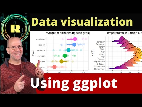
Visualize your data using ggplot. R programming is the best platform for creating plots and graphs.
 0:00:17
Excel tip to make a quadrant scatter plot chart
 0:00:21
Drawing Scatterplots is so Simple in Python! #python #pythoncode #pandas #scatterplot #DataViz
 0:00:13
Upgrade your scatter plots #scatterplot #datavisualization #data #bcg #consulting #charts
 0:00:10
GGPlot2 Scatter Plot Tutorial: Long vs One-Liner in R #R #DataViz
 0:00:16
Sales Data Visualization #dataanalysis #ai #datascience #machinelearning #visualization
 0:00:12
Base R vs. ggplot2 - Drawing Scatterplots! #rstats #statistics #dataviz #scatterplot #ggplot2
 0:00:23
How to Color Scatter Plot Point based on Cutoff Values in Graphpad #short #graphpad #tutorial
Комментарии