Hyperlegible: an approach to accessible type design
preview_player
Показать описание
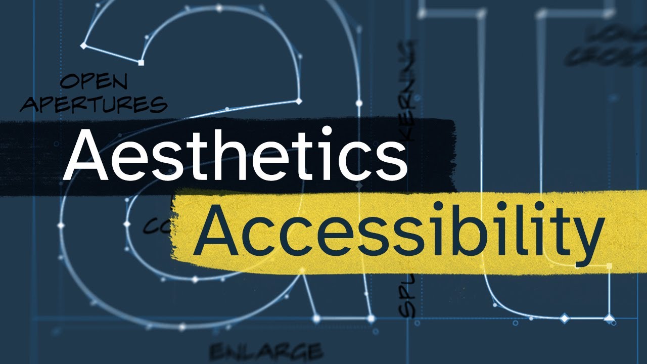
A case study on how Braille Institute's Atkinson Hyperlegible was designed to improve accessibility for people with low vision. Now available, free on Google Fonts and Google Docs.

For more information on the Braille Institute

#accessibility #legibility #inclusivedesign

Designed by Applied Design Works

Online talk at the Letterform Archive

00:00 Challenging what disability looks like
01:04 My connection and disclosure
01:17 The origin of Atkinson Hyperlegible
02:19 Harmonious design vs letter differentiation
03:39 Legibility tweaks on three levels
04:13 Level 1: Humanist legibility tweaks
04:51 Level 2: Differentiating homoglyphs (easily confused letters)
06:17 Level 3: Other vision challenges, and partial-homoglyphs
07:27 Putting it all together
08:43 How to add Atkinson Hyperlegible to Google Docs
09:07 Beyond one typeface

Sources:

Athletics highlights - Rio 2016 Paralympic Games

Beyond bionics: how the future of prosthetics is redefining humanity

The Phoenix i by Phoenix Instinct

Benjamin Hubert's Layer designs world's first 3D-printed consumer wheelchair

Can Prosthetics Outperform Real Limbs? Cyborg Nation

Video backgrounds by:

Music from Streambeats and Epidemic Sound
Рекомендации по теме
Комментарии
Автор

As a developer, I'll start using this font on every project. Besides improving accessibility, I think it is a beautiful font.

GermanAndres
Автор

As a programmer, if there was a monospaced version of this font I would switch my code editors to it in a heartbeat.

For just about everyone who programs, mono is king, avoiding homoglyphs is vital, and ease of reading is excellent. Atkinson Hyperlegible solves two out of these three masterfully, we just need a monospaced version.

masonbarber
Автор

I'm so happy someone is addressing the lowercase L vs uppercase i problem. It drives me crazy!!

julianatlas
Автор

This is a really great breakdown of why the balance between aesthetics and character differentiation in legibility. My clients are often very into the idea of accessibility, and I've been asked a few times if "dyslexic" fonts should be used in a more mainstream way, and struggle to explain the intricacies of why these kinds of super-differentiated, often very wonky, typefaces are not always the most accessible. I'll just send this video from now on instead of trying to explain it myself!

shannon
Автор

Such an amazing project, and that it’s free to use so broadly is even better! Thanks for your work on this, and sharing it with us, too.

Azeria
Автор

It's neat seeing some of the things I've added to my own handwriting to improve legibility in math work (flagged 1, serif l, and backslash 0) be used in a real font. The only thing it's missing is crossed 7s.

lazyyfox
Автор

As someone with dyslexia, i am very happy to see you cover accessibility in font design! Thank you to you and the rest of the team for creating this very helpful font

gouchnox
Автор

This makes my disabled yet design nerd self extremely happy! Congratulations on working on a project that I know will positively impact the lives of many.

geocadzow
Автор

I'm a designer from Brazil, and my wife has low vision. We LOVED your video, and really liked the new type. We've been using APHONT up and down, but we will try Atkinson Hyperlegible, and if it suit us, we're changing for sure. Thanks, and keep up the good work. :)

HeitorAmaral
Автор

BIA should reach out to Apple, Microsoft and Google to have the Atkinson Hyperlegible included by default in their future releases of Windows, Mac OS, iOS and Android.

mesteme
Автор

"The larger the x-height as a proportion of total vertical space, the more legible"

110% X-HEIGHT

jemesmemes
Автор

Hey Linus,
I dont know if you read comments on old videos, but I feel like I need to tell you about the impact this video had on me.
I am quite fond of accessible design due to a multitude of reasons. I was watching your videos before this one came out and still remember installing and using it for documents of my local club.
I since have written my bachelor thesis on the subject of accessibility, especially for government communication. The topic was to a large part inspired by this video and it enabled me to take an educated look at the document as a whole. Not only the building and facilities need to be accessible, but also the content and design of our communication, including the font. I have since received my degree and will start working at the councils office where I have written my thesis.
I am still hopeful that I can integrate accessible design in our workflow. Maybe we'll have a process that is way more accessible soon.
I love you and your videos, they have tought me a lot and they reinvigoured my interest in typography and logo design.
As some other commentator put it: You really are criminally underrated!

timowagner
Автор

This is incredible. As a graphic designer who works in disability justice this is often an issue I run into. I'd love to see your take on typefaces for neurodivergencies like dyslexia and ADHD. While existing fonts like OpenDyslexic and Dyslexie have given it a shot, the feedback I've received from dyslexic people has been mixed at best. Some time back I shared a meme in a disabled student group chat I started and it was met with excitement and enthusiasm! The meme involved a way of typing that made the first letter of key words bolder and jump out more, therefore leading the eye along without resistance and assisting many ADHD people read without becoming distracted. It's definitely an interesting and necessary design challenge

felixhenson
Автор

Very nice video and beautiful font. As a teacher it made me think of incorporating this typeface as a standard on the documents I make for the class.

alandB
Автор

I'm a teacher and I've been using this font in all the material I make for my students and some of them have asked me about the font, because it's easier on their eyes as they say, so you and the entire team should be really proud of what you've accomplished 👏

newfelo
Автор

As someone who has lived their entire life being legally blind, I'd like to thank you for trying to make things a little easier. It almost seems like legibility is an afterthought in so many products..from packaging to web design and text in video games. Something as simple as telling whether the instructions on a baking mix box say "3/4 or 1/4" cup can turn into a horrendous chore f or someone with visual impairment.
Thank you again for being a part of this project. You have helped produce something that will make countless lives a little easier.

bethanygunnels
Автор

Even for me who have normal vision, this font is still super helpful and improved my reading speed.

whff
Автор

Huh, these changes remind me a lot of what's done with monospace fonts meant for programming. Slashed/dotted zeroes, differentiating I/l/1, etc. It's another situation where you really don't want to have potentially confusing near-homoglyphs.

RyanTosh
Автор

One thing I noticed, when typing my own name- When I type "r" and "i" next to each other, the thing sticking out of the "i" is at the same level of the thing sticking out of the "r". Combined with how the thing sticking out of the "r" does not curl down like in most typical fonts, and how the "i" does not have that bottom flat line, the sequence "ri" in this font looks a lot more like an "n" than in the average font.

ericxue
Автор

As a person with ADHD i too strongly appreciate highly legible fonts, I'm way less likely to misread with good fonts

srenpeterkaagaardthuesen