filmov
tv
Pairing Fonts – 3 effective ways to combine typefaces, from easy to advanced
Показать описание
💌 Pimp my Type Newsletter with weekly font recommendations:
📰 Corresponding article with images:
TL;DW: First, decide if you really need another typeface, have a reason for it. Decide on a base, then find something to combine it with. For a quick win, use type families that contain different styles (most sans-serif and serif), and are designed to fit together. Another quick win is going for a very diverse combination. The most advanced level is looking at a typeface’s construction and pair similar underlying designs. Most important: have fun while doing it!
Basic Principles
🤔 Do you really need more than one typeface? You can achieve a lot with only one typeface by using a different style, like a bold heading or an italic, or a display style.
🤔 Use as little different styles as possible! Repeat your font choices as often as you can, and only when something does not work in a given situation, add a new style.
🤔 Have a reason for another typeface! Some common cases are for titles, headings, or pull quotes; for captions, marginalia, small print, navigation or other UI components; or for code on your site.
Ways to find good typeface combinations
1️⃣ Use type families (easy)
A super quick win! Type families or super families are designed in different typographic styles (e.g. sans and serif) with the aim to fit together, like IBM Plex, Roboto, Adelle, Tisa, or Merriweather. Use them to have more variation, and they will work right out of the box!
2️⃣ Make it obviously different (medium)
Go for contrast: Pick a font for your titles, headings, lead-in paragraph, or pull quotes, that really stands out. Choose something that won’t get in the way of your regular body text, because it’s so different.
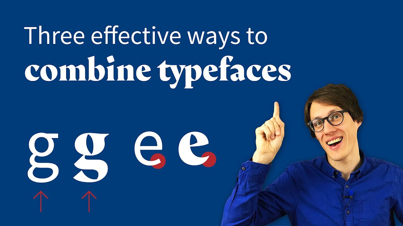
3️⃣ Look at the typeface’s construction (advanced)
I came up with the word “Megatypos” that contains very different letter to compare typefaces at a glance. Look at the letter forms (single-story or two-story a/g), apertures (is the inner space of the letter shapes more open or closed, see e, a, s) and the contrast (are the strokes even or contrasting)
⚠️ Popular Pairings on Google Fonts
Ignore them! They are clearly based on the popularity of a typeface, not if it’s a good combination. Most of the time they will misguide you and suggest combining a font with another from the same category (like sans-serif with sans-serif, which does not make a lot of sense).
🔠 Some cool featured fonts
ABC Arizona by Dinamo Typefaces (at 4:06)
The Questa Project by Martin Majoor and Jos Buivenga @exljbris (at 4:23)
Árida by Latinotype (at 6:12)
Chapters
00:00 Intro
01:32 Do you really need another typeface?
02:06 Use as litte fonts as possible
03:01 Have a reason for another typeface
03:35 Way 1: Use type families
05:25 Way 2: Make it obviously different
06:10 Way 3: Looking at the construction
09:25 About Google Fonts’ popular pairings
10:36 Summary & Outro
11:54 Outtakes
📰 Corresponding article with images:
TL;DW: First, decide if you really need another typeface, have a reason for it. Decide on a base, then find something to combine it with. For a quick win, use type families that contain different styles (most sans-serif and serif), and are designed to fit together. Another quick win is going for a very diverse combination. The most advanced level is looking at a typeface’s construction and pair similar underlying designs. Most important: have fun while doing it!
Basic Principles
🤔 Do you really need more than one typeface? You can achieve a lot with only one typeface by using a different style, like a bold heading or an italic, or a display style.
🤔 Use as little different styles as possible! Repeat your font choices as often as you can, and only when something does not work in a given situation, add a new style.
🤔 Have a reason for another typeface! Some common cases are for titles, headings, or pull quotes; for captions, marginalia, small print, navigation or other UI components; or for code on your site.
Ways to find good typeface combinations
1️⃣ Use type families (easy)
A super quick win! Type families or super families are designed in different typographic styles (e.g. sans and serif) with the aim to fit together, like IBM Plex, Roboto, Adelle, Tisa, or Merriweather. Use them to have more variation, and they will work right out of the box!
2️⃣ Make it obviously different (medium)
Go for contrast: Pick a font for your titles, headings, lead-in paragraph, or pull quotes, that really stands out. Choose something that won’t get in the way of your regular body text, because it’s so different.
3️⃣ Look at the typeface’s construction (advanced)
I came up with the word “Megatypos” that contains very different letter to compare typefaces at a glance. Look at the letter forms (single-story or two-story a/g), apertures (is the inner space of the letter shapes more open or closed, see e, a, s) and the contrast (are the strokes even or contrasting)
⚠️ Popular Pairings on Google Fonts
Ignore them! They are clearly based on the popularity of a typeface, not if it’s a good combination. Most of the time they will misguide you and suggest combining a font with another from the same category (like sans-serif with sans-serif, which does not make a lot of sense).
🔠 Some cool featured fonts
ABC Arizona by Dinamo Typefaces (at 4:06)
The Questa Project by Martin Majoor and Jos Buivenga @exljbris (at 4:23)
Árida by Latinotype (at 6:12)
Chapters
00:00 Intro
01:32 Do you really need another typeface?
02:06 Use as litte fonts as possible
03:01 Have a reason for another typeface
03:35 Way 1: Use type families
05:25 Way 2: Make it obviously different
06:10 Way 3: Looking at the construction
09:25 About Google Fonts’ popular pairings
10:36 Summary & Outro
11:54 Outtakes
 0:12:20
Pairing Fonts – 3 effective ways to combine typefaces, from easy to advanced
 0:11:03
10 Tips for Pairing Fonts
 0:04:48
Stop Wasting Hours Font Pairing - Use These Instead!
 0:00:40
3 FONT PAIRING TIPS
 0:00:43
Don’t make these font pairing mistakes
 0:06:54
How to Combine Fonts, How Not To, and the Best Font Combinations
 0:00:57
Font pairing made simple
 0:07:00
How To Pair Fonts Together | Tutorial
 0:07:23
How To Pair Fonts Styles Together | Script, Sans Serif, and Serif Fonts
 0:00:20
The BEST Fonts to Use in Your Videos
 0:13:56
Font Pairing Tips for Graphic Designers
 0:00:29
The Easiest Way to find Font Pairings - Helpful Websites Episode 102
 0:06:51
My Favorite Font Pairings in Adobe Express: 3 FONT COMBOS FOR EASY STRESS-FREE DESIGN
 0:00:10
Font Pairings for Your Business | Canva Font Recommendations | Font Combinations #canva
 0:00:16
✨These font pairings #cricut #cricutdesignspace #cricuthack #fonts #mgl #writing
 0:08:41
Quick Tips On How To Pair Fonts
 0:08:34
Pairing Fonts | Best Free Online Tools For Font Pairing
 0:08:10
Designers Only Need These 6 Fonts. Trash the Rest.
 0:00:30
Best Font Pairings For Churches
 0:07:41
Best Font Pairing Recommendations 2022 - Phil Pallen
 0:00:11
Font Pairing #canva #canvadesign #canvachampions #font #fonts #fontspack #canvaforbeginners
 0:00:24
Top 5 Cinematic Fonts to Use in Your Videos 🎥
 0:00:19
Best Canva Font Combinations part 2
 0:00:16
Best Website to help you choose fonts for your project #fonts #typeface #typography #webdesign #mktg
Комментарии