filmov
tv
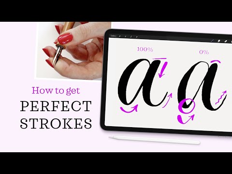
Thin and Thick Calligraphy Strokes in Procreate – My Top 3 Tips

Показать описание
Learn my top tips on how to draw perfect calligraphy strokes in Procreate, with beautiful thin and thick weight that looks just like ink-on-paper writing.
PROCREATE BRUSHES:
PRACTICE SHEETS:
CALLIGRAPHY TOOLS:
OTHER HELPFUL ARTICLES & VIDEOS:
------------------------------------------------------------------------------------
Tag me in your work so I can have a peek:
Instagram: @mollysuberthorpe
------------------------------------------------------------------------------------
MORE...
Favorite Calligraphy Supplies
Skillshare Classes
Calligraphy Workshops
Calligraphy Business Resources
My Work
------------------------------------------------------------------------------------
HARDWARE & SOFTWARE
------------------------------------------------------------------------------------
 0:09:50
Thin and Thick Calligraphy Strokes in Procreate – My Top 3 Tips
 0:07:16
Brush calligraphy // How to transition from thin to thick strokes
 0:00:29
how to do calligraphy with brush pens 🤍✨ SUPER EASY BEGINNER LETTERING TUTORIAL 😊 #shorts
 0:00:16
Practice the basics to improve your thin and thick strokes
 0:00:23
How to apply pressure to create thin and thick strokes
 0:11:13
Basic strokes: The oval
 0:03:42
Beginner Lettering Series: Part 3 - Thin on the Up, Thick on the Down
 0:11:37
Stop Struggling With Thick & Thin Strokes!
 1:50:26
🔴 New to Hand Lettering? Let’s Learn Together (No Pressure!) | Day 11/30
 0:05:02
How to Make Thick & Thin Strokes with a Brush Pen
 0:00:30
Basic Brush Calligraphy Strokes
 0:06:22
How to Begin Calligraphy with Any Pencil: the Secret Tips to Write Thick & Thin Lines
 0:08:43
Basic strokes: The ascending stem loop
 0:02:13
Beginner’s Guide to Calligraphy Thin Strokes | How to
 0:05:00
4 Thick & Thin Strokes - Secrets Of Modern Calligraphy
 0:11:35
CALLIGRAPHY with a BALLPOINT PEN (Thin and thick strokes)
 0:04:55
Transitioning from thick to thin strokes
 0:00:17
'pride' brush pen calligraphy.
 0:00:35
Why are there thick and thin strokes in calligraphy? #shorts
 0:00:16
How to control pressure to create thin and thick strokes
 0:02:10
How to use thin stroke and thick stroke for calligraphy|Calligraphy Station
 0:07:44
Basic strokes: The overturn stroke
 0:08:20
5 Things to Keep in Mind while Learning Calligraphy as a Beginner
 0:01:42
how to make a procreate calligraphy brush in 2 MINUTES!
Комментарии