filmov
tv
Create a Responsive Web design using CSS3 and HTML5

Показать описание
Responsive Web Design is an approach towards making your website to have have optimal viewing experience in various devices. With wide variety of devices available in market, people may view your website in an Iphone, Ipad, desktop etc. CSS3 responsive web design also called RWD uses various techniques to manipulate the information on your screen to render differently for different devices. It is imperative that our website be mobile friendly.
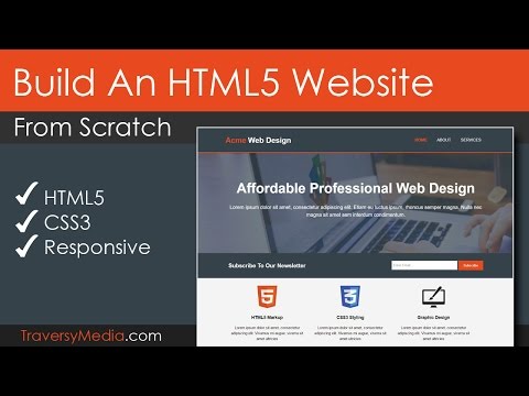
In this video I show you a few techniques where you can build an HTML 5 website from scratch and use CSS3 responsive web design techniques to build a simple website.
We look at how it displays in Ipad resolutions, Iphone resolutions and desktop resolution.
We will demonstrate how to adapt our site to various resolutions using the CSS3 media queries.
We also look at an example, where we render an image differently for different resolutions. We will not be simply hiding/unhiding an image, but will use CSS3 @media queries to render the optimal size image for various resolutions. Thus we will keep our page weight light so that its optimized for bandwidth as well.
We will also have a brief look at the Navigation. We will look at how we can change navigation and display an hamburger button, when we enter lower resolutions.
I will demonstrate an end to end HTML5 website building from scratch and use CSS3 @media queries and introduce the concept of picturefill to display images and also build a basic navigation.
 0:23:13
A practical guide to responsive web design
 0:15:54
5 simple tips to making responsive layouts the easy way
 0:21:17
17: How to Make a Website Responsive | Learn HTML and CSS | Full Course For Beginners
 0:13:46
Create Responsive Website Designs | Figma Tutorial
 4:14:08
Introduction To Responsive Web Design - HTML & CSS Tutorial
 0:09:44
Master Media Queries And Responsive CSS Web Design Like a Chameleon!
 0:08:18
How To Make Website Responsive Using CSS Media Queries | Responsive Web Design Tutorial
 0:20:19
24 | MAKE A WEBSITE RESPONSIVE FOR ALL DEVICES | 2023 | Learn HTML and CSS Full Course for Beginners
 0:02:20
Create a Responsive Car Sale Website 💯 Free Source Code | Design Using HTML CSS And JavaScript
 0:19:16
How To Make Responsive Website Design Using HTML And CSS Step By Step
 0:33:16
Make Your Website Design Fully Responsive | Figma Tutorial
 0:06:38
Responsive Web Design | 10 Basics
 1:25:35
🌐 Responsive Web Development: Building Websites for All Devices! 📱💻🖥️
 0:06:06
The Secret to be Mobile Friendly in 10 Minutes | Truly Responsive Web Design
 0:11:03
Useful & Responsive Layouts, no Media Queries required
 0:20:16
Top 10 Advanced CSS Responsive Design Concepts You Should Know
 0:26:30
Responsive Website In Figma
 0:15:13
How To Create a Responsive Navbar Using HTML & CSS | Step By Step Tutorial
 1:01:15
Build An HTML5 Website With A Responsive Layout
 0:04:14
Practical Guide to Responsive Design
 0:10:18
How To Make ANY Design Responsive in Figma
 2:02:22
Build a Responsive Website | HTML, CSS Grid, Flexbox & More
 1:11:59
How To Make Website Using HTML & CSS | Full Responsive Multi Page Website Design Step by Step
 0:20:47
Responsive Design in Figma: Crash Course 2023
Комментарии