filmov
tv
How to Build a Responsive Navigation Bar with Flexbox

Показать описание
Time for a practical exercise in flexbox! In this video tutorial, we will use flexbox to create a mobile-first, responsive, toggleable navigation bar with different layouts for mobile, tablet, and desktop screens.
- - - - - - - - - - - - - - - - - - - - - - - - - - - - - - - - - - - - - - -
Envato Tuts+
Envato Elements
All the creative assets you need under one subscription. Customize your project by adding unique photos, fonts, graphics, and themes.
- - - - - - - - - - - - - - - - - - - - - - - - - - - - - - - - - - - - - - -
- - - - - - - - - - - - - - - - - - - - - - - - - - - - - - - - - - - - - - -
Envato Tuts+
Envato Elements
All the creative assets you need under one subscription. Customize your project by adding unique photos, fonts, graphics, and themes.
- - - - - - - - - - - - - - - - - - - - - - - - - - - - - - - - - - - - - - -
 0:17:31
The Easy Way to Build Responsive Websites
 0:23:13
A practical guide to responsive web design
 1:19:56
framer tutorial: building a responsive site from scratch
 2:02:22
Build a Responsive Website | HTML, CSS Grid, Flexbox & More
 0:09:39
5 CSS Tips & Tricks for better Responsive Web Design
 0:00:24
Responsive Portfolio Website HTML CSS JavaScript
 0:00:09
🚀 Portfolio Website | Responsive HTML, CSS & JS | MZCode01 #website #coding #shorts #css #html #...
 0:33:28
Framer for Beginners: The #1 Secret to a Responsive Site
 2:31:04
Responsive Portfolio Website Using HTML & CSS Only
 0:21:17
17: How to Make a Website Responsive | Learn HTML and CSS | Full Course For Beginners
 0:04:18
Master Responsive CSS Media Queries in easy way
 0:00:06
🚀 Responsive Sidebar with Slide Animation | HTML CSS JS #webdevelopment #coding #sidebar #shoerts
 0:15:54
5 simple tips to making responsive layouts the easy way
 1:01:15
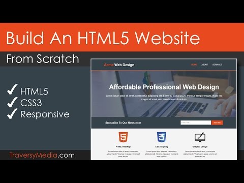
Build An HTML5 Website With A Responsive Layout
 0:06:09
How to build a responsive WordPress website
 0:49:38
Build a responsive website with HTML & CSS | Part one: Analyzing the project and setting the sta...
 0:18:54
Making Responsive Websites in Framer
 0:00:10
🔥 SMOOTH SCROLL 3D Animated Website Design ✨ | CSS & JavaScript Magic!
 0:13:46
Create Responsive Website Designs | Figma Tutorial
 4:14:08
Introduction To Responsive Web Design - HTML & CSS Tutorial
 1:00:07
Build a Responsive Personal Portfolio with HTML & CSS | Full Beginners Tutorial 🔥🚀
 0:00:59
Must Have Tailwind Plugin For Responsive Design
 0:17:51
How to Build a Responsive Navigation Bar (feat. Gregory John)
 0:22:35
How to Create Responsive Websites (TailwindCSS)
Комментарии